Storm8 — MONOPOLY Bingo!
Simplifying a live game lobby
- My role
- UI/UX Design · Visual Design · Interaction Design
- Collaboration
- PM · Engineering · Art · Live Ops
- Discipline
- Mobile Game UI · Information Architecture · Live Events · Progressive Disclosure
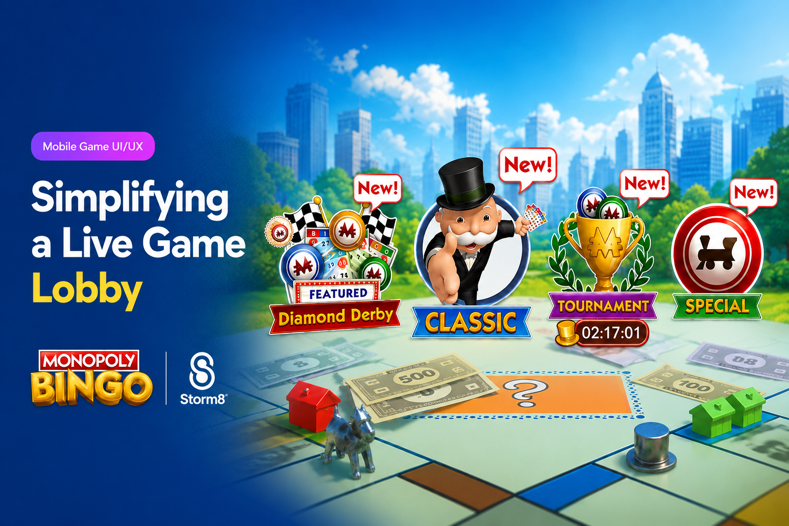
The challenge
As MONOPOLY Bingo added more modes, live events, tournaments, and promos, the lobby got hard to navigate. Events fought with the core modes for attention, temporary content showed up in a different spot every release, and the screen got more crowded with every feature a player unlocked — so the events we most wanted seen could end up buried. The structure also had no room for the next wave of live content.
What I did
- I split the lobby into two levels: permanent game modes stay dominant, and time-limited events get their own navigation.
- First pass, I fixed the foundation — resized and aligned the four core modes into one scannable row instead of a scattered layout.
- Then I added a compact event selector, so live content has one predictable home and each new event slots into a pattern instead of being pinned somewhere new.
- I made that same pattern work in the Main Lobby, Room Selector, and Tournament screens, with a collapsible panel that gives space back when players are focused on playing.
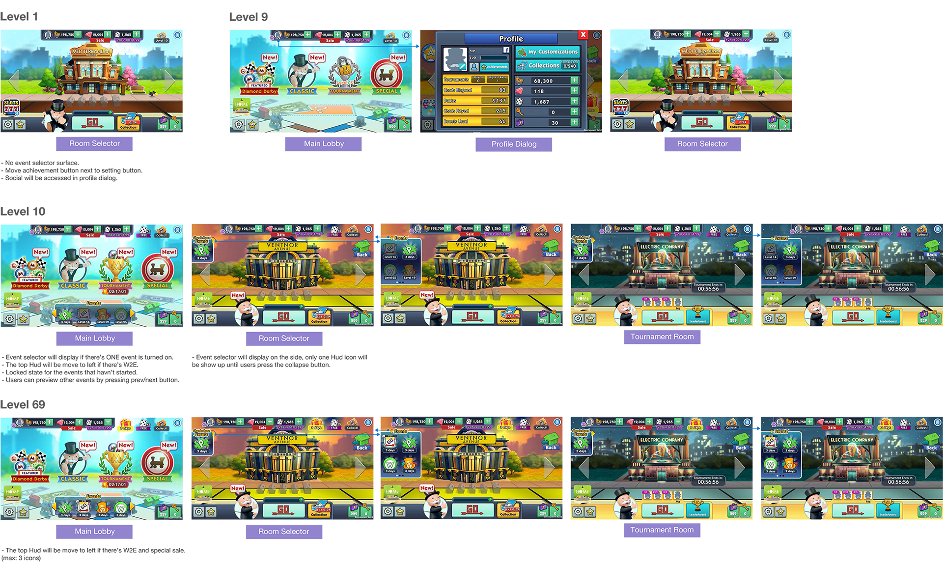
- I designed the lobby to open up as players level — minimal at Level 1, events introduced at Level 9, the selector added at Level 10, more live content by Level 69 — all on the same layout.
Progressive lobby — Level 1 → 69
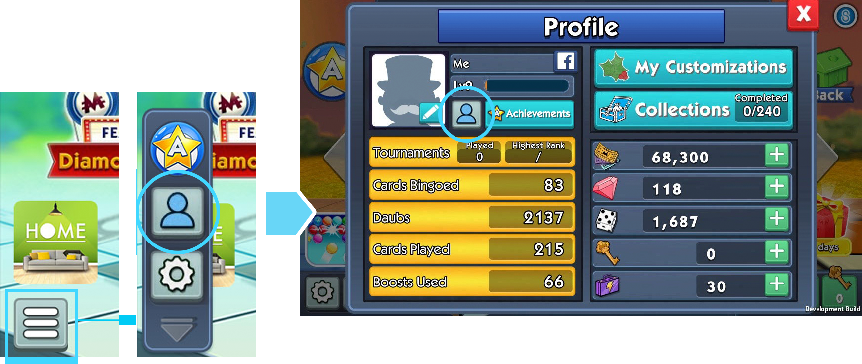
Profile moved into the menu
01 · Challenge
A Lobby That Grew Too Complex
Over time, new events and features got dropped into the lobby wherever they'd fit. Too many things competed for attention, temporary content landed in a different place each release, and the screen got busier the more of the game you unlocked.
We wanted a clearer split between core gameplay and live content, and a lobby that could keep growing without turning into noise. I started by consolidating the secondary stuff — Profile moved into the menu next to achievements and settings, which freed the lobby up for things players actually act on.
- Competition
- events and permanent modes fought for the same visual weight
- Inconsistency
- temporary content landed in a different place each release
- Scale
- no room for the next wave of live events
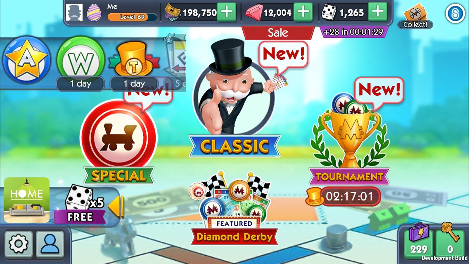
Before — four modes at four sizes, event icons overlapping the board, and no reliable place to look first.
02 · Design Direction
Fix the Hierarchy First, Then Add Events
The first pass fixed the foundation. I resized the four core modes to one scale and lined them up in a row, so Diamond Derby, Classic, Tournament, and Special read as one set of choices.
The second pass added the event selector — a compact strip you page through sideways. It gives time-limited content a permanent address without letting it outshout the modes above it.
Resize & align → Introduce event selector → Scale to more events
Before
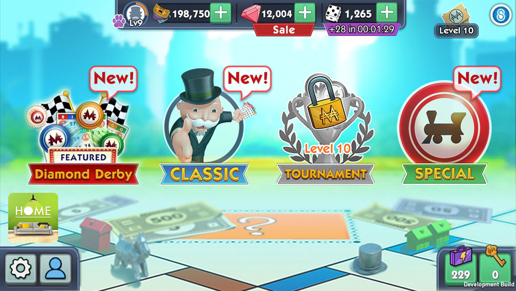
First pass: resize — one row, one scale. Hierarchy before any new features are added. After
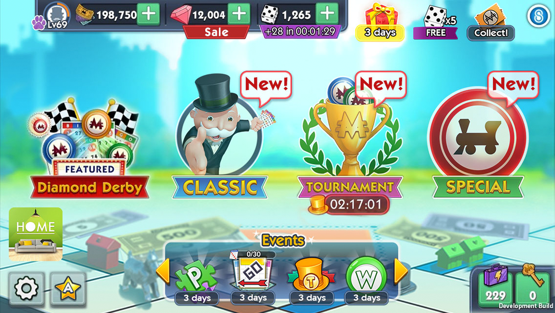
Second pass: add new selector — the Events strip carries live content in a predictable, pageable slot.
03 · System
One Event System, Everywhere
I designed the event pattern to work outside the main lobby too. The same selector shows up in Room Selector and Tournament, collapsing to the side so players keep the space they need while still seeing that something live is running.
It also grows with the player. Level 1 stays minimal, Level 9 introduces events, Level 10 adds the selector, and by Level 69 the same layout is carrying a lot more live content — one lobby that scales, not four different ones.
- Level 1
- minimal UI, focused on the core loop
- Level 9
- event system introduced
- Level 10
- events selector added
- Level 69
- more live events and content, same structure
Main Lobby
Main Lobby — the selector sits below the modes, where live content is expected. Room Selector (Events Collapsed)
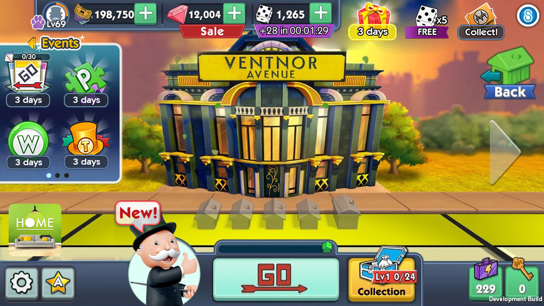
Room Selector — the same events, docked to the side so the room stays the subject.
04 · Testing & Iteration
Fewer Steps, Better Discovery
One of my early concepts put every event behind a single “Play Our Events!” button. It made the lobby much cleaner — and it also put an extra tap in front of the content we most wanted players to see.
Testing confirmed it: that one extra step hurt event discovery and engagement. So instead of hiding high-priority content behind another screen, we brought the most relevant events back into the lobby through the compact selector. It controls how busy the screen feels without controlling access.
- Hypothesis
- group events behind one entry point to reduce clutter
- Learning
- testing showed that an additional interaction reduced event discovery and engagement
- Decision
- keep high-priority live events directly visible in the lobby
Early Concept (Rejected)
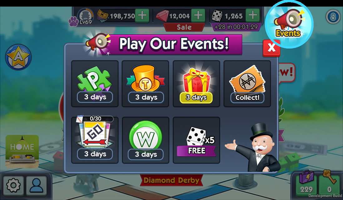
Rejected — every event in one dialog, one tap further from the player. Final Direction
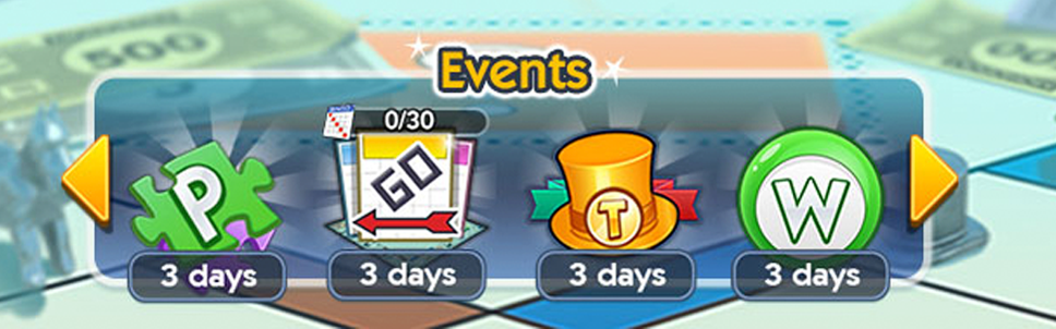
Final direction — high-priority events stay in the lobby in a compact, pageable strip.
05 · Outcome
A Clearer Lobby With Measurable Impact
The lobby ended up with a clean split between permanent gameplay and live content, and the team got a structure they could keep adding events to. On entry, players can answer the four questions that matter: what can I play, what's new, what's running right now, and where do I go next.
+8%
retention lift on the release
A team result across everything in that release, not the redesign alone — but the lobby work was a meaningful part of it.