RitzDeli Games · Client Project for Meta — Epic Roller Coasters
Making VR content easier to discover, compare and buy
- Client
- Meta · client work delivered through RitzDeli Games
- My role
- Lead UI/UX Design · Monetization UX · Purchase Flow · Store UX
- Collaboration
- PM · Engineering · Art · Production
- My focus
- UX Flows · Interaction Design · UI Systems · Visual Design · Prototyping
- Discipline
- VR UX · Monetization UX · Purchase Flow · Store UX
Client project for Meta through RitzDeli Games. As the Product Designer, I translated product and monetization requirements into the purchase flow, interaction model, information hierarchy, and final VR UI — working with the PM and engineering team from early flow exploration through final design.
The challenge
Epic Roller Coasters is a live VR coaster game with a deep library of rides, carts, companions and bundles. The content was all there, but the experience made it hard for players to discover, understand and buy the ride content they wanted without leaving the moment they were in — a ride and the bundle that unlocked it lived on separate screens, and a required View More step pulled players out of the game before they ever saw a price.
What I did
- Audited the shipping store and purchase flow against the PM brief and reframed the purchase experience as three problems: discovery, comparison, and checkout.
- Explored whether purchase information should stay behind a step or move in-context, then designed the in-context panel that keeps the ride on screen with its price, its matching bundles, and what the player already owns.
- Mapped the whole flow through Meta Checkout so success, cancel, and failure all land back on the same panel instead of restarting it.
- Restructured the store into Featured, Rides, Theme Bundles and Fun Packs on one card pattern and one detail layout, so contents, discount and price sit in the same place each time.
- Designed the states for the PM's offer rules, so the board adapts to what each player already owns.
How the work moved
- PM goals & requirements
- UX analysis
- User flows
- Design exploration
- UI system & visual design
- Engineering & art handoff
01 · Business Goal
What the Business Needed
Improve content discoverability and create a clearer path from ride discovery to purchase, while making bundles and purchase options easier for players to understand.
02 · User Problem
What Players Ran Into
Players interested in a ride had to move through several steps and leave the ride context to understand their purchase options. On top of that, they had to separately work out which DLC or bundle actually contained the content they wanted.
03 · Constraints
Designing Inside a Live VR Game
This was a change to a shipping product, so the room to move was set before the first screen was drawn.
- Live VR game
- everything had to work inside an existing, shipping VR title
- Existing system
- the solution had to respect the current visual and interaction language
- VR legibility
- information had to stay readable at a comfortable VR viewing distance
- Existing commerce
- the flow had to work with the commerce and checkout architecture already in place
- Right amount of information
- reduce friction without overwhelming players with more to read
04 · Exploration
Behind a Step, or in the Moment?
Walking the shipping flow against the brief, the friction was really three problems: players couldn't easily find content, couldn't compare a ride against the bundle that unlocked it, and the purchase path added friction because View More stood between players and the price — while checkout outcomes could break their context.
That framed the central design question — should purchase information stay behind a separate View More step, or should the most important purchase information be surfaced directly while the player is still looking at the ride?
- What I found
- The existing purchase journey separated discovery, evaluation, and purchase across multiple steps. Players could discover a locked ride, but understanding its price and the bundle that included it required leaving the immediate ride context.
- Design direction
- Bring the essential purchase information into the ride-selection experience so players could understand the ride, price, and bundle relationship without navigating through a separate purchase journey.
Before: Ride → View More → Details → Offer → Checkout · After: Ride → In-context Purchase Panel → Checkout
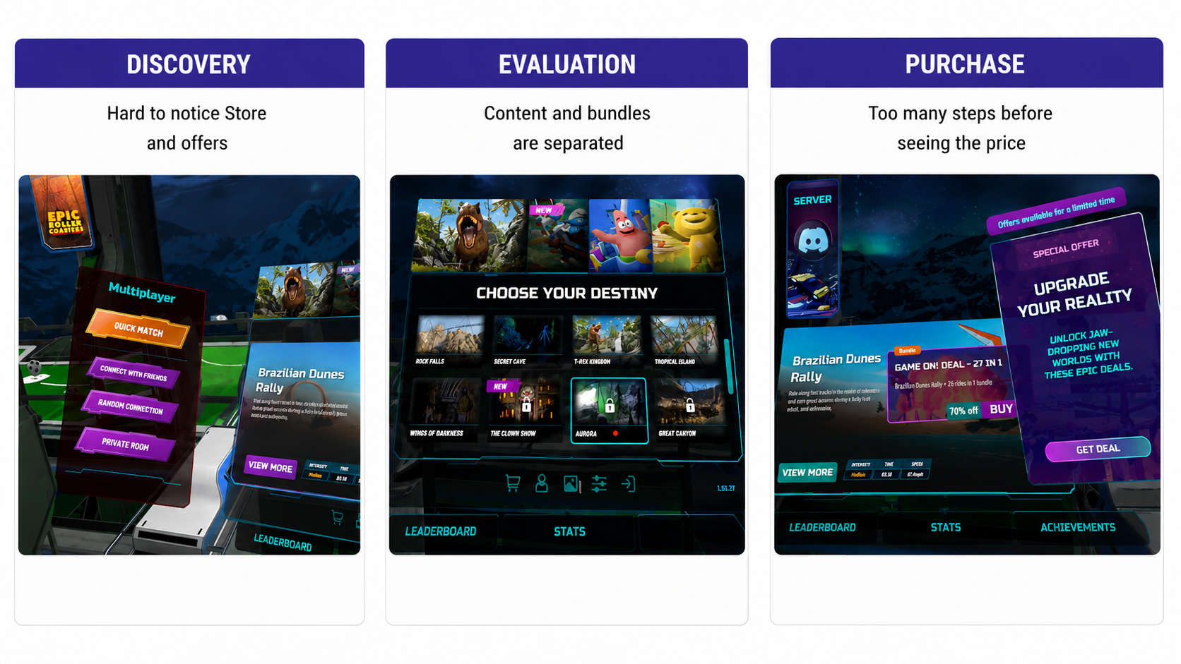
The audit that raised the question — one purchase problem split into a discovery, a comparison and a flow problem. 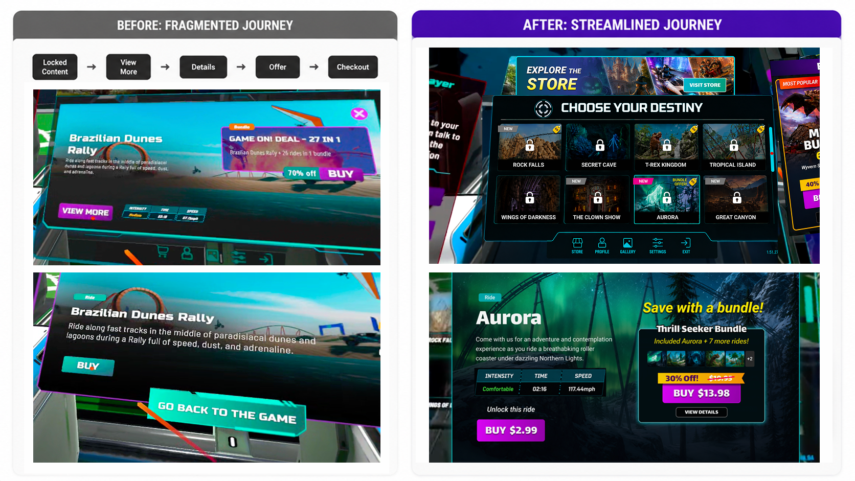
Before and after side by side — the existing flow keeps purchase behind a chain of steps; the redesign puts the ride, its price and its bundle on one panel.
05 · Design Decision
Why In-Context Won
I chose the in-context approach. It removed unnecessary navigation while keeping the player connected to the ride they were already interested in — instead of asking someone to remember a ride, leave the experience and hunt for the right DLC, the design put discovery, comparison and purchase into one continuous flow.
Tapping locked content now opens a single panel: the ride with its individual price, up to two matching bundles with their size, discount and final price, and anything already owned marked. The panel answers the question players actually had — is it cheaper to buy this ride, or the bundle it's in? View Details stays, but as an option, not a required step.
- Surface at intent
- show purchase options the moment a player selects locked content
- Compare in context
- keep the selected ride visible while showing bundles, price, savings and ownership together
- Preserve context
- cut intermediate screens and return players to the same place after purchase, cancel or failure
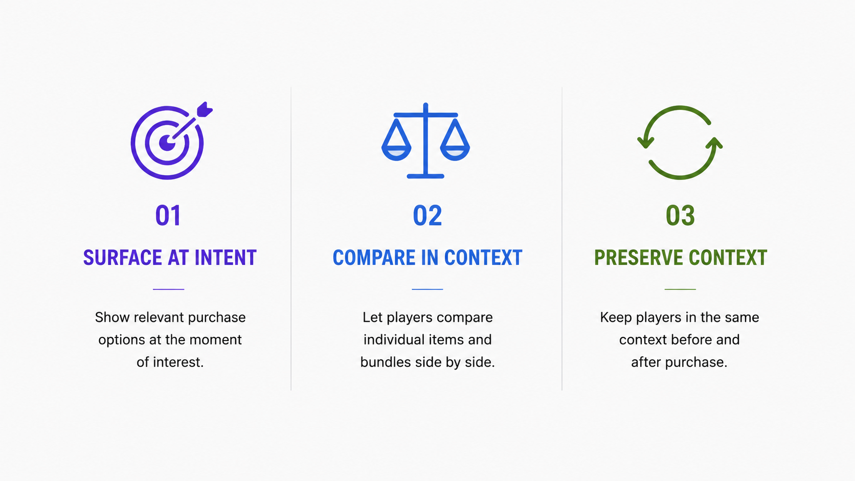
Three principles we aligned on to guide design decisions throughout the project.
The Decision, Before and After
The same two moments — browsing offers, then evaluating one bundle — with the deciding information moved onto the surface the player is already looking at.
Before
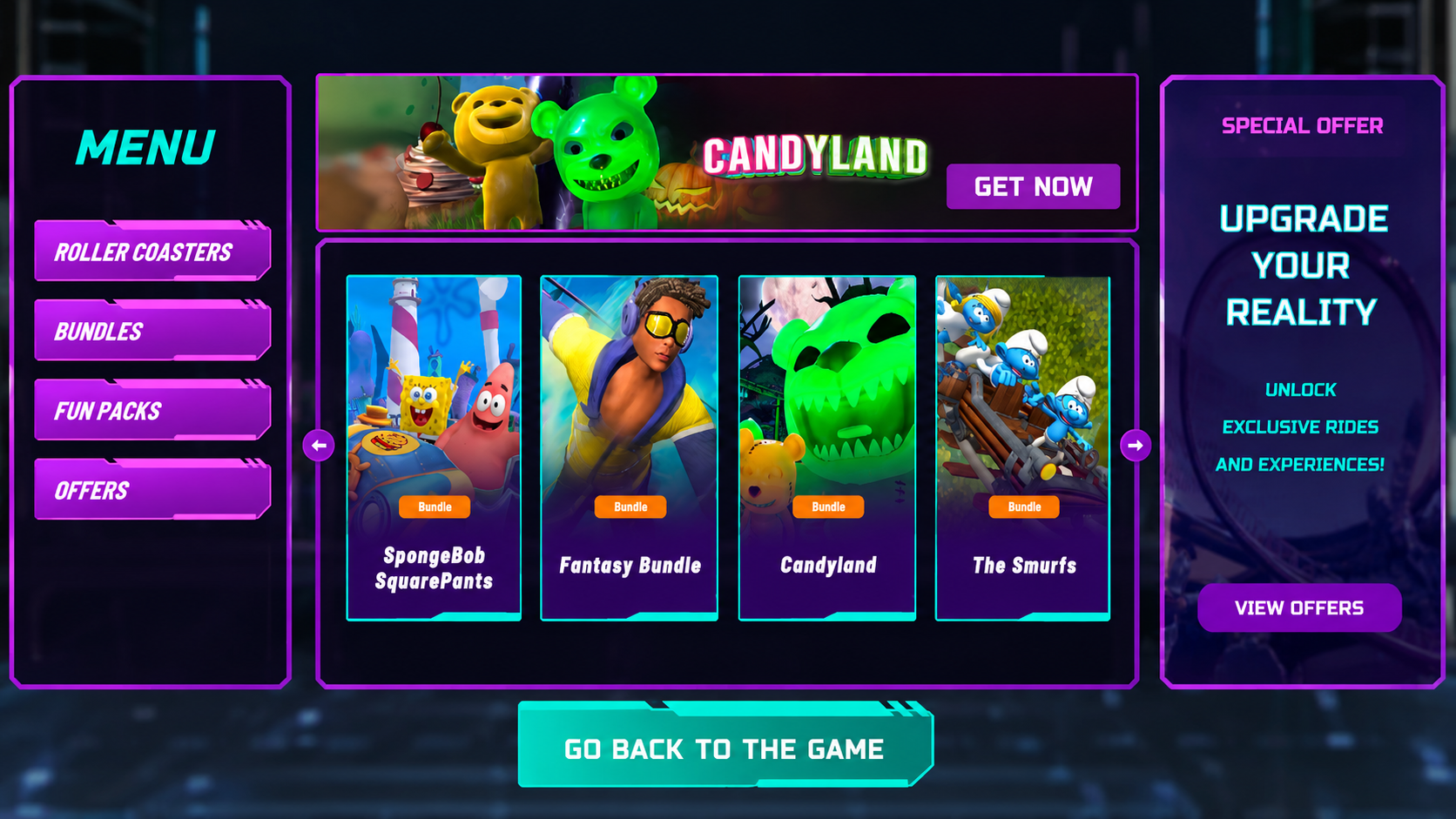
Browsing — every card carries the same generic Bundle tag. No size, no price, no discount, so choosing between four bundles means opening all four. After
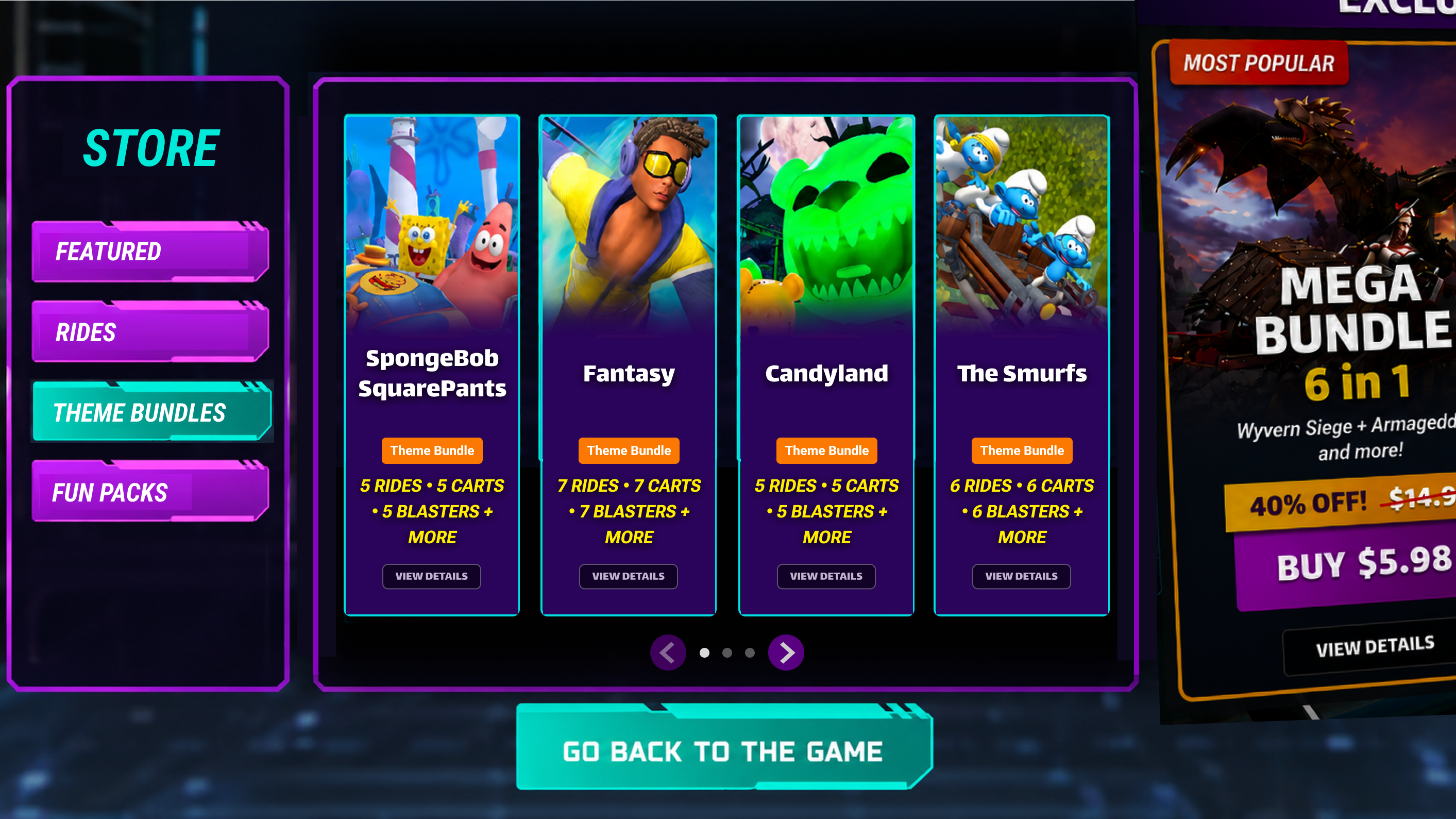
Browsing — Theme Bundles becomes a real category and each card states what it contains. With no promo banner overhead, the grid itself carries the comparison that used to require opening all four. Before
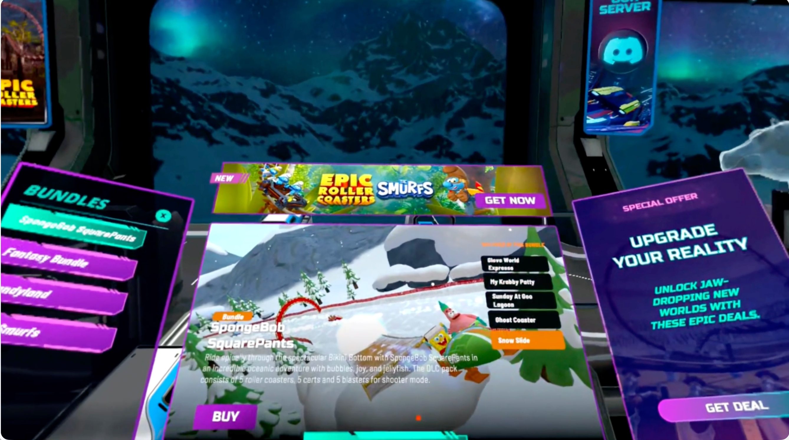
Bundle detail — description text sits on top of live gameplay, the Buy button carries no price, and a promo panel competes with the bundle it is advertising. After
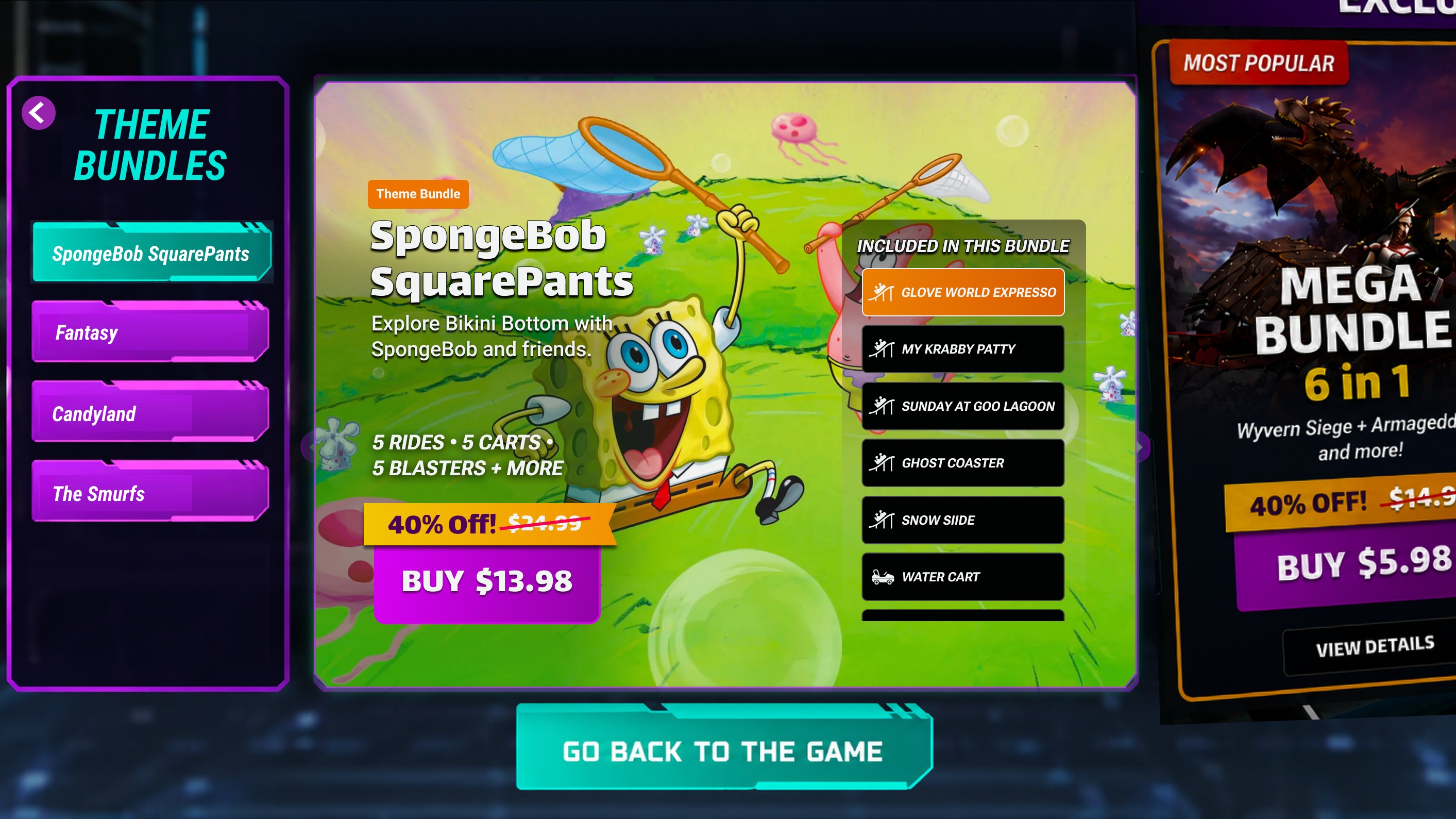
Bundle detail — the contents list, the discount and the final price sit together on a legible surface, so the buy decision needs no further taps and the way back into the game stays one tap away.
06 · Collaboration & Tradeoffs
How Much to Surface Without Overloading VR
Product requirements defined what the commerce experience had to support. I worked with the PM and engineering team to decide how much of it we could put on screen before a VR panel started to feel heavy — what earned a place on the surface, and what stayed one tap away behind View Details.
The offer logic was the clearest example. The PM owned the rules for eligibility, ownership and player history; I designed the states those rules produced, so the board keeps showing something useful instead of content a player already owns.
- Starter or Mega purchased
- only the purchased slot refreshes with unowned content
- Game On purchased
- all slots refresh, since the bundle already covers most ride content
- Non-payer past day 3
- standard offers are replaced with lower-priced, higher-discount options
07 · Final Design
One Continuous Journey
The final design connects the whole path on the surfaces players already look at — from finding a ride to getting back into one — with a single card pattern and a single detail layout so each step feels like the last. I also took the promo banner off the bundle screens, where it had been competing with the very offer it pointed at.
Discover Ride → Understand Purchase Option → Compare Bundle → Purchase → Return to Ride
Discover — the store is hard to miss
A clearer storefront mark and a store that leads with offers, so players find content instead of hunting for it.
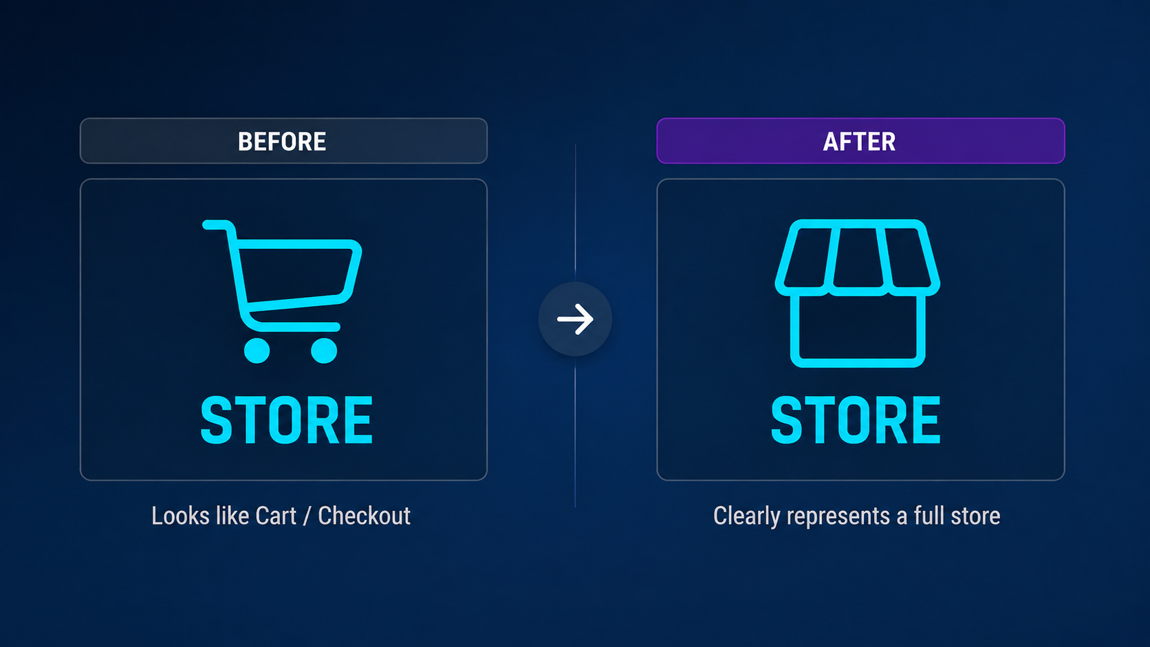
The storefront mark reads as a place to browse, not a checkout. 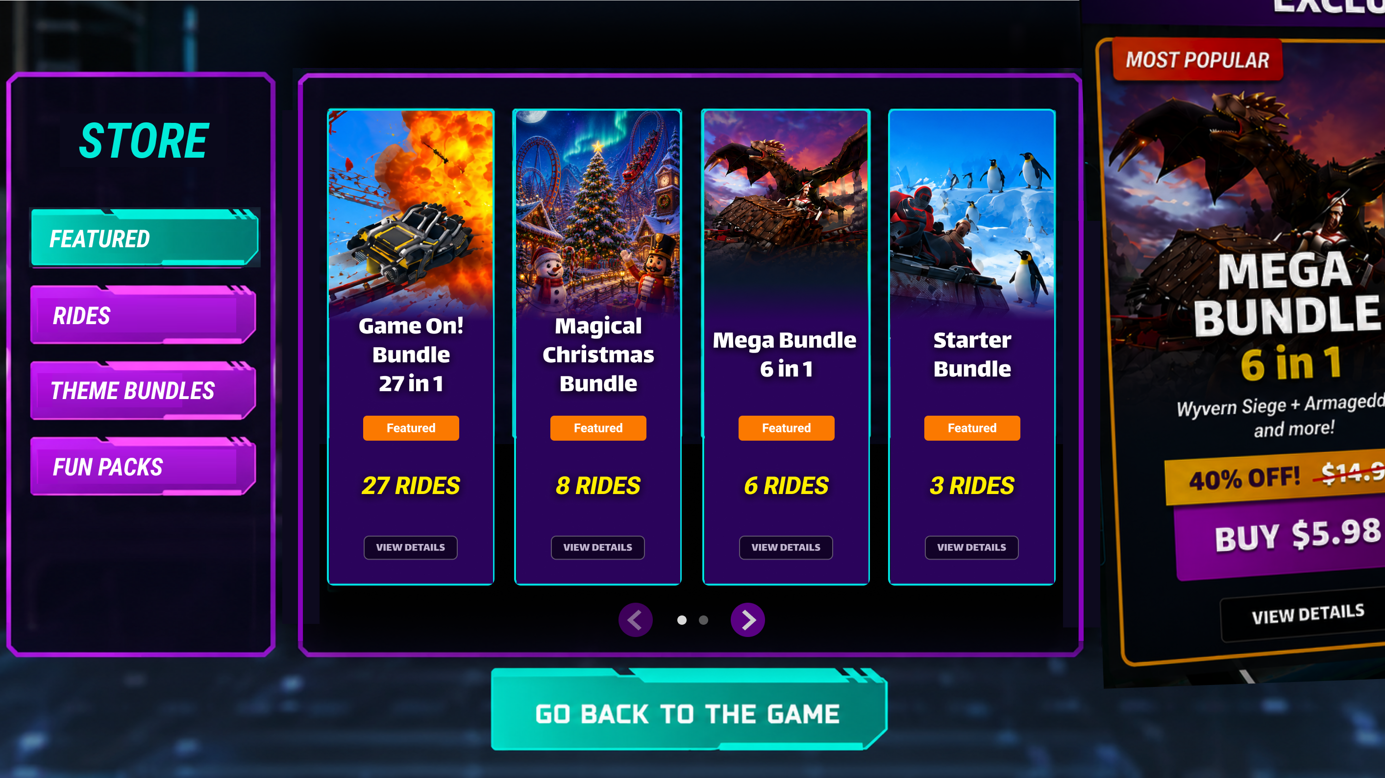
Offers lead the store, and each card states its ride count so the biggest deal is obvious without opening anything.
Compare — one card pattern, every category
Featured, Theme Bundles and Fun Packs share one card that states what's inside, so offers compare without being opened — only the unit of content changes.
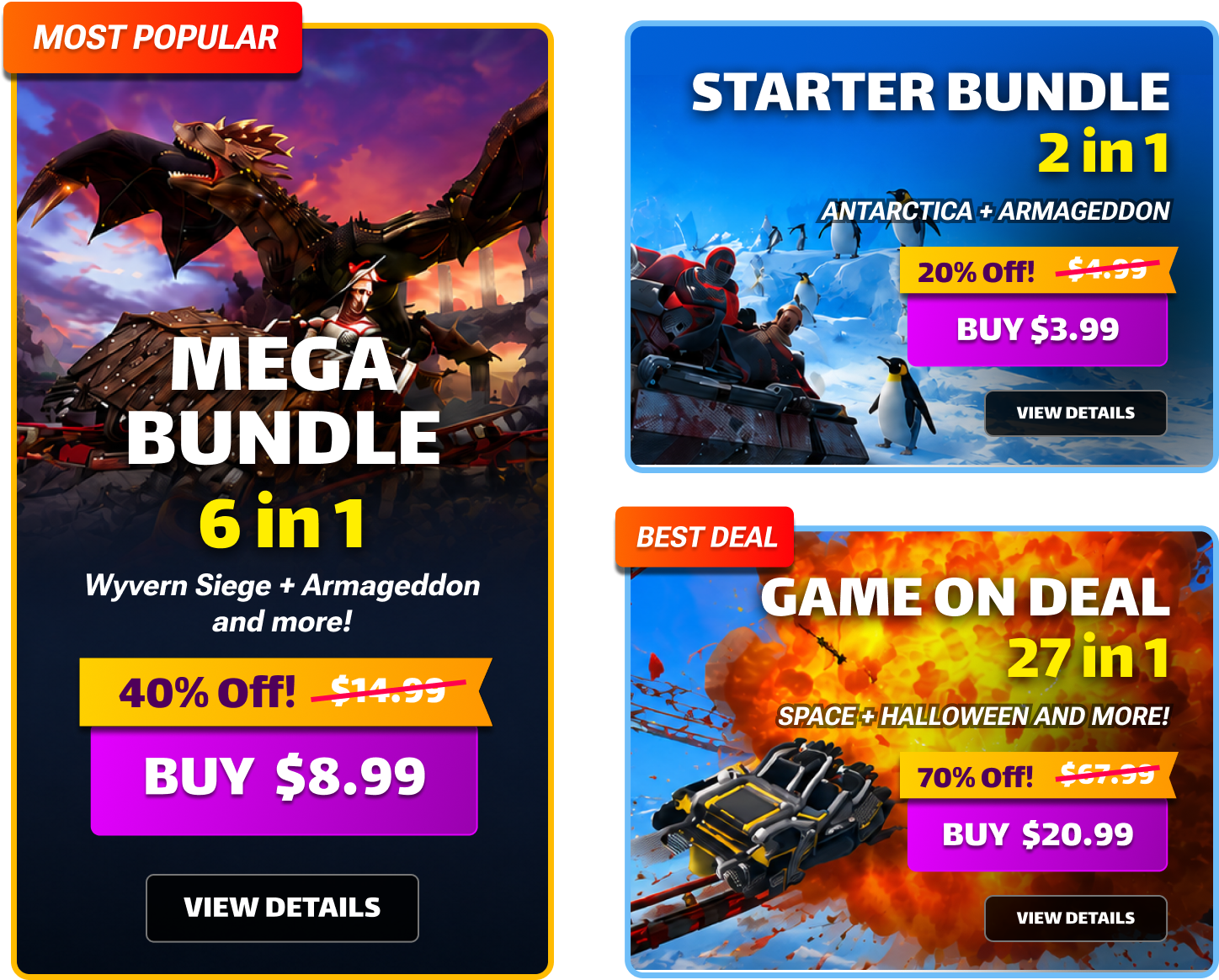
Size, discount, original price and final price are all readable on the card itself. 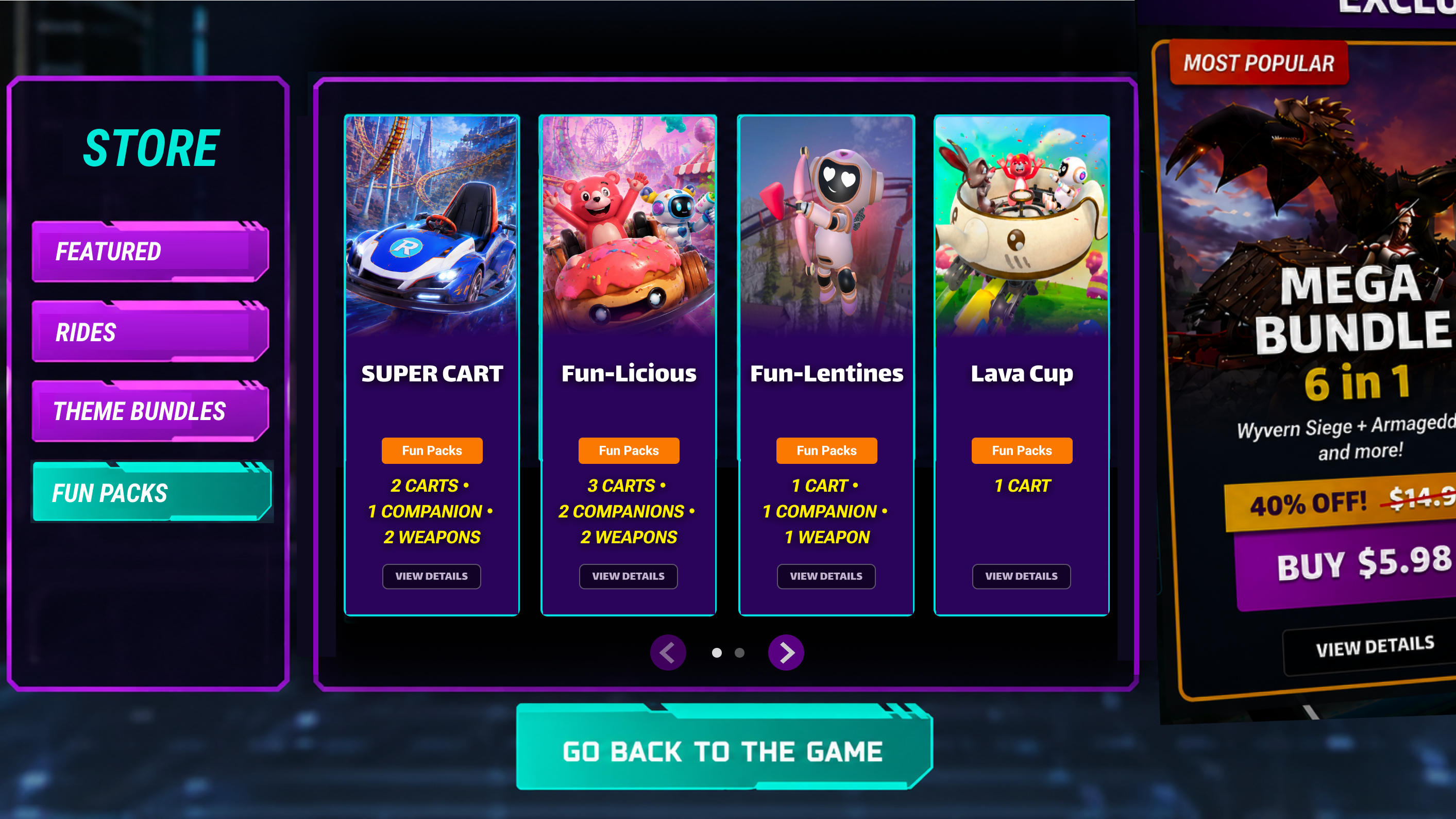
The same pattern carries over to Fun Packs, counting carts, companions and weapons instead of rides.
Decide — one detail layout, every category
Every offer type resolves to the same layout — description, contents, discount and final price in the same place — with a scannable list replacing the old wall of names.
Before
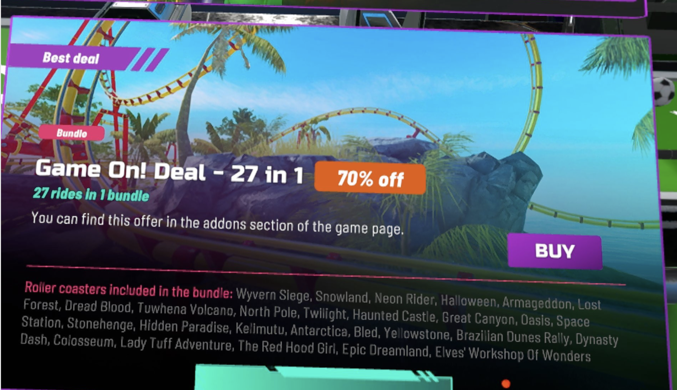
Featured before — 27 rides as one comma-separated paragraph, a Buy button with no price, and a line sending players elsewhere. After
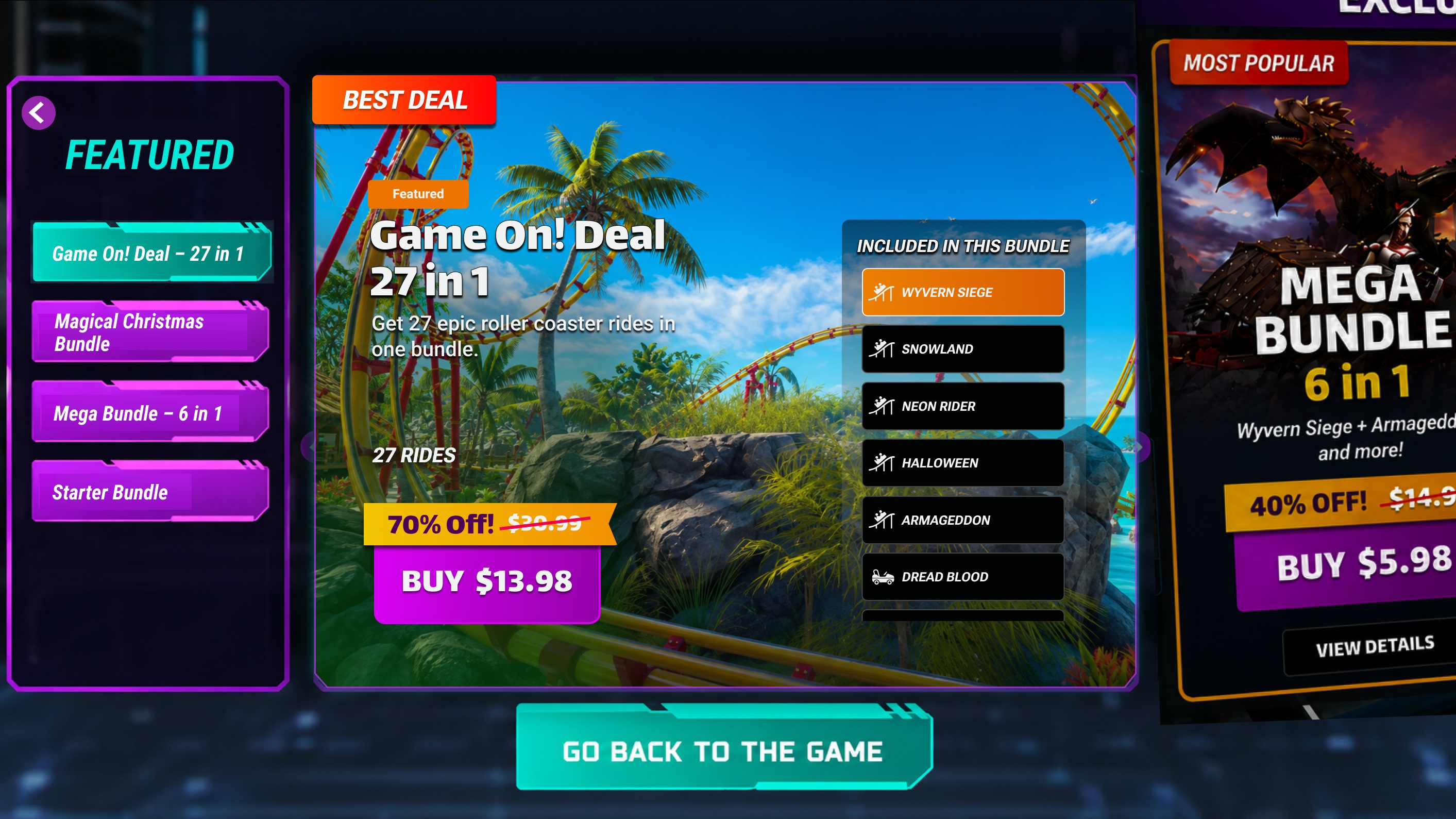
Featured after — the same 27 rides become a scrollable Included list, and the final price sits on the Buy button. Before
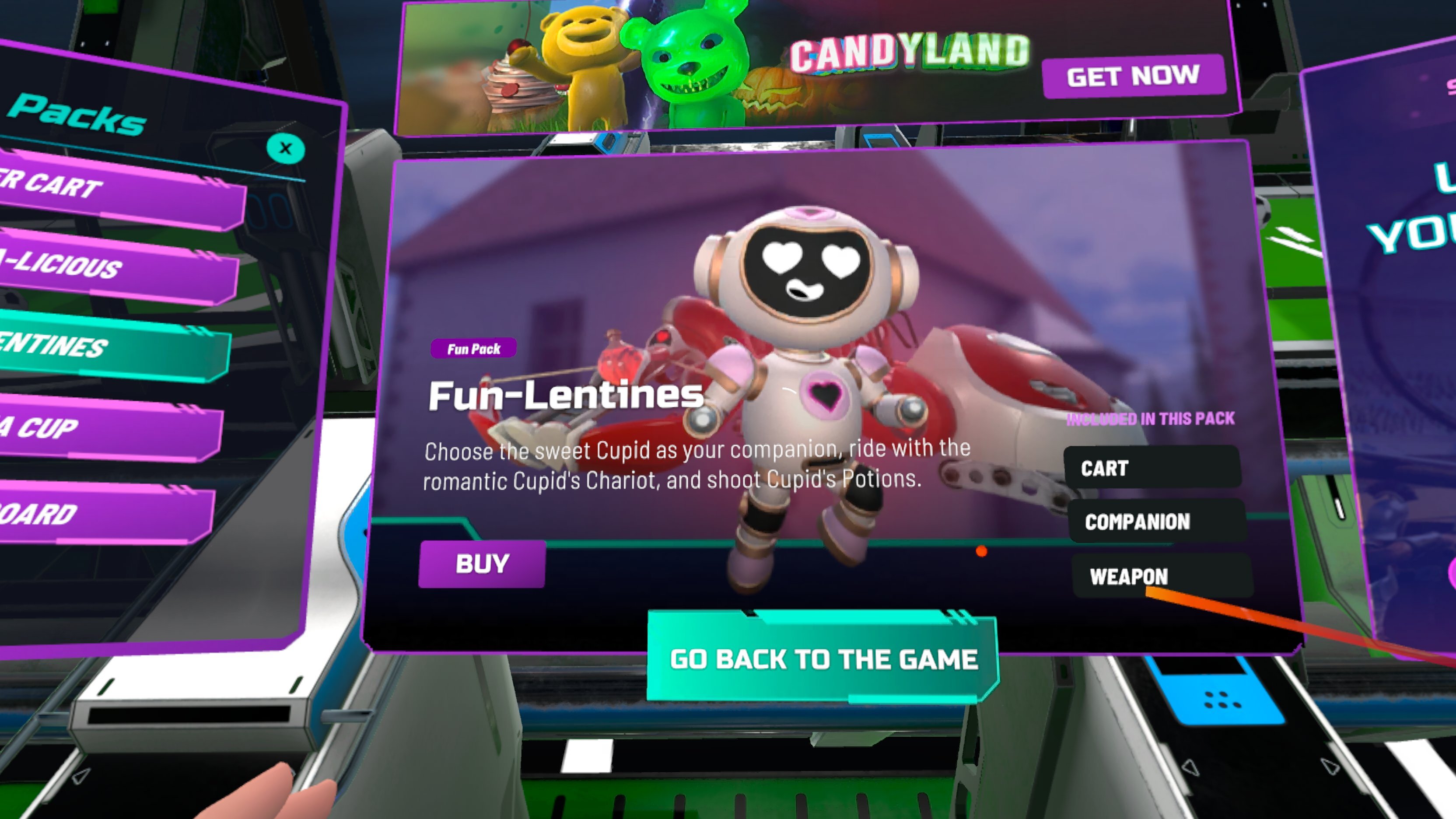
Fun Packs before ��� contents named only as CART, COMPANION and WEAPON, with a promo banner overhead. After
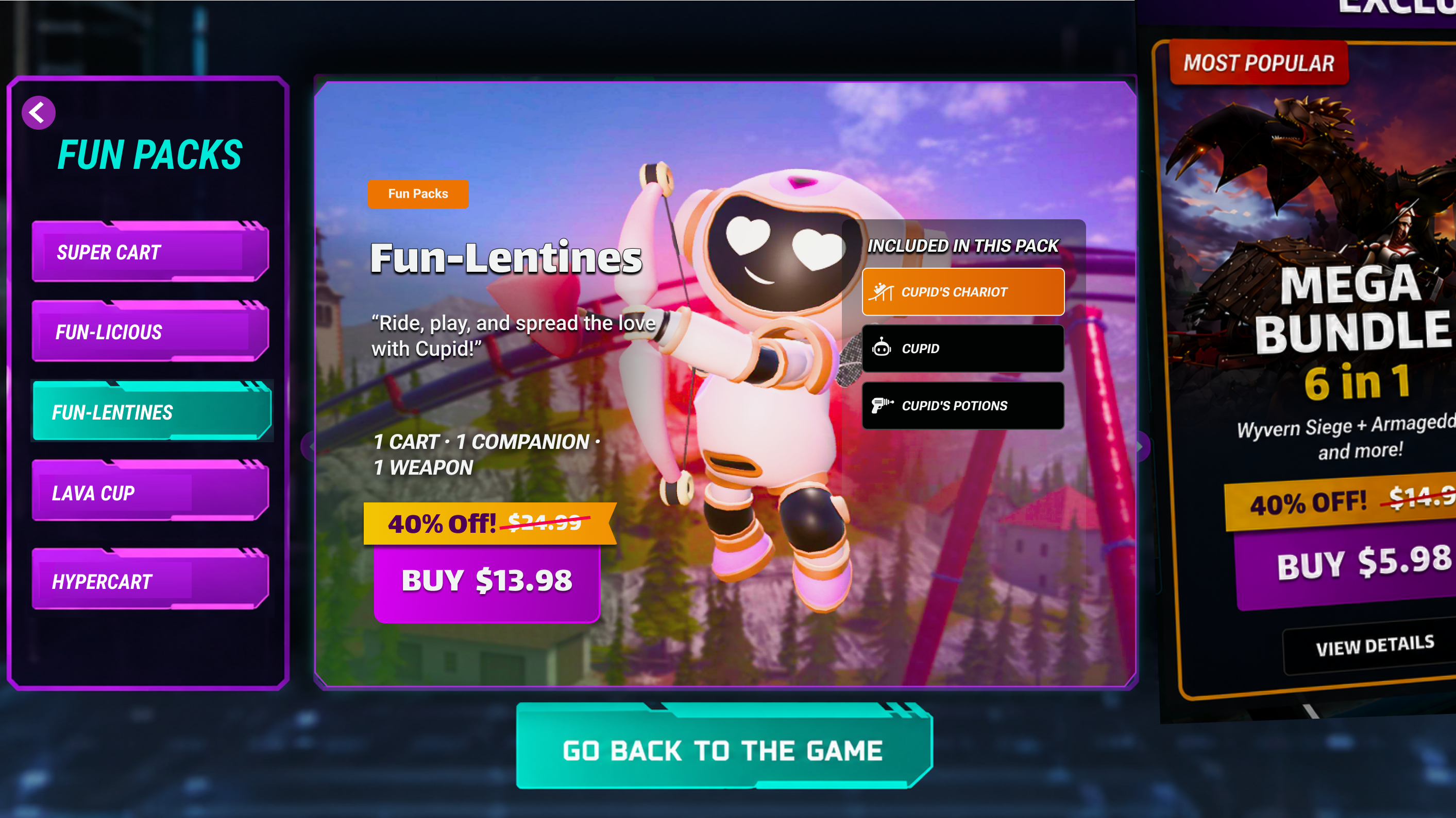
Fun Packs after — the same layout as the bundles, with the actual items named and selectable to preview.
Purchase & return — the flow never loses the player
Checkout runs through Meta Checkout and always lands back on the same panel: success unlocks and returns; cancel or failure returns with the selection intact.
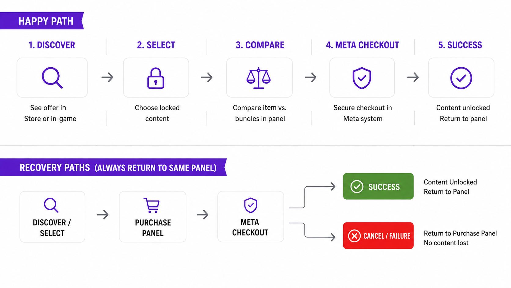
One flow, two tracks — the happy path and every recovery path land the player back on the same panel.
08 · Final System Flow
Shooter Event & Reward Flow
The final flow connects event discovery, gameplay, rewards, progression, and collection into a continuous loop. Rather than treating the event as a standalone screen, the experience keeps players moving between the lobby, gameplay, and event progression while making rewards visible at key moments.
- 1. Shooter Visibility
- The updated mode selection gives Shooter stronger visibility within the existing mode system, making the experience easier to discover without introducing a separate entry point.
- 2. Event Discovery
- A dedicated event entry in the Main Lobby gives the active event a clear, persistent presence and communicates its status, timing, and featured rewards before the player enters.
- 3. Event Screen
- The event screen establishes the current tournament, leaderboard position, progression, and available rewards, giving players a clear reason to participate and return.
- 4. Gameplay → Standard Game Over
- Players enter the existing Shooter gameplay flow. After a match, the standard Game Over screen remains intact so the event system does not disrupt the established gameplay experience.
- 5. Event Update
- After returning to the lobby, an Event Update surfaces the player's latest score, event rank, and progression toward rewards. When a player reaches a new reward tier, the same moment becomes a more prominent tier-up state, reinforcing progress and achievement without requiring a separate flow.
- 6. Event Completion
- When the event ends, the event entry transitions into a completion state so players can review their final placement and claim earned rewards.
- 7. Sticker Collection
- Earned event rewards feed into a persistent Sticker Collection, extending the value of participation beyond a single event and creating a longer-term collection goal.
The key screens
Each stage of the flow, in order — the event layers around the existing Shooter experience rather than replacing it.
1 · Shooter Visibility
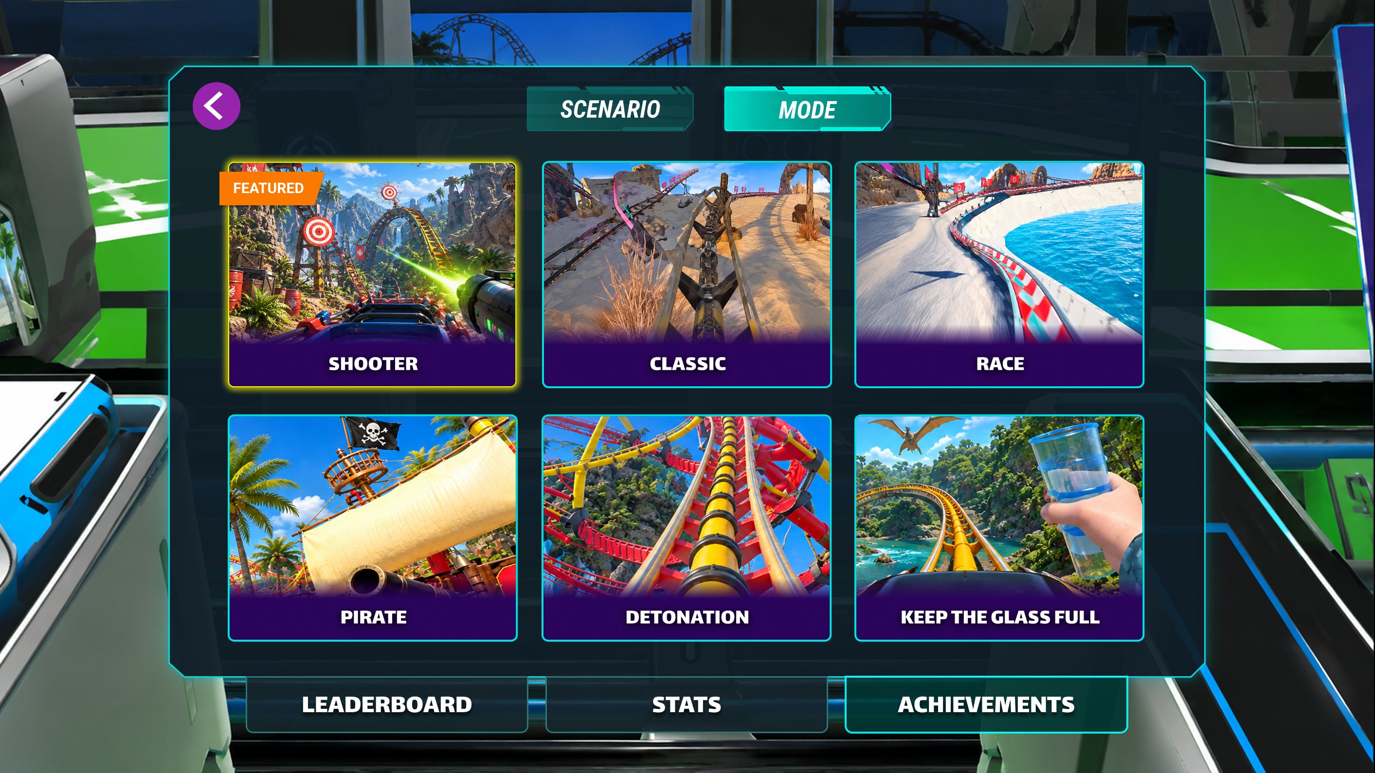
Shooter is featured within the existing mode grid, not given a separate entry point. 2 · Event Discovery
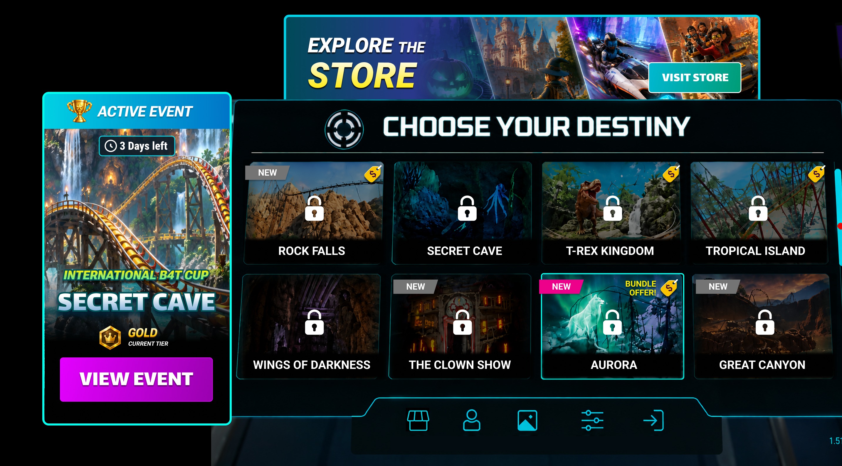
A persistent event entry in the lobby shows the event, time left and current tier before the player enters. 3 · Event Screen
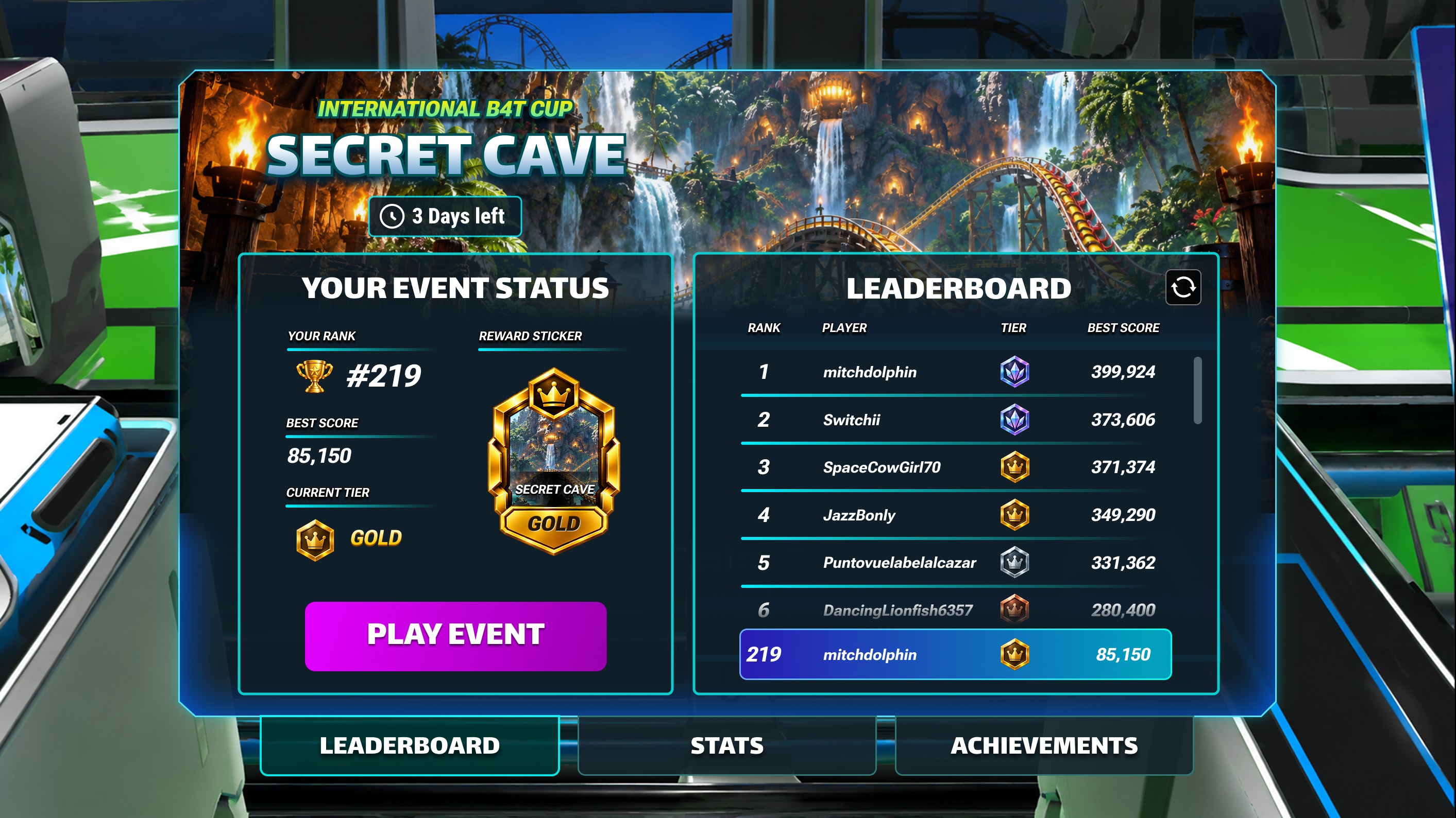
Status, reward and leaderboard position sit together, giving a clear reason to play and improve. 4 · Standard Game Over
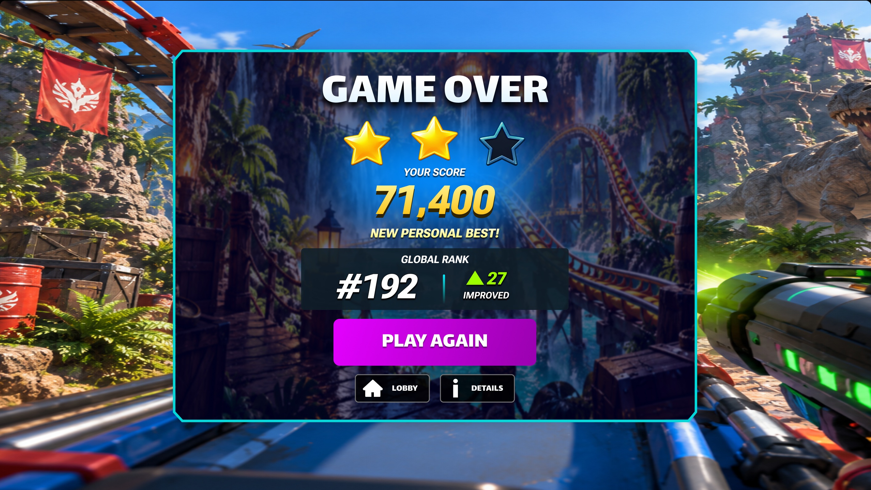
The existing Game Over stays intact — event progression is shown separately after the run. 5.1 · Event Update
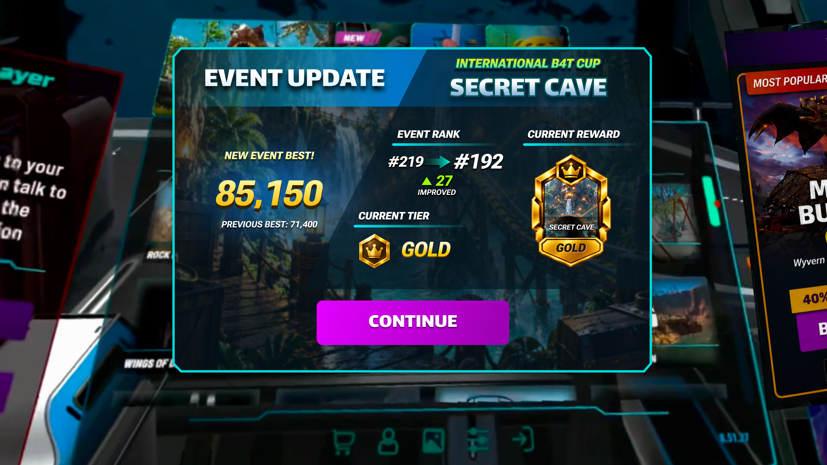
Back in the lobby, the latest score, rank change and current reward are surfaced when they matter most. 5.2 · Tier Up
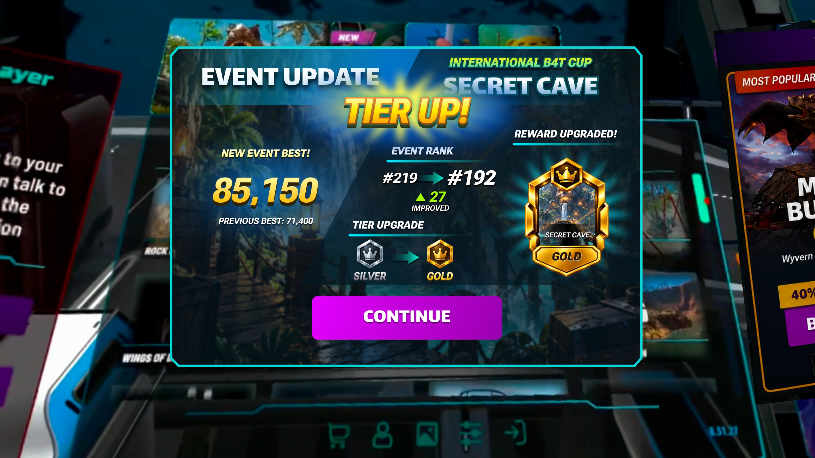
Reaching a new tier turns the same moment into a more prominent tier-up state, without a separate flow. 6 · Event Completion
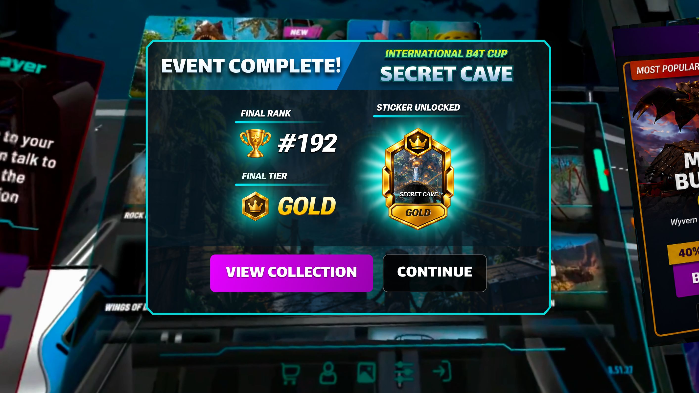
When the event ends, players see their final placement and the sticker they earned. 7 · Sticker Collection
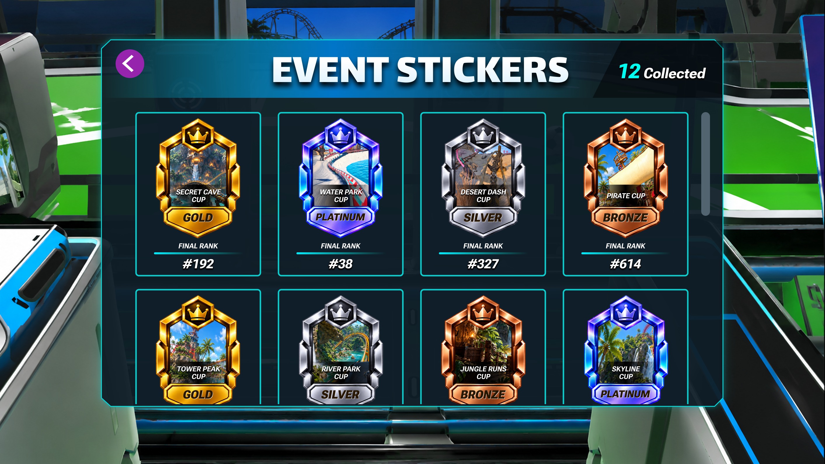
Completed events become permanent collectibles, recording the event, tier and final rank.
09 · Design Rationale
Why This Flow
The goal was to add a meaningful event progression loop without rebuilding the existing Shooter experience. By preserving the established gameplay and Game Over flow, the event system could layer discovery, progression, and rewards around the core experience with less disruption.
Over time, event rewards also contribute to the Sticker Collection, giving repeated participation a persistent sense of progress.
- Preserve the core
- Keep the existing Shooter gameplay and Game Over experience rather than creating an event-specific gameplay flow.
- Discover from the lobby
- Surface the event in the lobby so players can find it before entering gameplay.
- Progress after play
- Show progression immediately after a run, when the result is most relevant.
- Earned emphasis
- Use the stronger Tier Up state only when the player reaches a meaningful reward milestone.
- Value beyond one event
- Turn completed event rewards into persistent collectibles so the system keeps its value after each event ends.
Discover Event → Enter → Play → See Result → Track Progress → Earn Reward → Return
10 · Outcome
A Clearer, More Direct Commerce Experience
The redesign turned a multi-step purchase detour into a more direct, in-context experience: ride ownership and purchase options are easier to understand, bundle relationships are visible during the decision, and players keep their connection to the ride the whole way through.
It also left a clearer, more scalable structure for presenting purchasable content — one card pattern and one detail layout that new offers drop into. I used AI tools to explore concepts and iterate on visuals faster; the UX decisions, flows and final UI came out of my design work and the team conversations with PM, engineering and art.
Note: concept and design proposal. No conversion, revenue or engagement metrics are claimed here; measured results will be shared when available.
- Stronger Discovery
- Relevant bundles and purchase opportunities are surfaced more prominently.
- Clearer Value
- Pricing, savings, ownership, and bundle contents are presented together so players can evaluate their options in one context.
- Context Preserved
- Checkout and recovery paths are designed to return players to the same purchase context instead of forcing them to restart the journey.
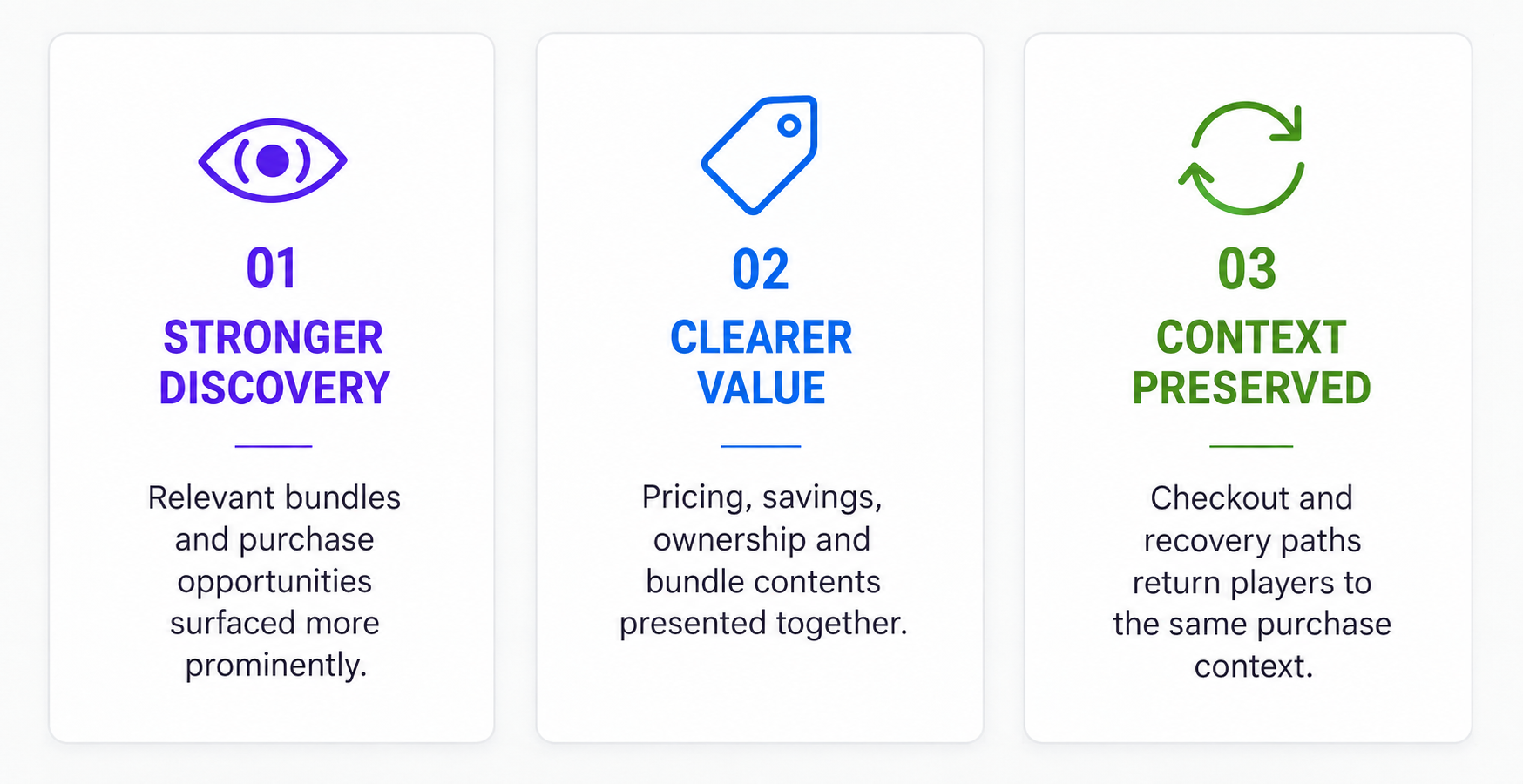
Three design outcomes the redesign was aiming at.
11 · Reflection
What I Learned
In VR commerce, reducing steps is only part of simplifying the experience. Preserving context matters just as much. Keeping the selected content, price, bundle value, and return path connected helped turn a fragmented purchase journey into one continuous decision.