RitzDeli Games · Client Project for Meta — Paintball Playground
VR growth and engagement design for a live game
- Client
- Meta · client work delivered through RitzDeli Games
- My role
- Lead UI/UX Design · VR UX · Monetization UX · Engagement Systems
- Collaboration
- PM · Engineering · Art · Production
- My focus
- UX Flows · Interaction Design · UI Systems · Visual Design · Prototyping
- Discipline
- VR UX · Monetization UX · Engagement Systems · Game Economy
Client project for Meta through RitzDeli Games. The engagement and monetization goals came from PM briefs and product requirements, which I translated into UX flows, interaction models, prototypes, and production UI with the product, engineering, and art teams.
The challenge
Paintball Playground needed stronger monetization and repeat-engagement systems without rebuilding the live VR experience. Purchase opportunities were difficult to discover, while the lobby offered limited guidance around what players could work toward next.
- Product goal
- Grow engagement and monetization in a live VR game without a full rebuild.
- My design goal
- Make purchasing easier to discover and give players clearer short- and recurring goals within the existing VR environment.
What I did
- I redesigned the PPCoin purchase experience around four clearly differentiated packs, making the step from entry-level to higher-value options easier to compare.
- I redesigned the in-world ATM to keep balances small and give the packs most of the space, letting Best Value and Most Popular labels do the comparing.
- We defined four bundle types together — Starter, Rescue, Hero, Premium — and I designed each one so price, contents, and timing read clearly for the player it was aimed at.
- I pulled featured bundles out of menus and into the room as big character displays with the discount, countdown, and contents readable from a distance.
- I designed Daily Tasks that pull from different parts of the game, so objectives spread players across Practice, multiplayer, and modes instead of repeating one thing.
- I built Weekly Events around three activity types that reuse gameplay we already had, which gave the week a rhythm without engineering new systems.
How the work moved
- PM requirements
- My UX exploration
- PM & producer feedback
- Design iteration
- Final direction & handoff
01 · The Core Loop
Four Features, One Product Problem
The brief included multiple monetization and engagement features, but designing each independently would have created four disconnected experiences. I mapped them as one loop so each system could give the player a clear next step.
Purchasing provides currency, bundles give that currency value, Daily Tasks create short-term goals and rewards, and Weekly Events extend the loop beyond a single session. Each one feeds the next — and mapping it out early gave us one question to check every decision against: does this make the next step clearer?
- 1. PPCoin packs
- simplify the IAP structure with clear value differentiation
- 2. Bundle strategy
- player-targeted bundles for different stages and spending behaviors
- 3. Daily Tasks
- short-term goals that encourage daily engagement
- 4. Weekly Events
- lightweight recurring events built on existing gameplay
Purchase → Spend → Play → Progress → Return · PPCoin → Bundles → Daily Tasks → Weekly Events
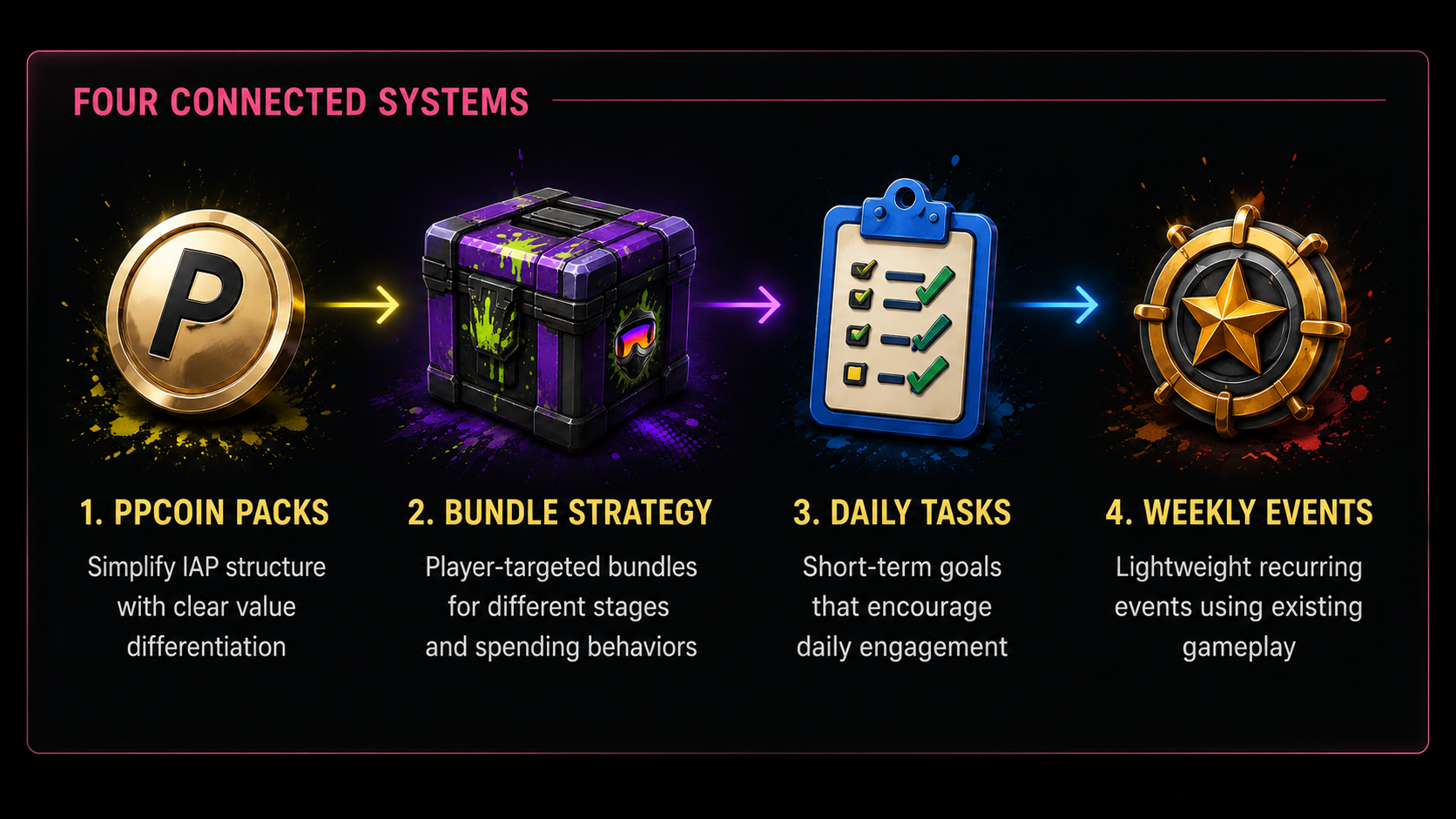
The core loop — four systems designed as one chain rather than four separate features.
02 · Constraints
Designing Inside a Live VR Game
Every decision that followed was shaped by the same reality: this was a shipped VR game with players in it, not a blank canvas. Writing the constraints down early is what kept four systems consistent as scope grew from one ATM screen to the whole lobby and store.
- Existing environment
- work within the current lobby, store, and in-world UI rather than redesigning the entire experience
- VR readability
- important information must be understandable quickly from a comfortable VR viewing distance
- Implementation scope
- reuse existing gameplay, environments, and systems where possible
- Information density
- introduce monetization and engagement features without turning the lobby into a wall of UI
- Live-product consistency
- new systems need to coexist with the game's existing interaction and visual patterns
03 · PPCoin Purchase Experience
Simplifying the Purchase Decision
Buying PPCoins was harder to figure out than it needed to be. I proposed four packs with clearly separated prices — 2,000 at $2.99, 10,000 at $9.99, 60,000 at $29.99, and 180,000 at $59.99 — so the step up from one to the next is obvious.
Then I redesigned the in-world ATM to put the packs front and center. Balances sit in one compact row at the top, the packs take the rest, and the amounts and prices are sized to read from a comfortable distance instead of making you lean in.
The labels do the comparing. Best Value and Most Popular sit right on the packs they describe, and each tier has its own coin render, so you can tell the sizes apart before reading any numbers.
- Compact balances
- three currencies in one row instead of a competing panel
- Pack-first layout
- coin packs take the majority of the screen area
- Merchandising labels
- Best Value and Most Popular reduce comparison to a glance
- Tiered coin renders
- pack size is legible before the number is read
Enter lobby → Approach ATM → Compare packs → Purchase
Design decision
Prioritize comparison over account information.
Instead of giving balances and purchase options equal visual weight, I compressed the balances and gave the coin packs most of the available space. Pack size, price, and merchandising labels became the primary hierarchy so players could compare offers quickly at VR viewing distance.
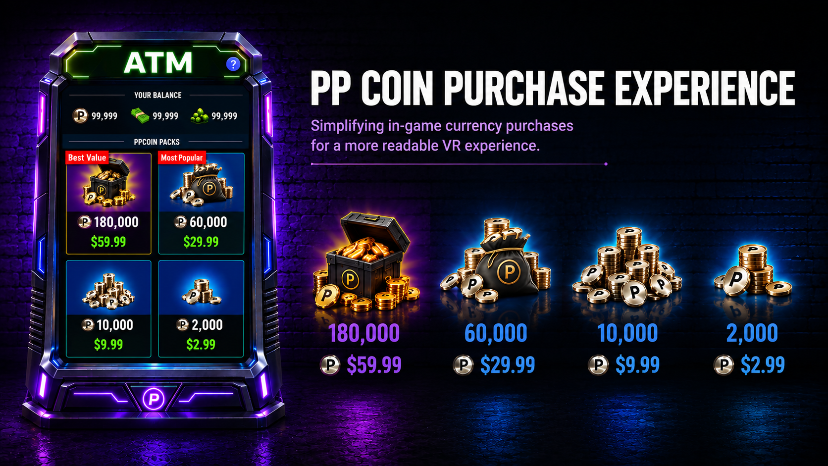
The ATM and its four coin tiers — pack size reads as a silhouette before the number is parsed.
04 · Bundle Strategy
Turning Cosmetics into Targeted Offers
Instead of one generic promotion, we defined four bundle types with different price points, contents, and levels of value. Starter gives new players a full loadout. Rescue is a lower-cost entry offer designed for more price-sensitive players. Hero rotates around one standout cosmetic. Premium is a larger collection at a higher value tier.
Each type has its own price, contents, duration, and audience — so one set of UI can handle very different offers without building a new screen for each.
It also had to work spatially. Rather than leaving bundles in menus, I explored putting them in the room: a life-size character wearing the loadout on a lit podium, with a panel next to it carrying the discount flag, the crossed-out price, the buy button, a countdown, and a grid of what's included.
Each bundle owns a color that runs through the character, the podium light, and the panel trim, so you can tell Shadow Strike, Blue Impact, and Crimson Storm apart from across the lobby. Seeing the outfit at full scale answers what a thumbnail grid never could: what you'll actually look like.
- Starter
- a complete introductory loadout for new players
- Rescue
- a lower-cost entry offer designed for more price-sensitive players
- Hero
- rotating offers built around one standout cosmetic item
- Premium
- a larger collection at a higher value tier
Design decision
Show the value spatially, not only as a thumbnail.
In VR, a life-size character could communicate the value of a cosmetic bundle more clearly than another menu grid. The player could see the complete look while price, discount, countdown, and contents remained visible beside it.
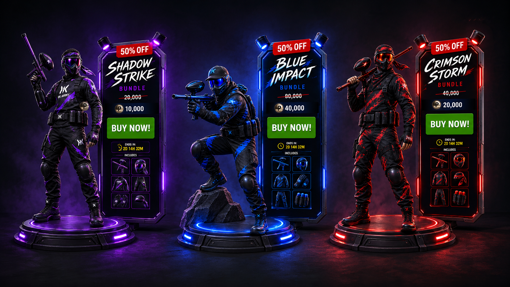
Bundles as environment objects — character, discount, price, countdown, and contents in one readable unit.
05 · Engagement System · Daily Tasks
Designing for Today
Monetization on its own wasn't going to fix engagement. Players also needed a reason to come back and something clear to do once they were in. I designed two engagement cadences: Daily Tasks for immediate direction and Weekly Events for recurring goals.
Daily Tasks give players immediate objectives and visible progress within a session. Tasks pull from different parts of the game — Playground and Practice, core multiplayer, and modes and variety — so objectives spread players across the game instead of repeating one action. In VR the hard part is density, not content: tasks sit up front in the lobby with simple progress states, a visible reward on each row, and locked states for what isn't open yet.
- Playground / Practice
- encourages exploration and skill development
- Core multiplayer
- directs players toward the primary multiplayer experience
- Modes / variety
- encourages players to explore more of the game
What should I do? → How far am I? → What do I earn?
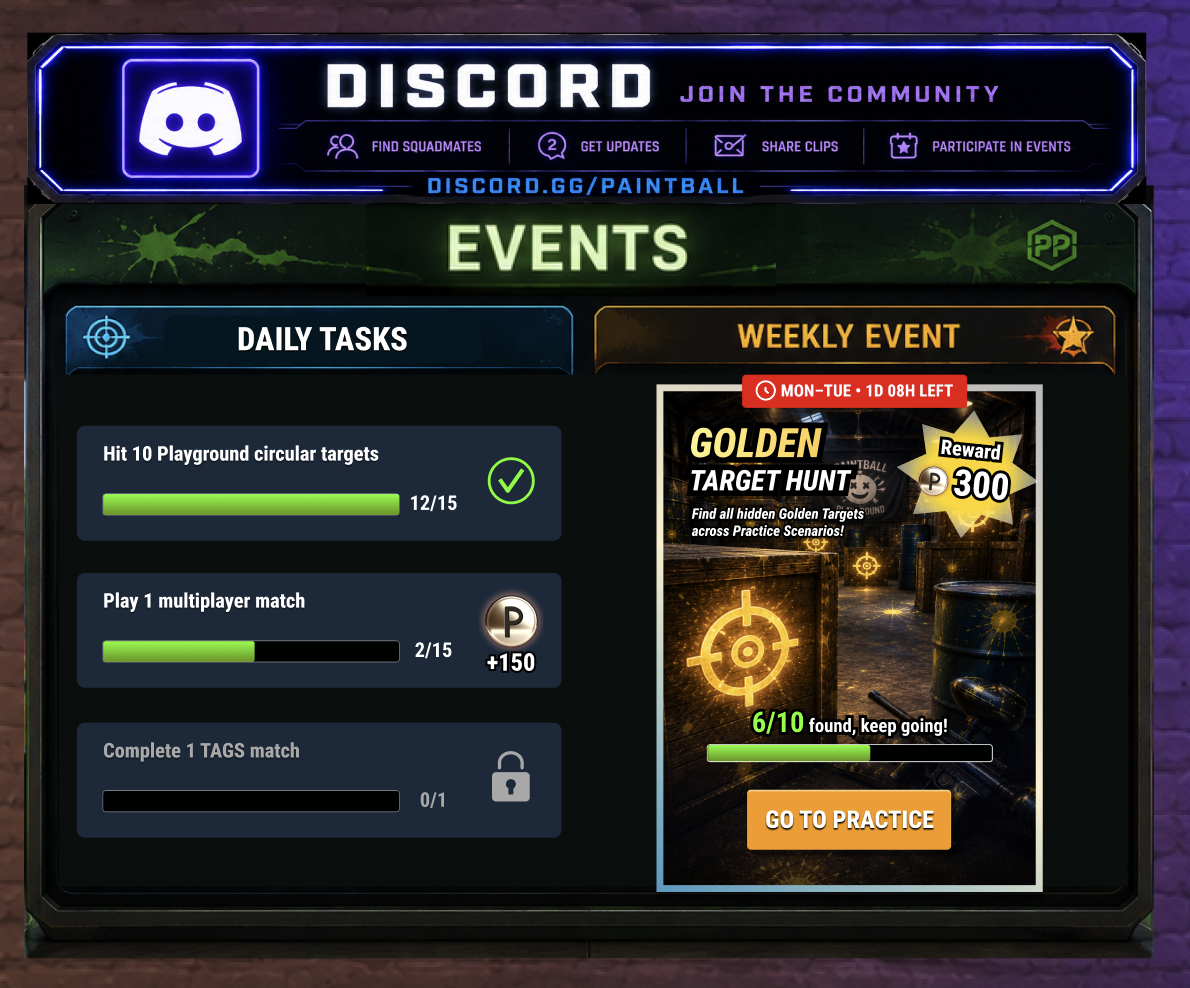
The lobby events board — Daily Tasks and the active Weekly Event side by side, with Discord above.
06 · Engagement System · Weekly Events
Designing for the Week
Weekly Events create a longer recurring cadence using the game's existing mechanics and environments. The week splits into three activity types — solo exploration, skill practice, and multiplayer competition — that reuse gameplay we already had.
Golden Target Hunt, Quickshot Rush, and Knockout Clash all share one card structure: day range and countdown, event name, a one-line rule, PPCoin reward, progress state, and a destination-based action. A new event changes the content without asking players to learn a new layout.
- Golden Target Hunt · Mon–Tue
- find and shoot all hidden golden targets in Practice — 6/10 found
- Quickshot Rush · Wed–Thu
- hit the correct targets as fast as you can — best score against the clock
- Knockout Clash · Fri–Sun
- one elimination equals one event point — 18/30 points
Explore → Practice → Compete → Return
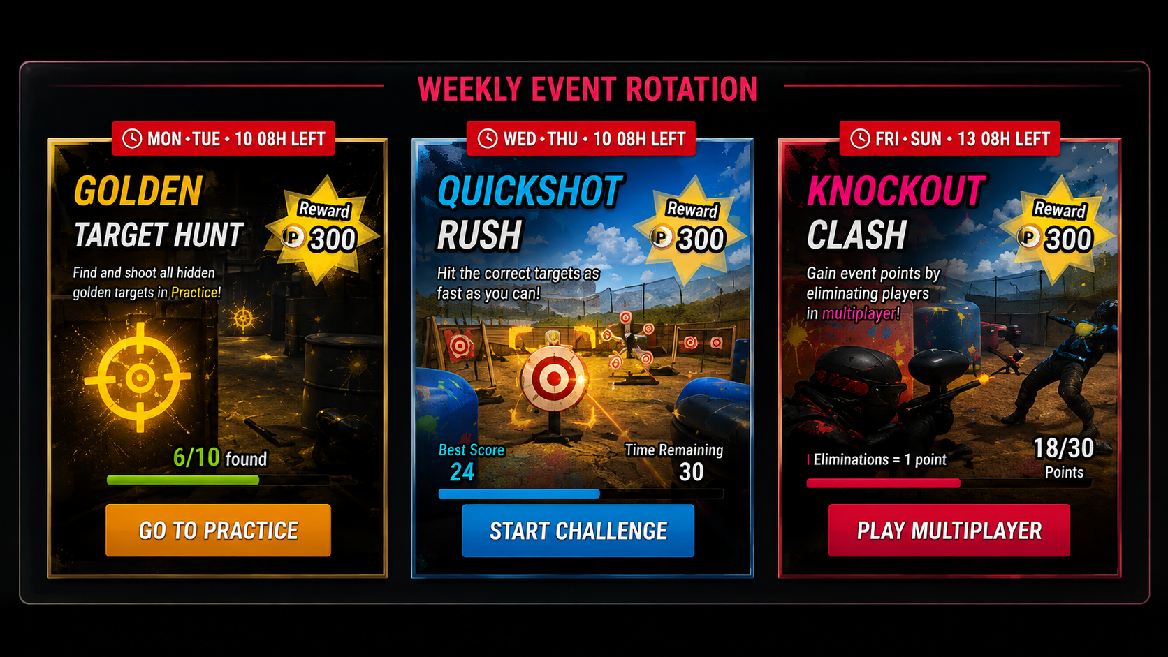
The weekly rotation — one card structure, three activity types, and a button that names the destination.
07 · Environment Integration
Bringing the Systems Together
The final direction puts monetization and engagement in the same room. Walk into the lobby and you can see Daily Tasks, the current Weekly Event, a featured bundle, and the ATM — all out in the open instead of buried in menus.
The lobby wall reads left to right. Leaderboard and stats tell you where you stand, the events board puts today's tasks and this week's event in one panel, and the featured bundle and ATM close the wall where interest is highest.
The store does the same thing with color-coded zones for Outfit, Mask, Bundles, Accessories, and Marker, so you browse by walking and looking instead of tabbing. Bundles hold the center wall, and the ATM sits by the entrance.
The scope decision was deliberate. I improved existing in-world UI where it already worked, introduced new UI only for the systems that needed it, and left the main menu and blackboard intact rather than redesigning the whole interface — not every system had to live on the main board.
The point wasn't to add more UI. It was to make the room we already had do more work.
Discover → Play → Progress → Earn → Purchase → Return
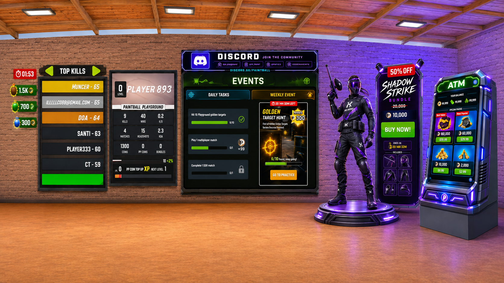
Lobby — leaderboard, stats, tasks and events, featured bundle, and ATM in one sightline. 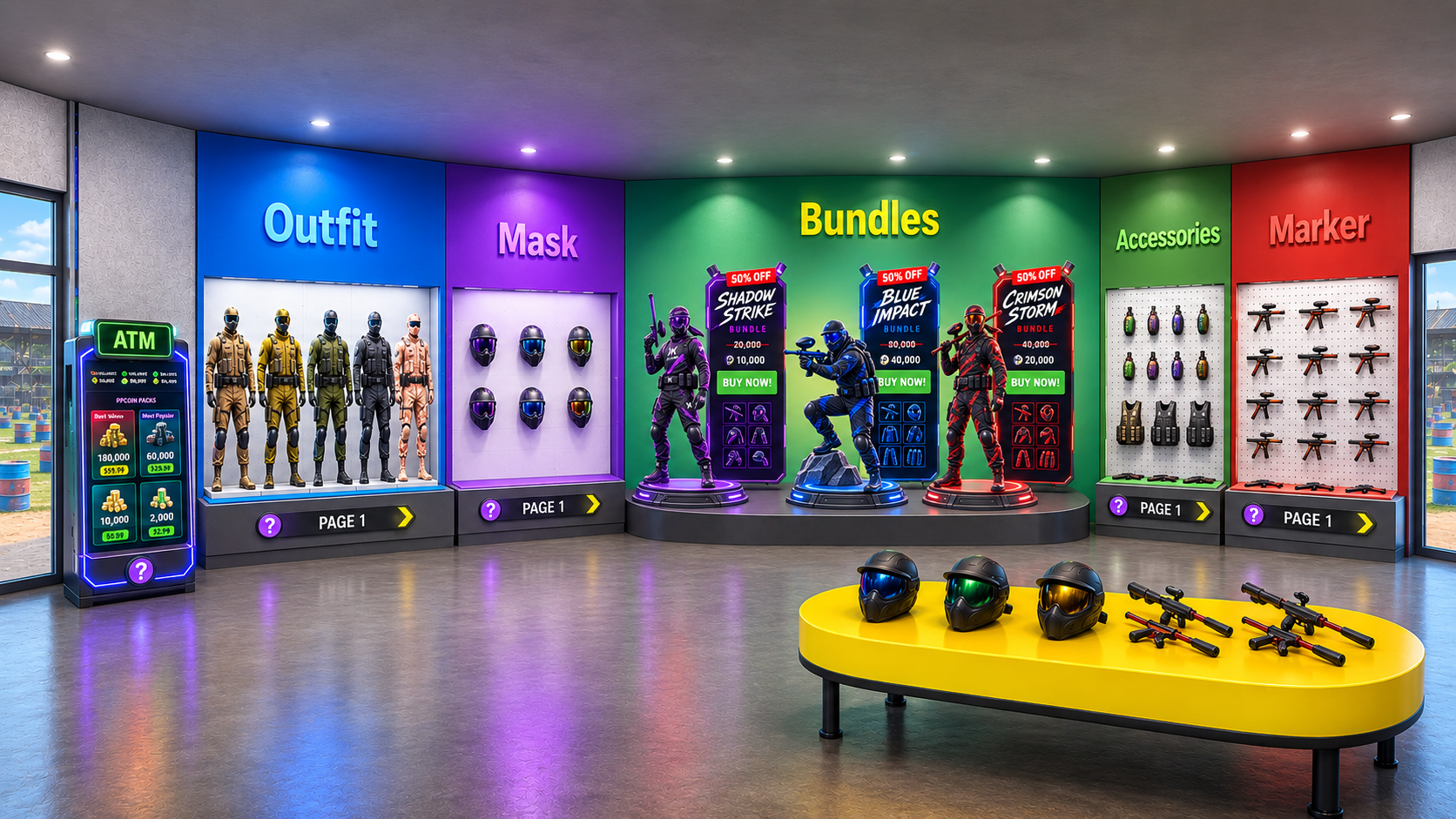
Store — color-coded zones make category navigation spatial rather than menu-driven.
08 · Collaboration & Tradeoffs
What the Team and the Constraints Decided
None of this landed on the first pass. I'd take an exploration into review with the PM and producer, and the notes that came back usually had less to do with how it looked than with what product needed, what it would cost to build, or how it held up in a headset. Much of the final design reflects those tradeoffs rather than a single original vision.
These are the decisions I can point to a specific conversation or constraint for.
- Product requirements
- the PM brief defined which monetization and engagement systems were needed; my role was to connect them into one legible loop rather than four screens
- Producer feedback
- my first Weekly Events concept needed new gameplay, so I rebuilt it around three activity types that reuse modes we already shipped
- Reusing existing systems
- rather than building a new purchase screen, I kept the ATM as an in-world object and moved comparison into pack sizing and merchandising labels
- VR viewing distance
- early bundle cards looked readable on a monitor but became too dense when reviewed at VR viewing distance, so I enlarged the contents and discounts and reduced the visual weight of secondary information
- Scope over rebuild
- we kept the existing main menu and blackboard, improved in-world UI where it already worked, and added new UI only for systems that required it — balancing feature visibility against environmental clutter
09 · Outcome
One Framework Instead of Four Features
The final design direction connects PPCoin purchasing, bundles, Daily Tasks, and Weekly Events as one framework rather than four isolated features. Each system supports a different point in the loop — purchasing, spending, playing, progressing, and returning.
- Purchase clarity
- PPCoin packs are structured for faster comparison at VR viewing distance.
- Offer discoverability
- Featured bundles become visible parts of the environment rather than menu-only promotions.
- Session direction
- Daily Tasks give players clear short-term objectives and visible progress.
- Recurring structure
- Weekly Events create a repeatable engagement cadence using existing gameplay.
- Environmental integration
- The lobby and surrounding in-world UI become connecting surfaces across monetization and engagement systems.
Note
Concept and design proposal. Final implementation and performance outcomes will be shared when available. I used AI tools to explore concepts and iterate on visuals faster; the UX decisions, interaction design, flows, and final UI came out of my design work and team conversations with PM, engineering, and art.
10 · Reflection
What I Learned
Live-product design isn't always about rebuilding the experience. The harder problem is deciding what to change, what to preserve, and how new systems can work together inside constraints that already exist. Paintball Playground reinforced the value of treating monetization and engagement as one connected system while keeping changes focused on the parts of the product that needed them most.