RitzDeli Games · Client Project for Meta — Horizon Worlds — Mobile
New User Experience for Horizon Worlds
- Client
- Meta · client work delivered through RitzDeli Games
- My role
- UI/UX Designer
- Collaboration
- Meta Content Team · PM · Art · Production
- My focus
- UX Flows · Interaction Design · Information Architecture · Visual Design
- Discipline
- Product Design · New User Experience · Onboarding · Mobile UX
Client project for Meta through RitzDeli Games. Meta's content team supplied the NUX guidelines and editorial goals; I translated them into UX flows, gameplay-based examples, and finished mobile UI for publication.

The challenge
Meta was writing guidance to help Horizon Worlds creators build better first-time experiences for mobile players. The same mistakes kept showing up: no clear next step, too much at once, controls explained with no gameplay around them, rewards arriving too late, and walls of text interrupting play.
- Product goal
- Turn Meta's written NUX guidelines into material creators would actually use.
- My design goal
- Show each principle as something a player does in a real mobile experience, rather than a rule they read.
What I did
- I turned the written NUX guidelines into visual, gameplay-based examples so creators could see each principle working inside a real mobile experience.
- Instead of illustrating the guidelines line by line, I looked at how onboarding, controls, progression, rewards, goals, and the economy could all be introduced through play.
- I built two concepts to teach with — a new user flow and Castle Quest, a fantasy castle-building loop — so creators could see the same ideas at two different scales.
- I sequenced each concept as six screens, so every lesson lands as something the player does instead of something they read.
- I kept the teaching inside the moment of play: short prompts, visible controls, and instant feedback rather than text up front.
How the work moved
- Content goals & requirements
- UX analysis
- User flows
- Design exploration
- UI system & visual design
- Publication handoff
Concept 01
New User Experience
A first-time experience built around clear onboarding, controls that make sense the moment you use them, and something social to find.
- Focus
- Onboarding · Exploration · Social Interaction · User Engagement
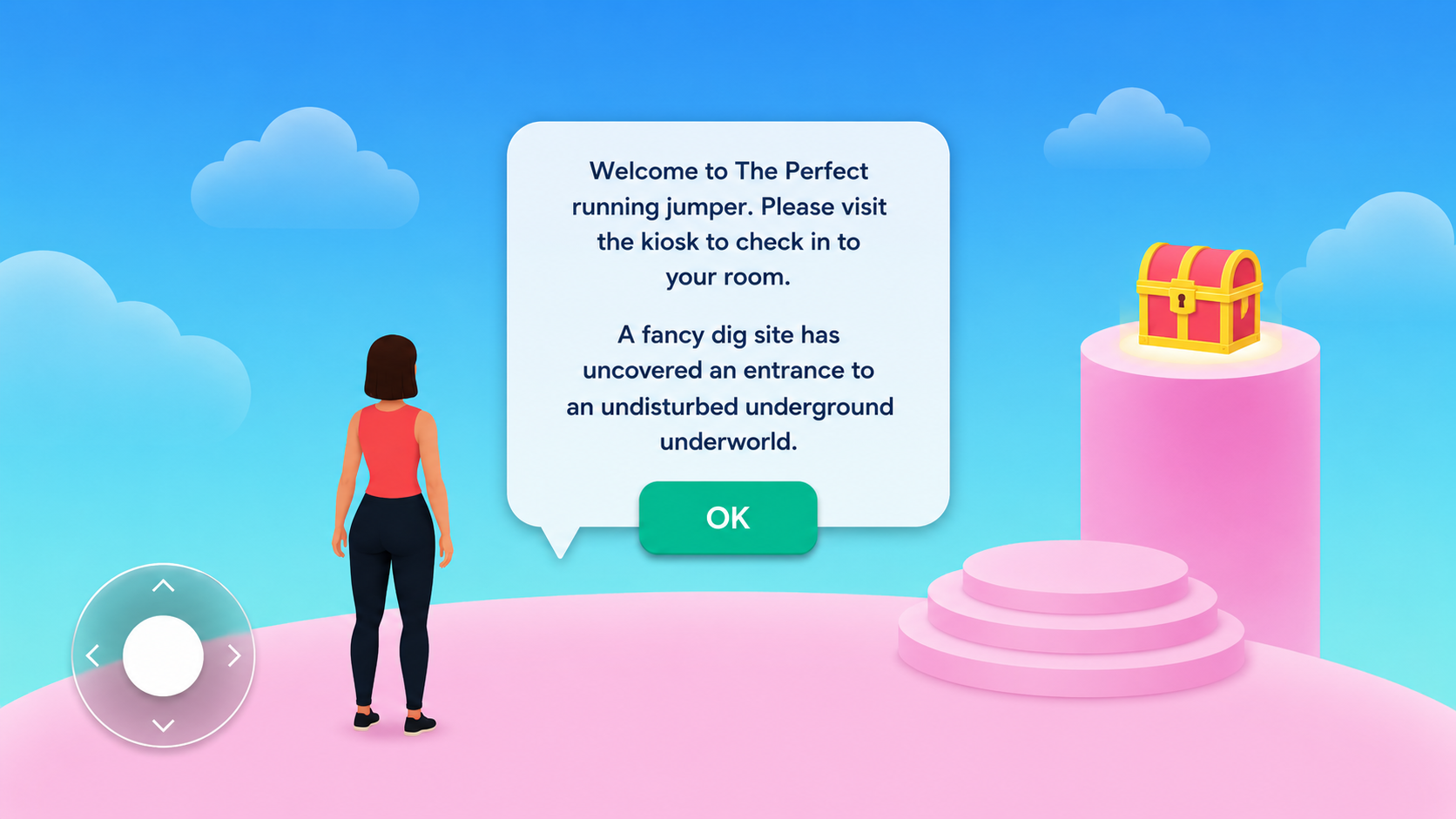
01Welcome & Story
A short speech bubble sets the premise and points the player at their first destination, with the movement pad already on screen.
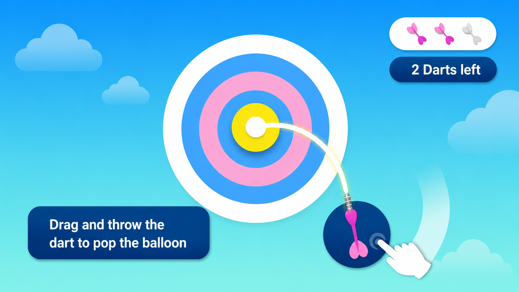
02Learn Controls
The first control is taught through a real action: drag and throw, with remaining darts shown as the only status the player needs.
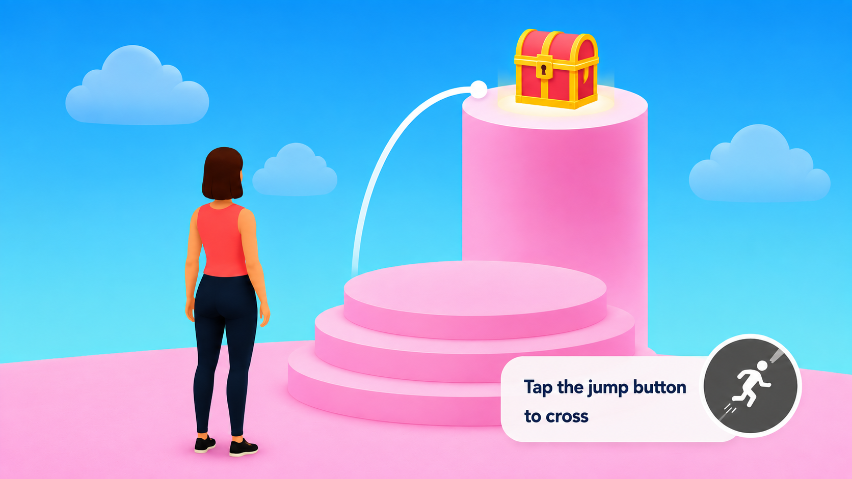
03Navigate & Explore
A visible reward on a higher platform gives the jump control a reason to exist before the prompt appears.
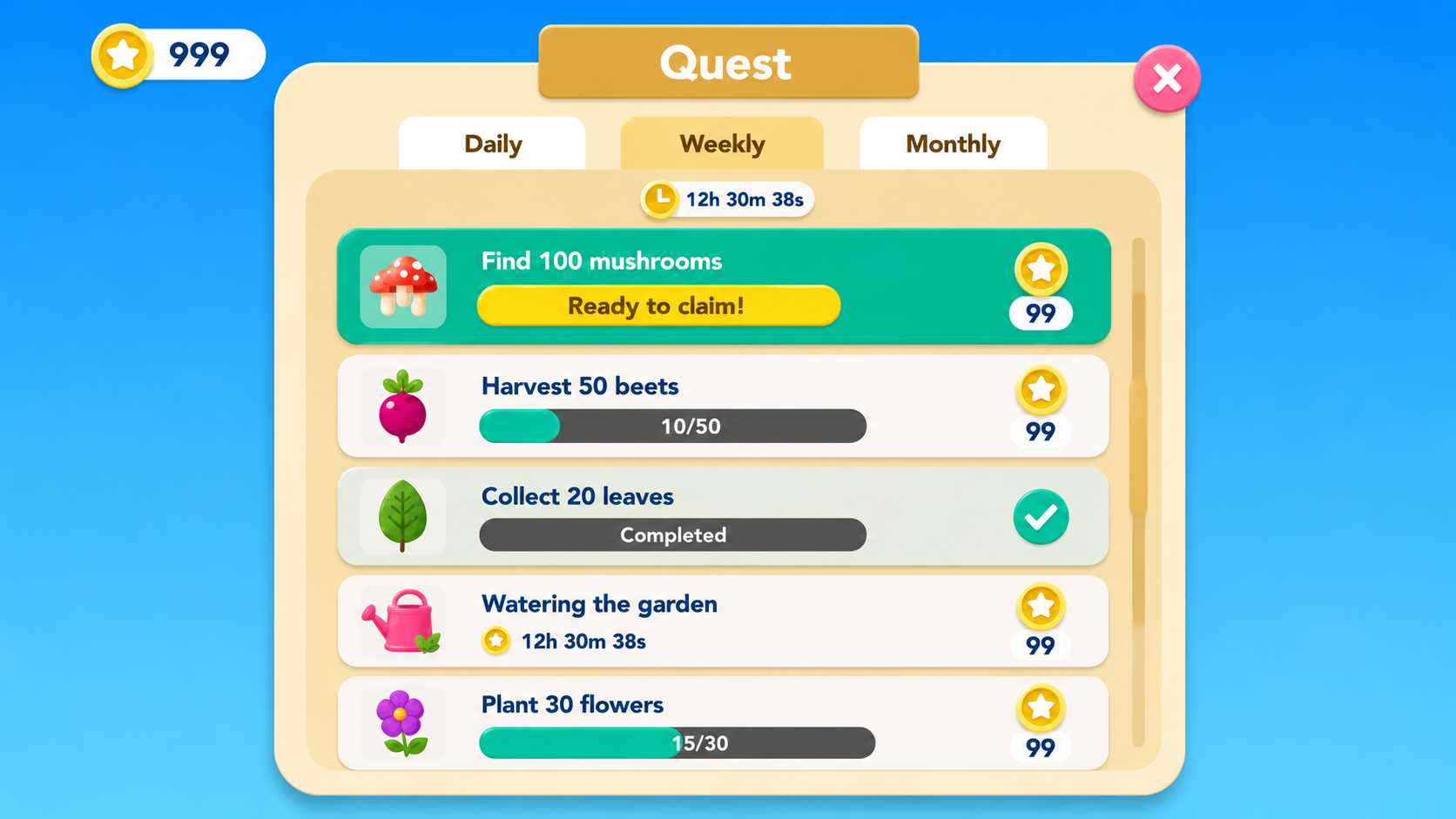
04Learn Core Loop
Daily, weekly and monthly quests give the loop a shape, with every task readable at a glance as claimable, in progress or done.
05Rewards & Progress
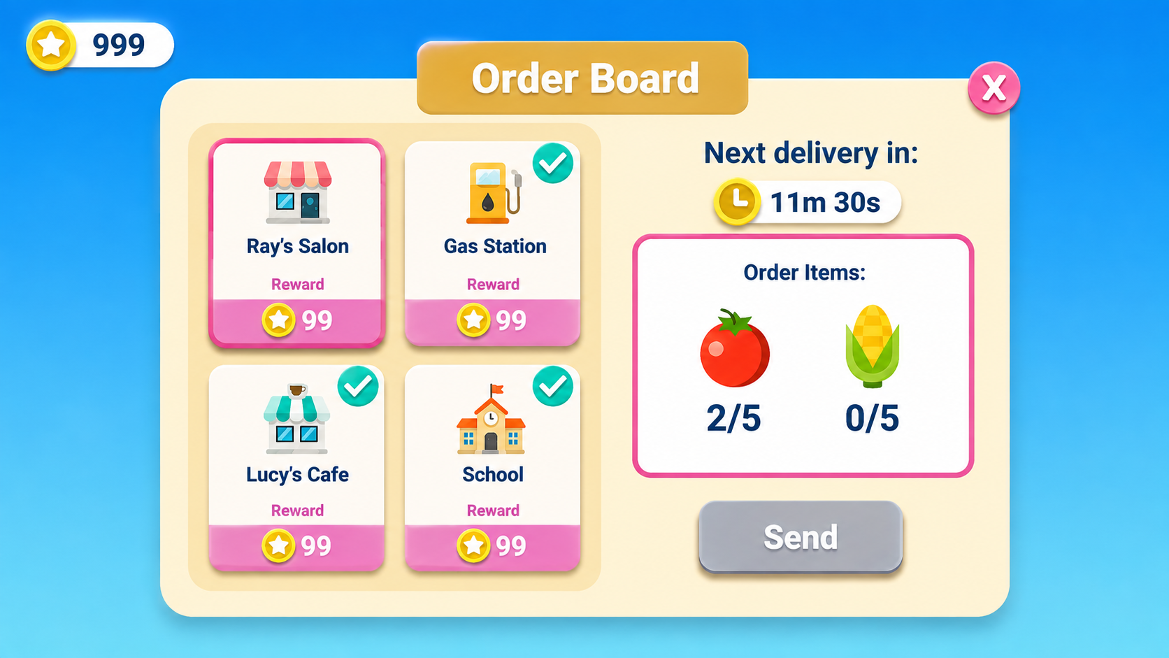
An order board turns collected items into a clear payout: what each location wants, what it pays, and when the next delivery lands.
06Show Growth
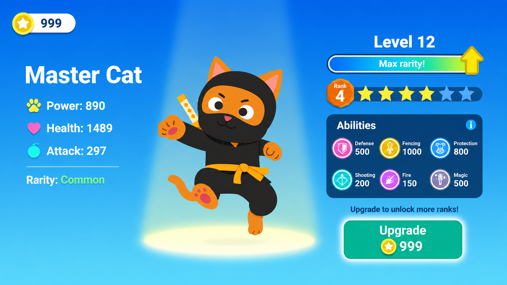
A character sheet makes long-term investment legible — stats, ranks, abilities, and the coin cost of the next upgrade.
Concept 02
Castle Quest
A fantasy castle-building world where you gather resources, build and upgrade, run quests, customize, and play with others — I used it to show how progression, economy, and live content can all be taught through play.
- Core loop
- Gather → Build & Craft → Quest → Earn → Upgrade & Customize
- Key features
- Castle Progression · Customization · Social Play · Daily Tasks · Seasonal Content · Game Economy · Shop & Bundles
01World Discovery
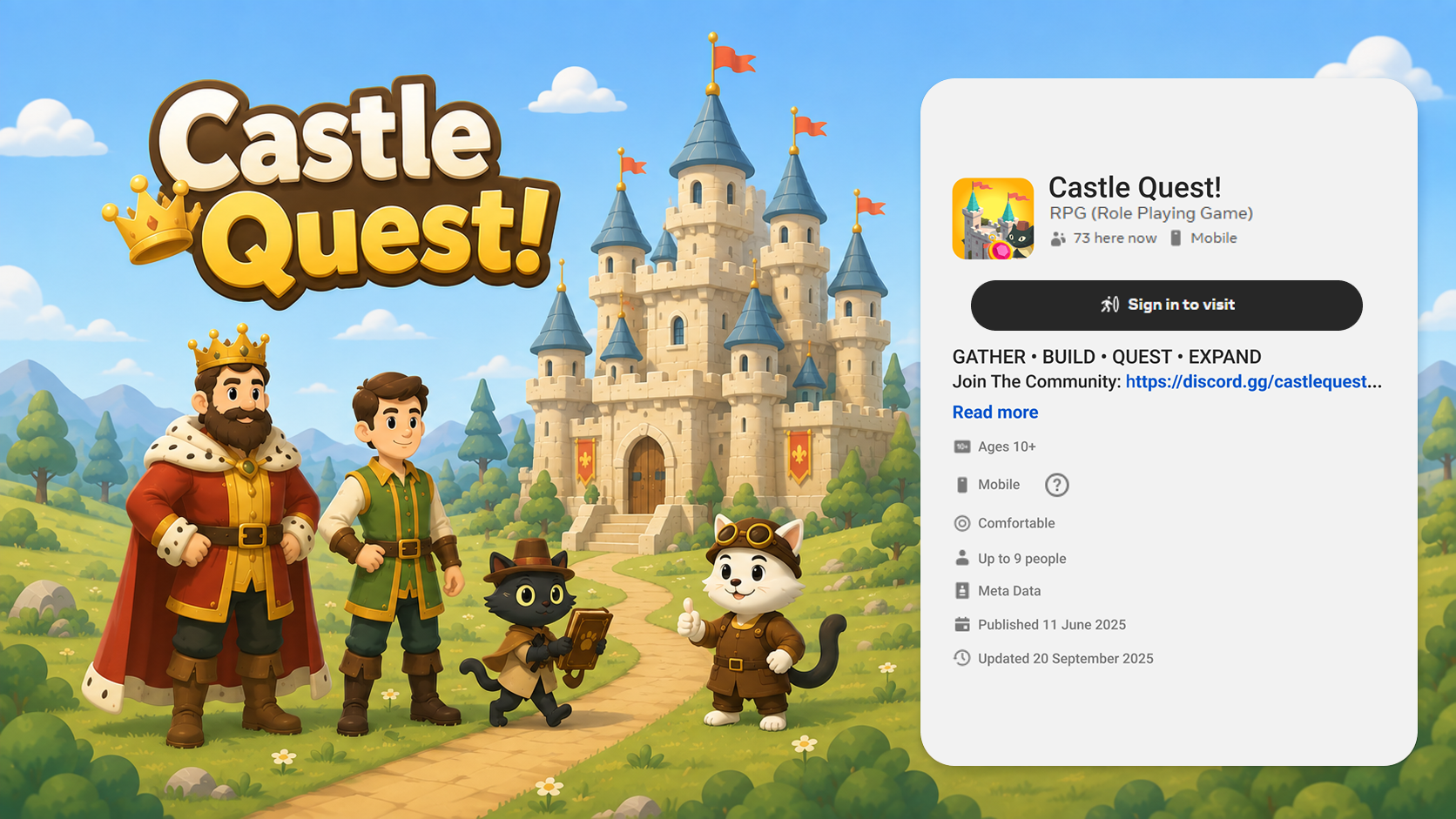
The store listing does the first job of onboarding: the logo, cast and castle say what the world is, while GATHER · BUILD · QUEST · EXPAND states the loop before anyone enters.
02Castle Customization
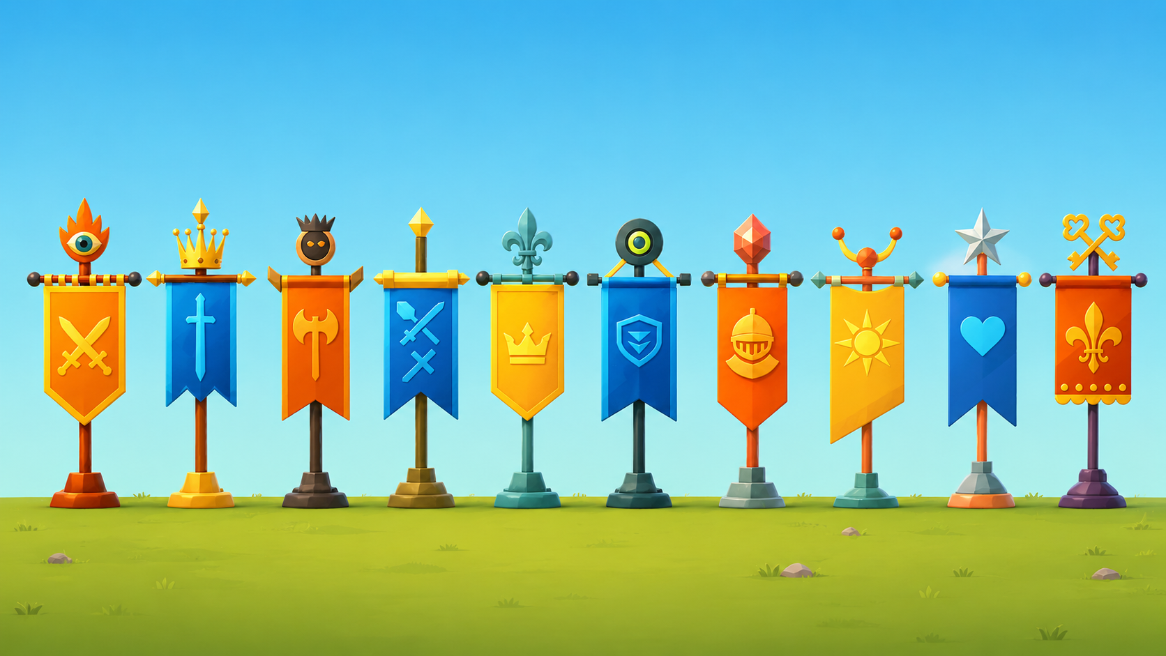
Cosmetics are shown as a collectible set — one banner per silhouette, crest and finial — so players can read rarity and personal style at a glance.
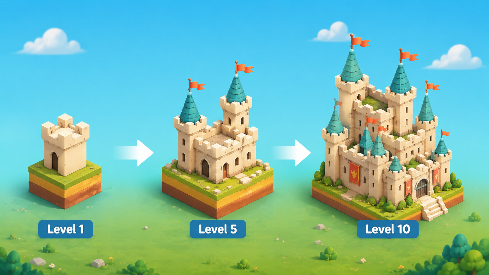
03Build & Expand
Three snapshots of the same plot make long-term progression legible: a single keep at level 1, a walled castle at 5, and a banner-lined fortress at 10.
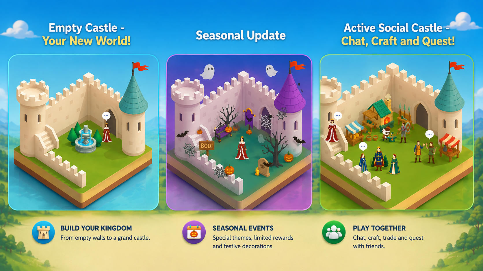
04Social & Seasonal World
The same courtyard, three states — empty, seasonally themed, and full of players — showing how build, live events and social play stack in one space.
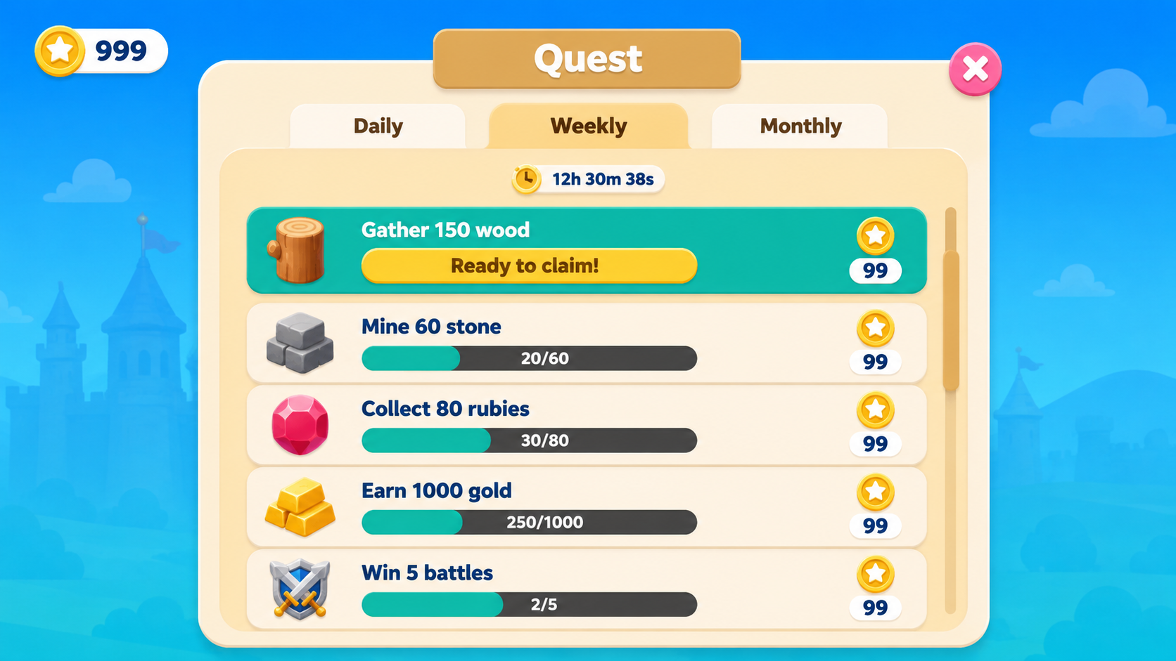
05Tasks & Progression
Daily, weekly and monthly tabs give the loop a rhythm, and every row reads as one of three states — ready to claim, in progress with a bar, or locked behind a timer.
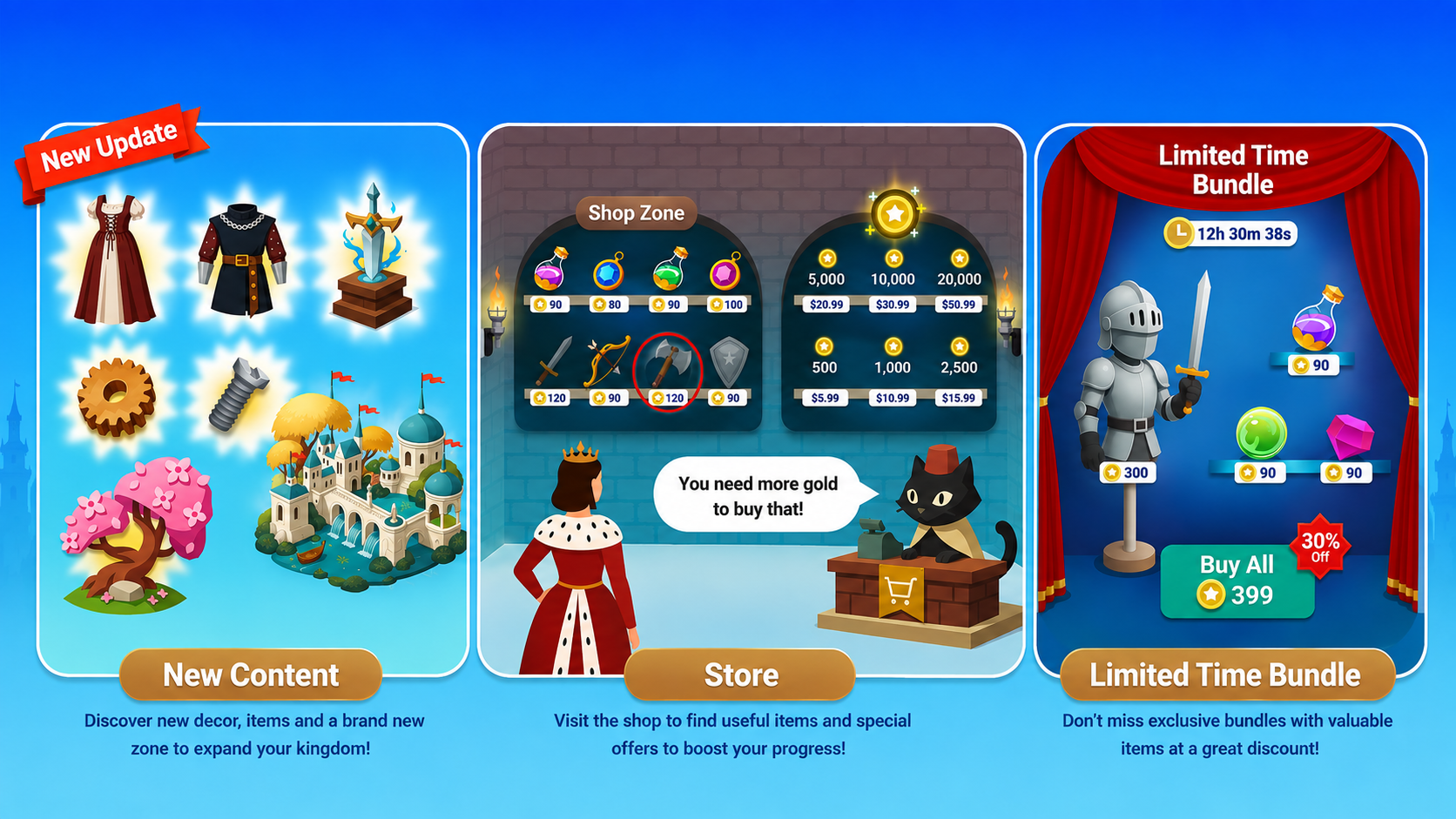
06Shop & Live Content
Live content is split into three clear reasons to return: new decor and a new zone, a browsable store, and a discounted bundle on a countdown.