RitzDeli Games · Client Project for Meta — Newton’s Playground
Building a creator ecosystem in VR
- Client
- Meta · client work delivered through RitzDeli Games
- My role
- UX/UI Design · VR UX · Creator Tools · Systems Design
- Collaboration
- PM · Engineering · Art · Production
- My focus
- UX Flows · Interaction Design · Information Architecture · UI Systems · Prototyping
- Discipline
- VR UX · Creator Tools · Engagement Systems · Systems Design
Client project for Meta through RitzDeli Games. Product goals and requirements for creator tools, progression, and economy came from PM documents and team discussions, which I translated into UX flows, interaction models, prototypes, and production UI.
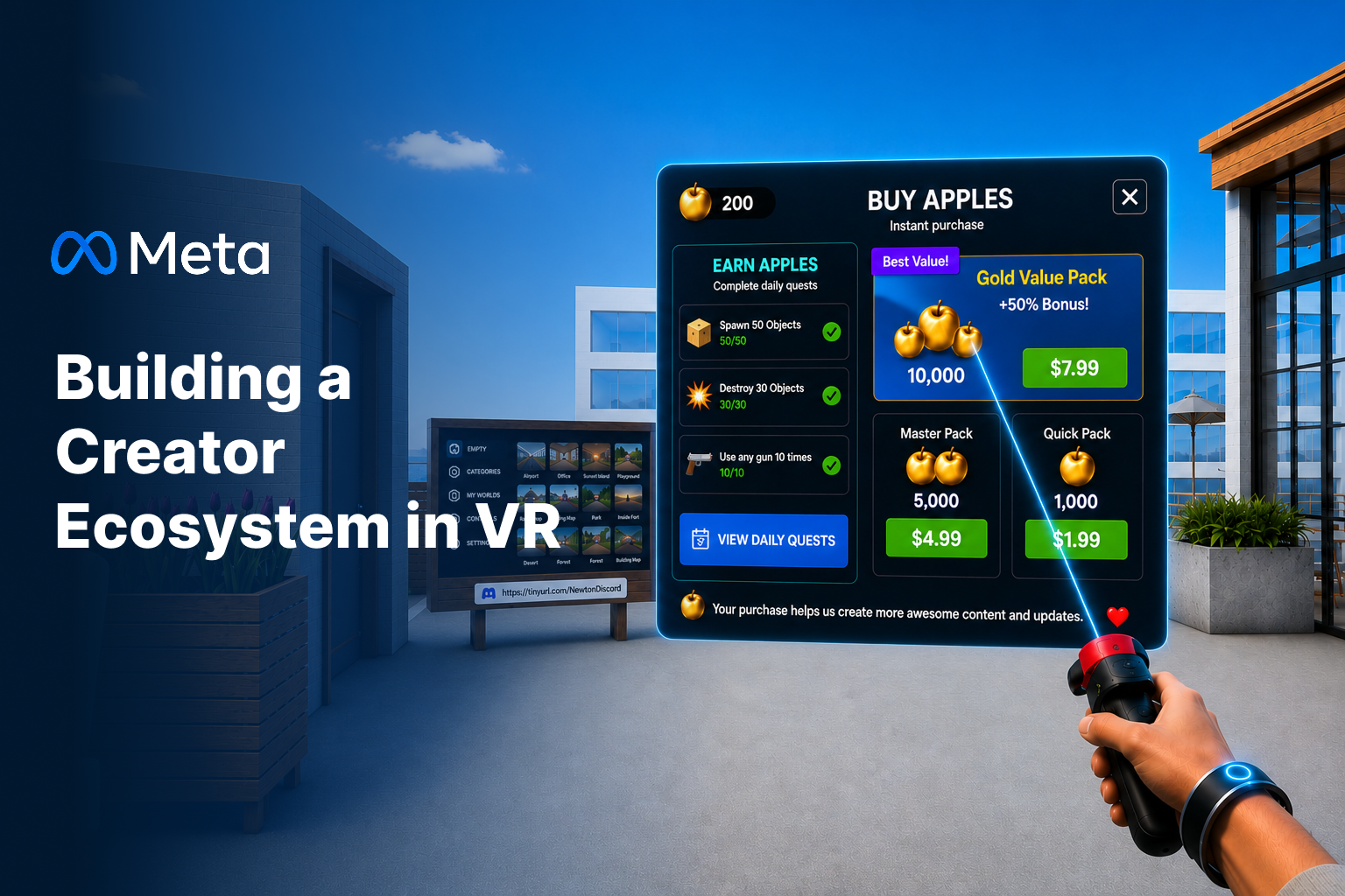
The challenge
Newton's Playground is a physics VR sandbox full of objects, characters, vehicles, and builds other players made. As the sandbox expanded, players had more objects, tools, characters, and community content to navigate, but the experience offered limited structure for deciding what to do next or moving from creation to sharing. The challenge was to introduce clearer direction without taking away the freedom that defines a sandbox.
- Product goal
- Add progression, an economy, and creator publishing to an open-ended sandbox.
- My design goal
- Make those systems point players toward what already makes the sandbox fun, instead of sitting on top of it as separate menus.
What I did
- I put Daily Tasks on the player's wrist, so goals are always there without taking up space in the world or interrupting play.
- I translated progression and economy requirements into a Daily Task experience that made goals, progress, and Golden Apple rewards visible and understandable in VR.
- The economy paid out Golden Apples for tasks; I designed earning and buying into one surface instead of splitting them into a separate store, so the free path stays visible next to the paid one.
- I rebuilt Spawn Gun navigation with persistent category icons, secondary tabs, and one reusable item card that handles owned, locked, new, selected, buyable, and favorite states.
- I designed everything for point-and-select: big targets, room between them, high-contrast selection, and a controller laser that connects your hand to what you're picking.
- I went through the two screens players hit most — the tool wheel and the community build browser — and rebuilt each one to be readable at a distance, obvious about its current state, and able to handle more content later.
How the work moved
- PM goals & requirements
- UX analysis
- User flows
- Design exploration
- UI system & visual design
- Engineering & art handoff
01 · Challenge
Turning an Open Sandbox Into a Repeatable Experience
As the sandbox expanded, players had more objects, tools, characters, and community content to navigate, but the experience offered limited structure for deciding what to do next or moving from creation to sharing.
The challenge was to introduce clearer direction without taking away the freedom that defines a sandbox. My direction was to connect these systems into one loop players could actually follow.
- Goals
- players needed clearer direction without losing sandbox freedom
- Discovery
- large content libraries needed organization and browsable states
- Creation
- building → saving → publishing → sharing had to be one path
- Cohesion
- progression and monetization had to feel connected to gameplay
- VR legibility
- every interface had to stay readable and easy to target
02 · System
Daily Tasks and Golden Apples as One Engagement Loop
Daily Tasks live on the player's wrist, so goals are there when you want them without sitting in the world or interrupting play. They come from a reusable pool — drop the weight, grab the cubes, rotate the gear, break the wall, find a new area — and each one shows its progress and Golden Apple reward right there.
Tasks pay out Golden Apples, which ties playing directly to what you can unlock. Earning and purchasing share one surface so the free progression path stays visible alongside the paid path.
Wrist menu → Task progress → Reward → Daily reset
Design decision
Keep goals available without putting them in the player's way.
I placed Daily Tasks on the player's wrist rather than permanently in the environment. This kept goals accessible on demand while preserving the open-ended sandbox and avoiding another persistent world-space panel.
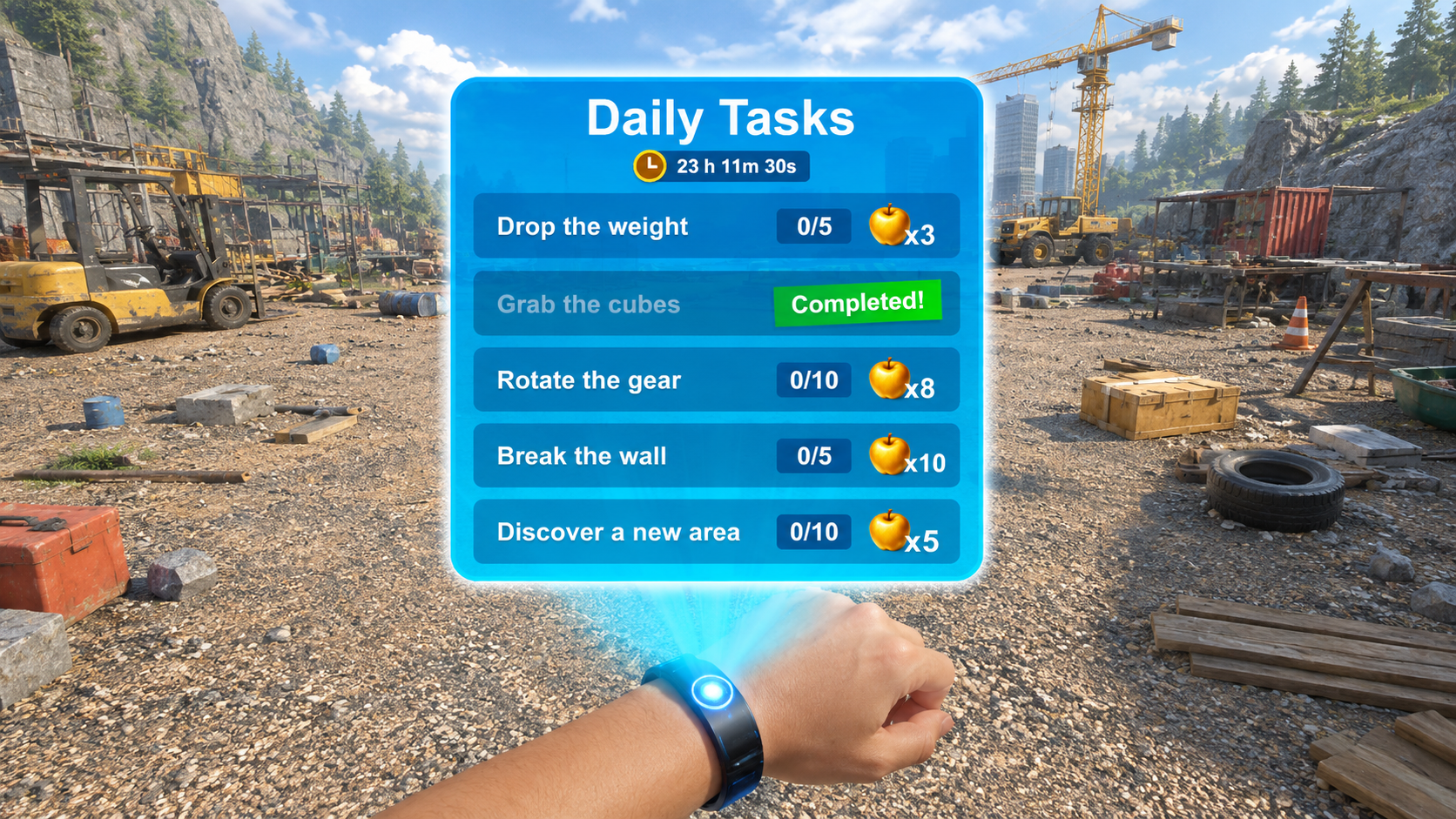
Wrist menu — objectives are summoned by the player instead of pinned to the world. 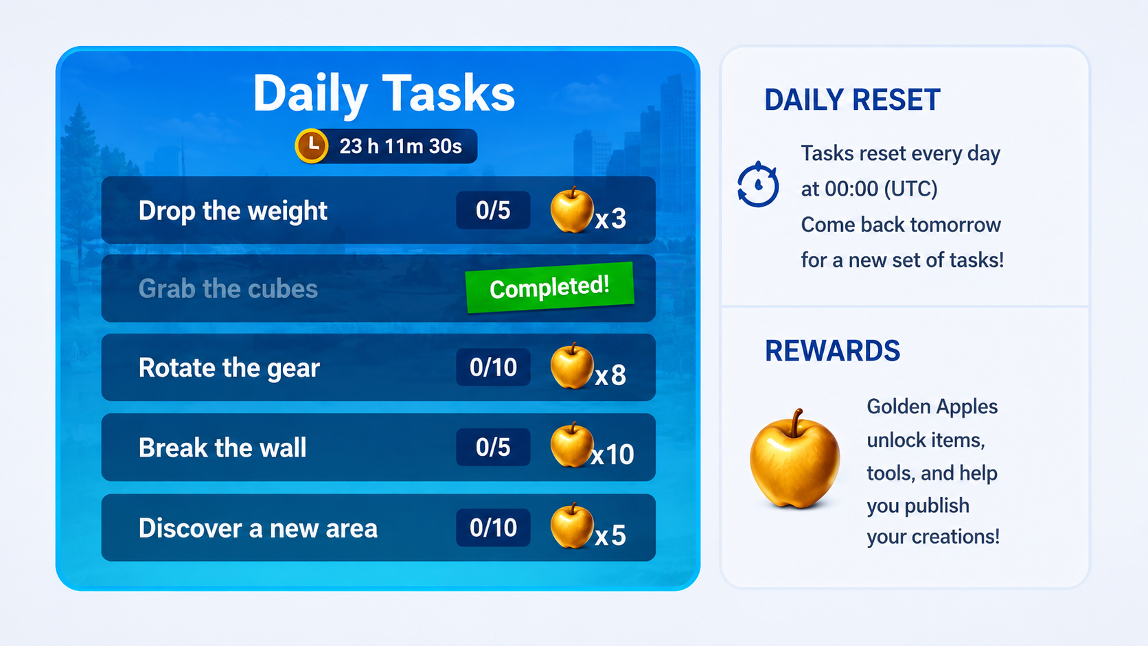
Reset and rewards — the panel states what refreshes and what the currency is for. 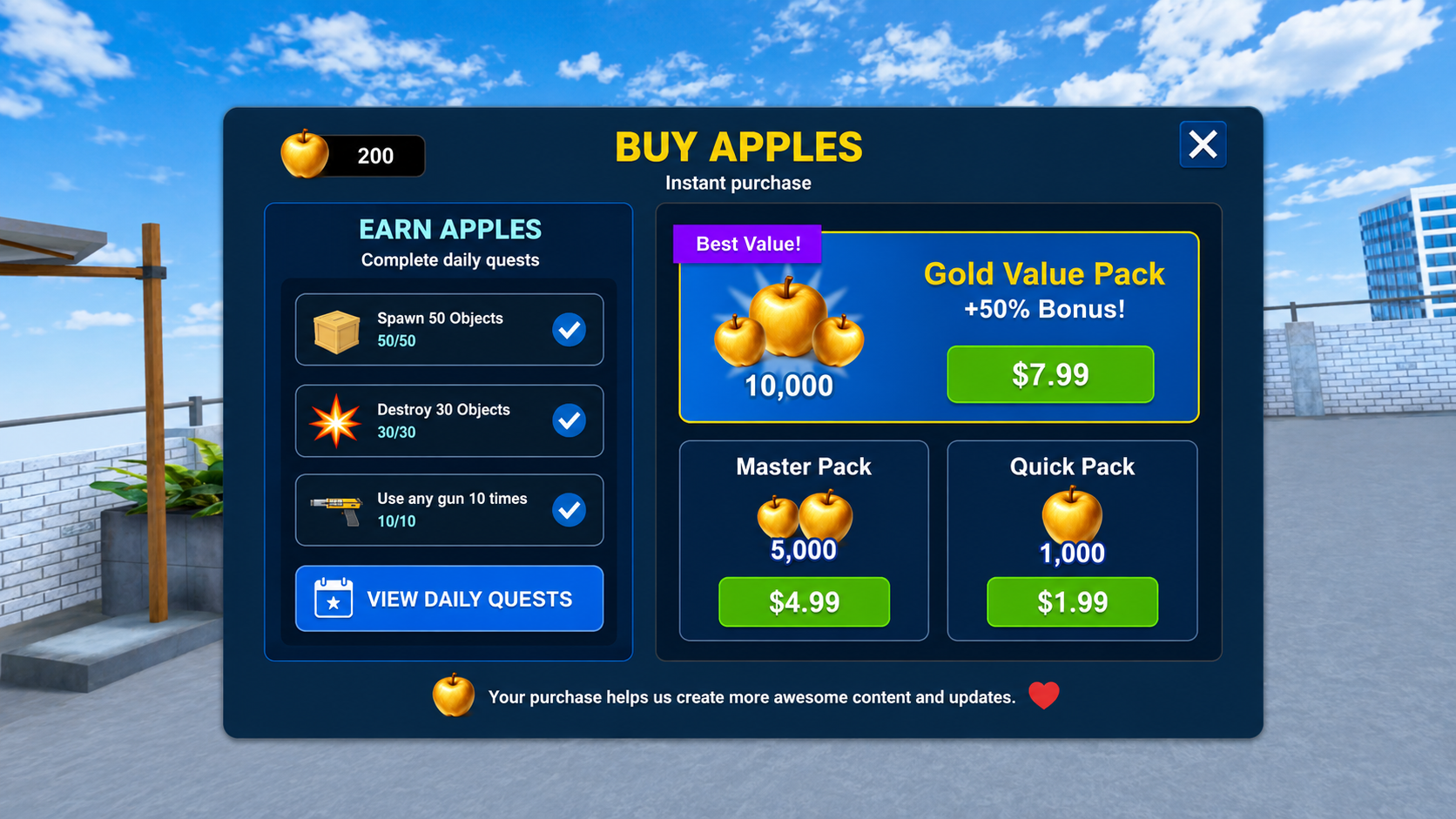
Earn and buy in one panel — the free path is never hidden behind the paid one.
03 · Content & Interaction System
Designing a Library That Could Grow
As more spawnable content shipped, the Spawn Gun needed an information architecture that could scale — one navigation and card model that new categories and content types drop into, rather than a bespoke interface per category.
The structure grows in place: persistent category icons, secondary tabs, and one reusable item card that works for NPCs, weapons, wearables, objects, vehicles, and saved builds — with the same point-and-select interaction language across all of them, so adding content never means learning a new model.
- Persistent categories
- the left rail never moves as the library grows
- Reusable cards
- one card handles every content type and state
- Saved builds inline
- player creations sit alongside first-party content
Point → Highlight → Confirm
Design decision
Build one scalable navigation and card system instead of designing separate interfaces for every content type.
One reusable card and a fixed navigation rail let the library support increasing amounts and types of content — including player-saved builds — without a new layout for every category, keeping selection and hierarchy consistent as the catalog grows.
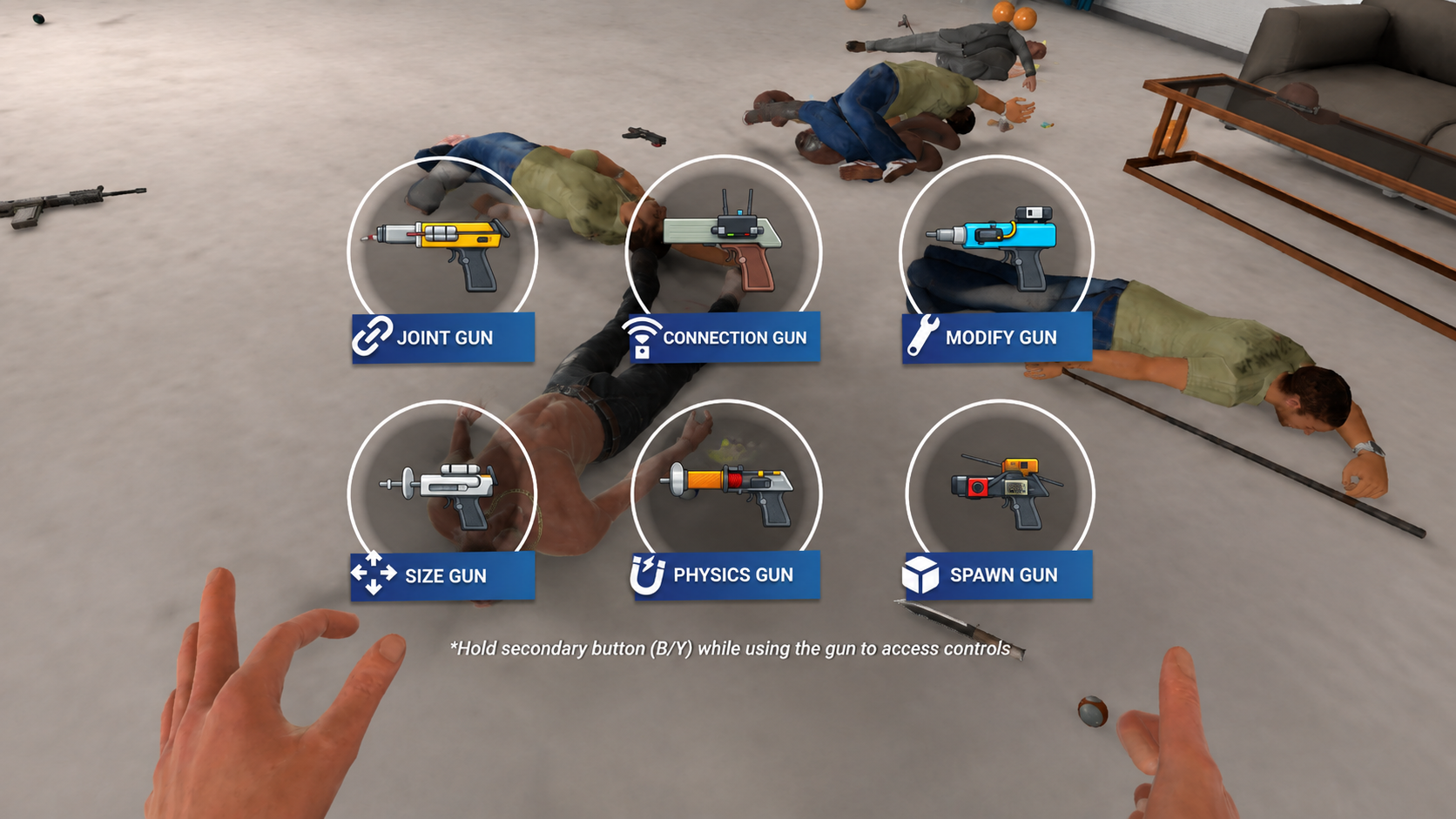
Tool selection — silhouette and color carry recognition before the label is read.
04 · Creator Loop
From Private Build to Community Content
Players build their own creations out of physics objects, so saving had to be a real step, not an afterthought. The flow goes from building, to saving, to naming, to spawning it again later from the Spawn Gun.
Saving keeps a build available to the player; publishing turns it into community content. I kept these as distinct states while making publishing a visible next step from Build Details, which shows likes, downloads, part count, and published status before anything goes out.
The Community browser turns other players' builds into a steady supply of things to do. It's split into My Builds, Community, and Downloaded, with Newest, Top Rated, Trending, and My Uploads filters inside Community — so the whole workflow reads as one state model: Create → Save → Manage → Publish → Discover.
Create → Save → Name → Respawn · Build Details → Publish → Community
Design challenge
Private creation and public publishing needed to feel connected without becoming the same action.
Saving keeps a build available to the player; publishing turns it into community content. I kept these as distinct states while making publishing a visible next step from Build Details — so the creator workflow is a state model, not just a sequence of screens.
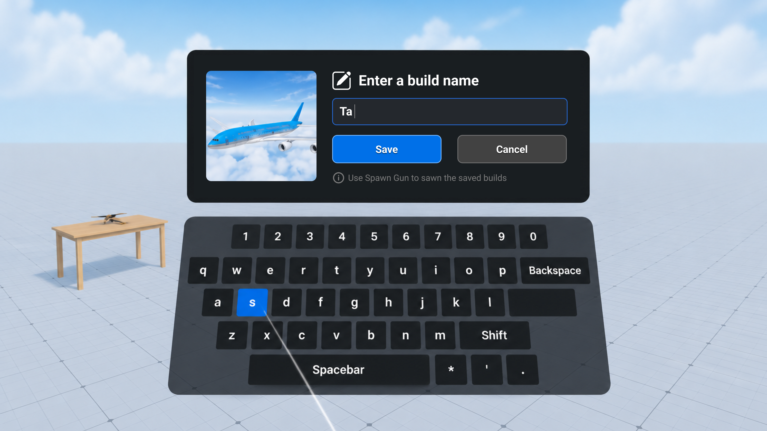
Naming — the preview stays present so the asset and the creation stay connected. 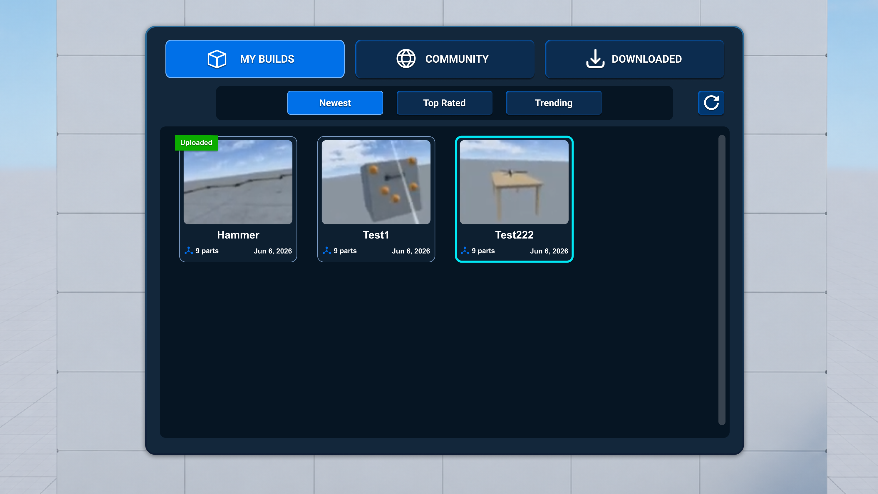
My Builds — part count, date, and upload status live on the card itself. 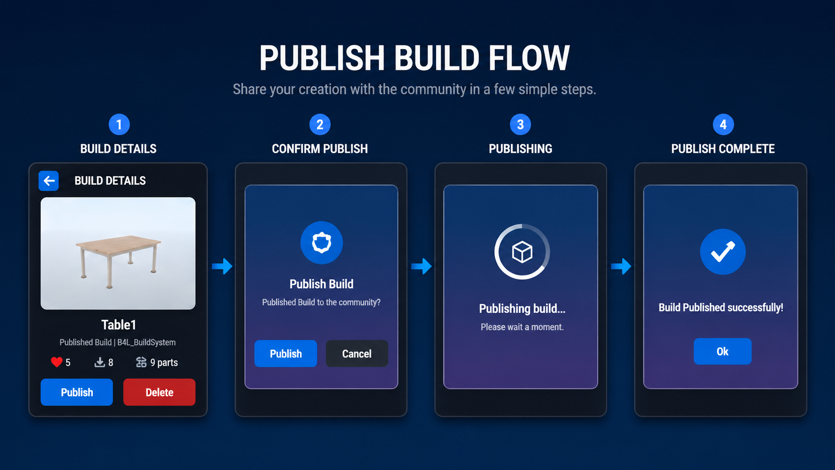
Every step is its own screen — nothing about publishing happens invisibly. 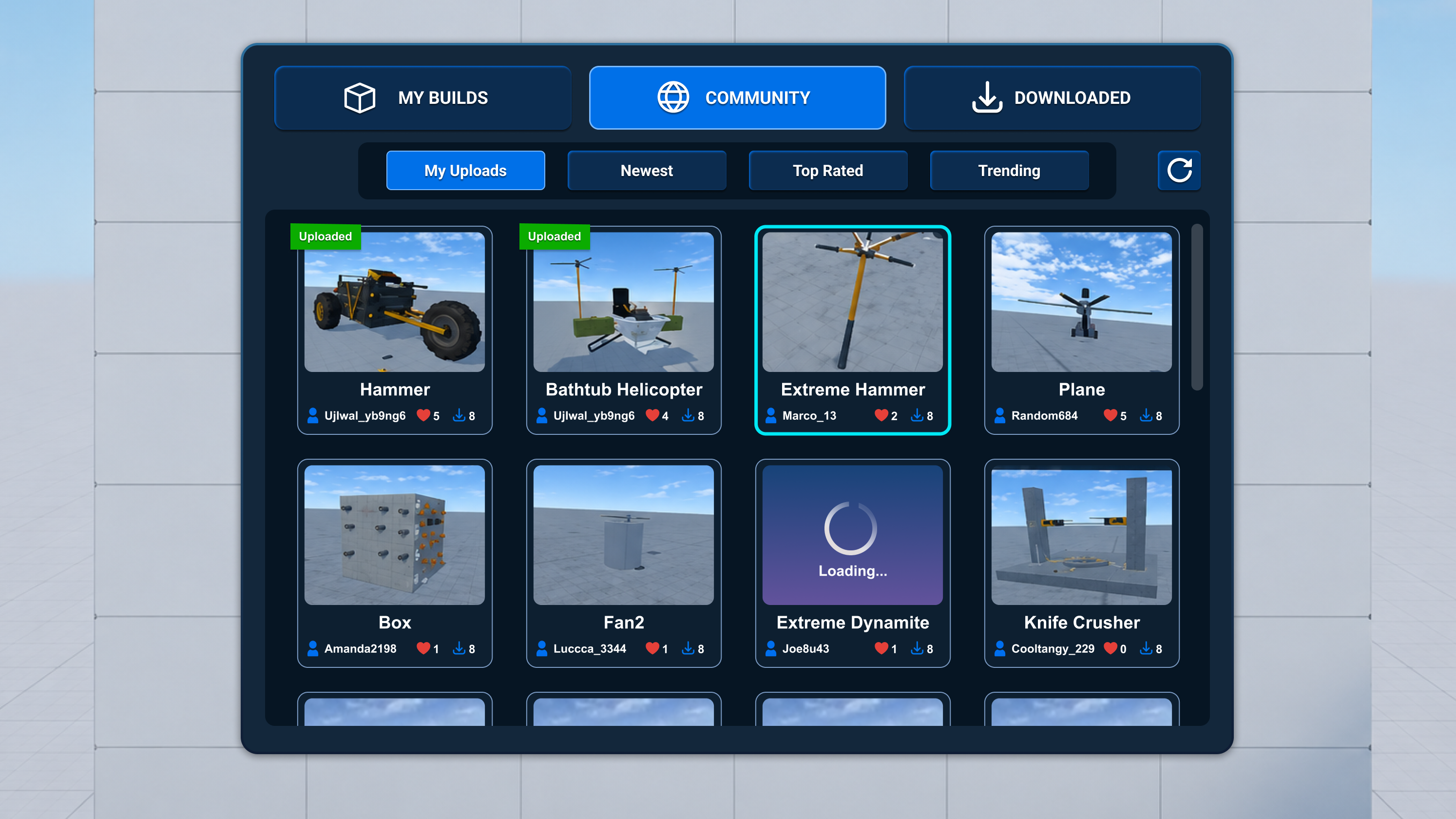
Community — the same card structure, now credited to other players.
05 · Before vs After
Auditing the Two Screens Players Used Most
Two screens carried almost all the repeat traffic: the tool wheel and the community build browser. I audited each against three questions — is it readable at VR distance, is its current state clear, and will the layout hold as content grows?
01Tool selection
Before
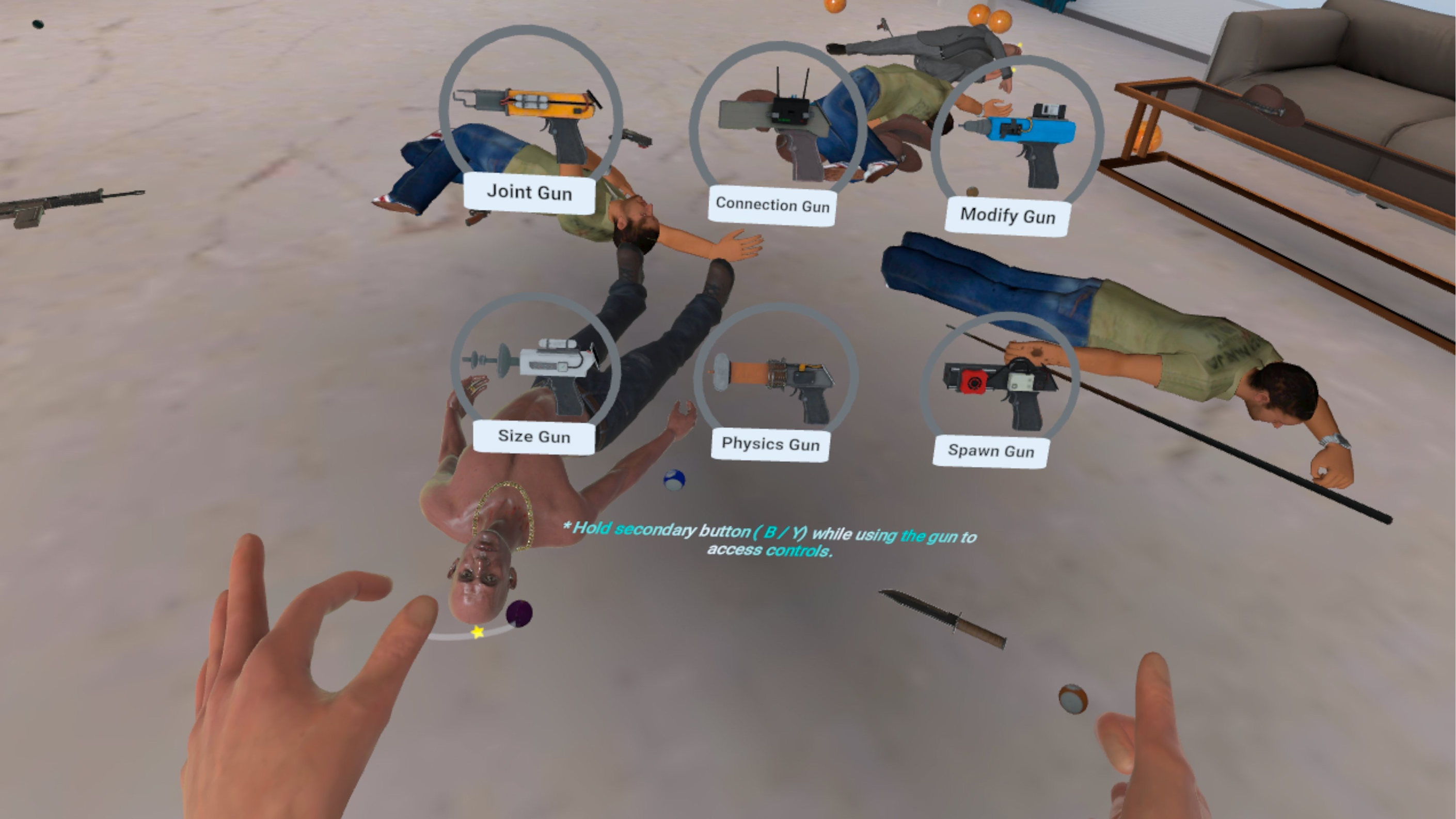
Before — six transparent rings on top of live geometry, with no equipped state and labels at uneven distances. After
After — contained targets, a symmetrical grid, and colour-coded silhouettes readable at a glance. What was breaking
The old tool wheel drew six thin grey rings directly onto the live physics scene, so the controls had no surface of their own and read as scene clutter. Labels floated at uneven distances, and nothing showed which tool was equipped.
What the redesign does
I gave every tool its own contained, evenly spaced target and let silhouette and color carry recognition before the label is read. A symmetrical grid builds positional memory, and the currently equipped tool is clearly marked.
- Contained Targets
- each tool sits on its own selectable surface instead of competing with live world geometry
- Recognition Over Reading
- silhouette, color, and fixed position help players recognize tools before reading labels
- Clear Equipped State
- selection feedback makes the currently equipped tool immediately visible
02Build browser
Before
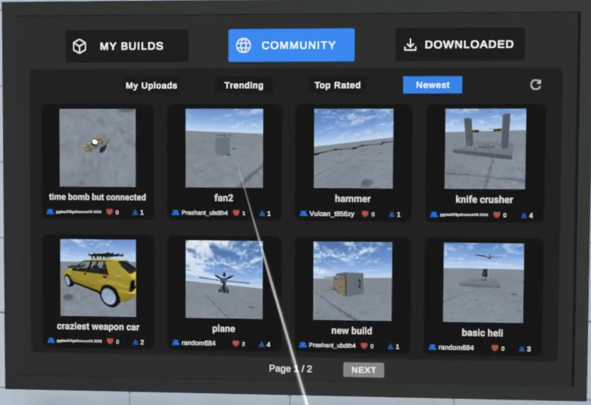
Before — three competing button treatments, illegible attribution, and a library split across pages. After
After — one active treatment per level, a scrolling grid, and status carried on the card. What was breaking
The old browser mixed three button styles in one row, so you couldn't tell what was clickable or how the list was sorted. Thumbnails were small, creator names illegible, and the library was split behind a Page 1 / 2 pagination control.
What the redesign does
I set two clear levels — destination tabs above sort pills, one active treatment each — and replaced pagination with a scrolling grid so discovery grows with the library. A status layer puts creator, selection, upload, and loading states on the card itself.
- Clear Hierarchy
- destination tabs and sort controls use distinct visual levels
- Scroll Over Pagination
- the library can grow without splitting discovery across multiple pages
- Status on the Card
- creator, selection, upload, and loading states are visible before opening a build
06 · Design System
One Visual Language Across the Experience
A big part of the work was getting systems with very different jobs to behave the same way. Shared surfaces, selection colors, action colors, and reward cues make Daily Tasks, the economy, Spawn Gun content, creator tools, and community publishing feel like one game instead of five features.
- Surfaces
- dark blue panels with card-based information hierarchy
- Selection
- bright blue selected states and cyan VR interaction highlights
- Actions
- green for purchase and confirmation, red reserved for destructive steps
- Rewards
- the Golden Apple as a single, consistent value cue
- States
- shared loading, confirmation, selected, locked, and success patterns
07 · Outcome
One Connected Player and Creator Loop
The final design direction connects progression, economy, content discovery, creation, and publishing into one system rather than treating them as separate features.
- Progression
- Daily Tasks make short-term goals and rewards accessible without taking over the sandbox.
- Economy
- Golden Apples connect play, earning, and unlocking within the same experience.
- Scalable Discovery
- Reusable navigation and card patterns allow the content library to grow across multiple content types.
- Creator Path
- Saving, publishing, and community discovery form a visible path from private creation to shared content.
- VR Interaction
- Consistent targets, selection states, and point-and-select patterns improve clarity across tools and content.
Complete Tasks → Earn Apples → Unlock Content → Publish Builds → Discover Community Builds → Create More
Post-Launch Results — 2 Months Later
- TPV from the July update
- ~$67K
- TPV uplift
- +88%
Player spending and engagement stayed stable after the initial uplift, so the improvement held rather than being a short-term spike.
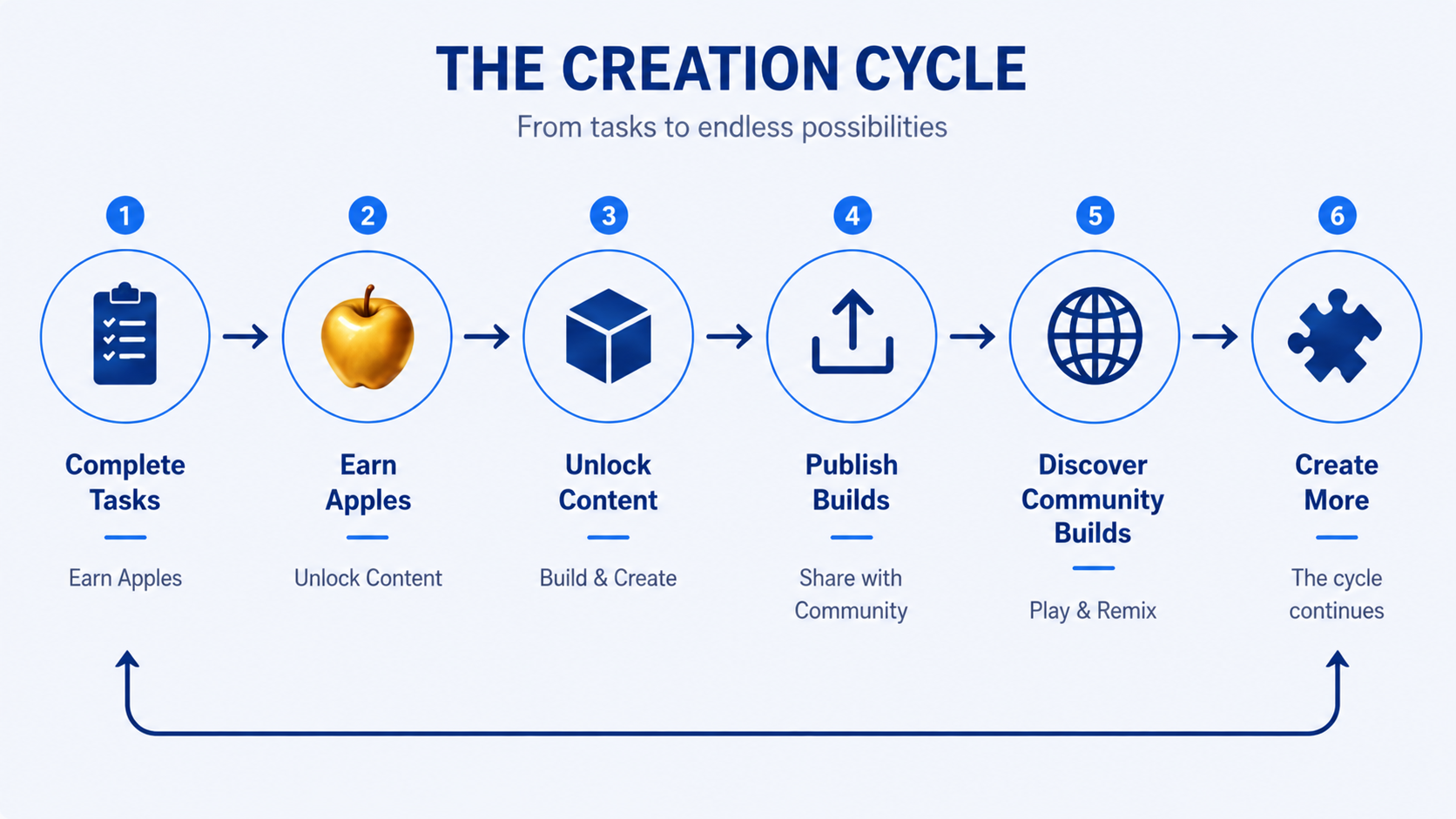
The loop as designed — each system creates a clear handoff to the next.
08 · Reflection
What I Learned
Designing for an open-ended sandbox taught me that adding structure doesn't have to mean reducing freedom. The most effective systems gave players clearer next steps while staying optional, reusable, and connected to the play patterns that already made the experience fun.