RitzDeli Games · Client Project for Meta — War of Wizards
Evolving a VR game UI system
- Client
- Meta · client work delivered through RitzDeli Games
- My role
- UI/UX Design · UI Art · Visual Design · Interaction Design
- Collaboration
- PM · Engineering · Art · Production
- My focus
- UX Structure · Interaction Design · UI Systems · Visual Design · UI Art
- Discipline
- VR / Spatial UX · Game UI · UI Art · Design System
Client project for Meta through RitzDeli Games. Feature requirements came from PM briefs and roadmap documents, which I translated into UX structure, interaction patterns, UI systems, and production-ready art.
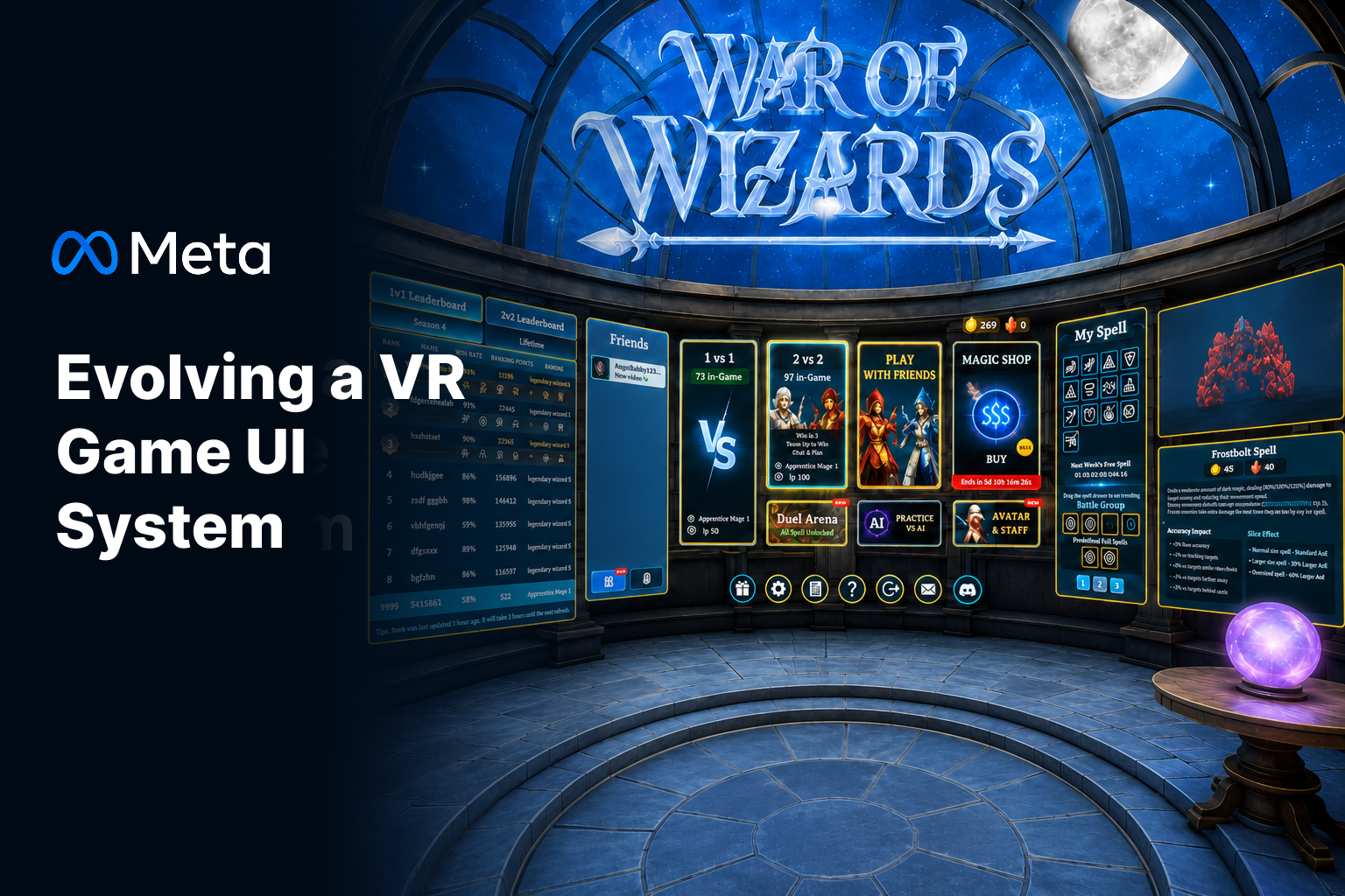
The challenge
As War of Wizards grew, the UI had to carry more game modes, progression, social features, customization, and commerce. The lobby was already packed, and every new feature made it harder to scan in VR.
- Product goal
- Ship more modes, spells, and commerce into an already-dense VR lobby.
- My design goal
- Make the lobby easier to scan and able to take on new content, without losing the magical look the game is known for.
What I did
- We agreed on three things to fix: make the main actions easy to spot, build structures that can hold more content later, and use one consistent interaction language throughout.
- I added a clearer hierarchy with bigger targets, tighter grouping, consistent spacing, and simpler states — building on the existing style instead of throwing it out.
- I split the lobby into three zones, so a player can see what they can play, where they customize, and how they're progressing in one look.
- I rebuilt the My Spell panel as a wider, paginated layout that separates browsing, current picks, and battle-group info, so it can hold a lot more spells.
- I reorganized the leaderboard to put the player's own position front and center and pull Friends away from the competitive ranking data.
- Specified in-game notifications as one banner with two color-coded variants, so death and objective events read instantly without a second visual language to learn.
How the work moved
- PM goals & requirements
- UX analysis
- User flows
- Design exploration
- UI system & visual design
- Engineering & art handoff
01 · Challenge
Designing for a Growing VR Interface
As the game grew, the UI had to carry more modes, progression, social features, customization, and commerce.
The lobby was already dense, and each new feature made it harder to scan in VR. We wanted it clearer without losing the magical look the game is known for.
- Clarity
- make primary actions easier to identify at a glance
- Scale
- build structures that can hold more content later
- Consistency
- use one interaction language everywhere
02 · Design Direction
From Dense to Deliberate
The original UI spread information across a lot of differently sized panels and controls. In VR that caused two problems: you couldn't pick out the important actions from a normal viewing distance, and the supporting details competed with the actual gameplay choices.
I gave it a clearer hierarchy with bigger targets, tighter grouping, consistent spacing, and simpler states. I wasn't trying to change the visual style — just make it easier to read and easier to add to.
Larger targets → Stronger grouping → Simplified states
Before
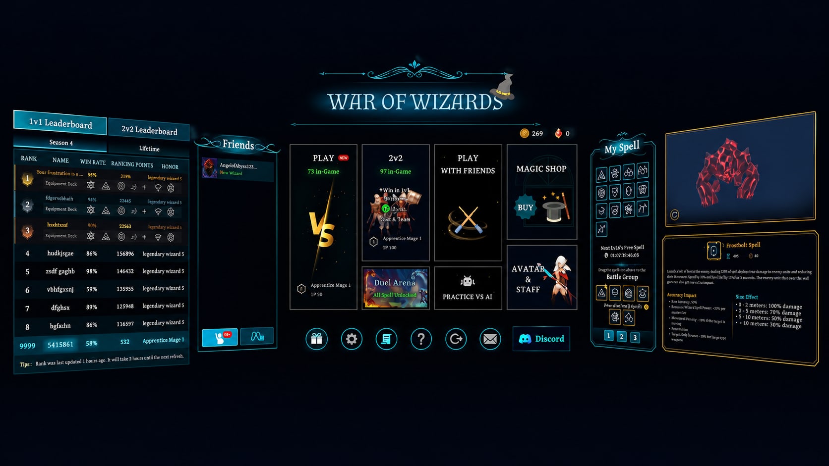
Before — uniform hairline panels in a void. Nothing reads as primary and microcopy disappears at distance. After
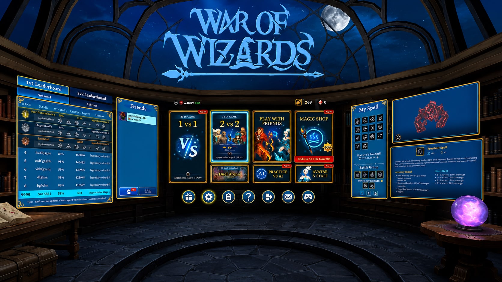
After — the refined lobby. Solid fills, gold frames, and a three-zone layout grounded in a real place.
03 · Navigation
A Clearer Lobby Hierarchy
The lobby is where players decide what to do, so I put the most important actions in the middle. The main modes — 1 vs 1, 2 vs 2, Play With Friends — get the strongest emphasis.
Secondary actions like Magic Shop, Practice, and Avatar & Staff stay one tap away without fighting the main choices. The Leaderboard and My Spell sit around the edges, which is what gives the lobby its three zones.
What can I play? · Where can I customize? · How am I progressing?
04 · Content & Progression
Room for More Spells and Ranking Data
The old My Spell panel was fine for a handful of spells, but we knew a lot more were coming. I designed a wider layout that pages instead of cramming, so more spells fit without the grouping and selection getting muddy.
The leaderboard shows a lot at once — rank, win rate, ranking points, equipped abilities, player status. I reorganized it so ranking is easier to scan and the link between how you played and where you sit is clearer.
- Browse
- a spell grid that grows by page, not by density
- Select
- battle group and pre-selected fall spells kept distinct
- Read
- spell detail restructured into scannable stat groups
05 · Design System
One Interaction Language Across Commerce, Customization, and Combat
The same rules carried into the Magic Shop and Avatar & Staff. The shop uses one predictable card with clear categories, ownership, locked states, and prices, so comparing two items is quick.
To keep things consistent, I built reusable states for everything that repeats: primary and neutral buttons, hover and selected, back and close, navigation, tabs, locked, add, and special actions. Players learn them once.
Notifications had to land instantly without pulling players out of a fight, so every message uses the same banner — a diamond crest, one line of copy, fixed just above the horizon where players are already looking. Only the crest and color change: red when you lost something, cyan when you gained something. You know the outcome before you read the words.
- One structure
- same crest, banner, and placement for every event
- Color as meaning
- red reads as loss, cyan reads as gain, before any text
- Non-blocking
- sits above the horizon so the lane and HUD stay clear
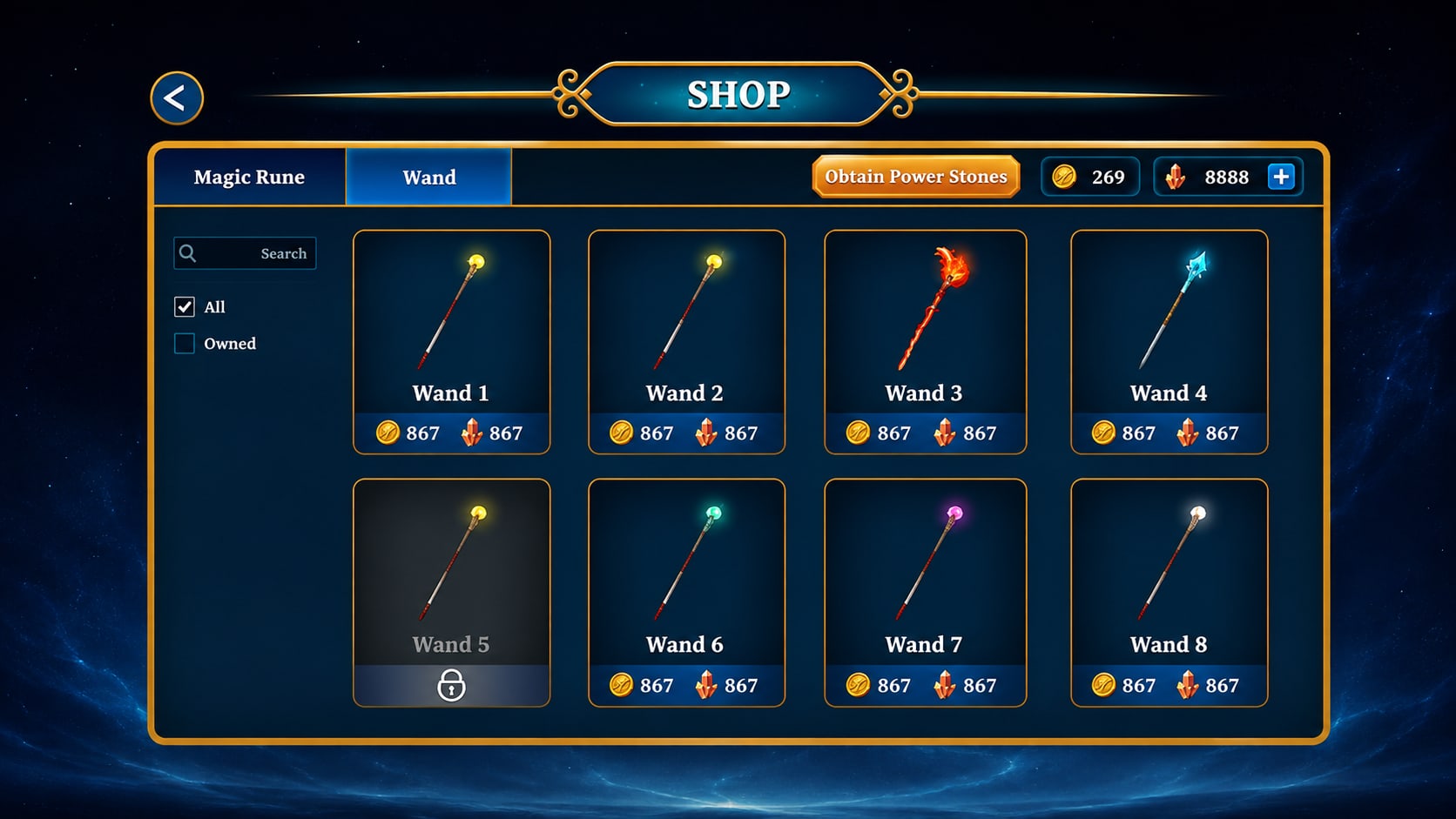
Magic Shop — one repeating card across the grid, with locked, owned, and purchasable states made explicit. 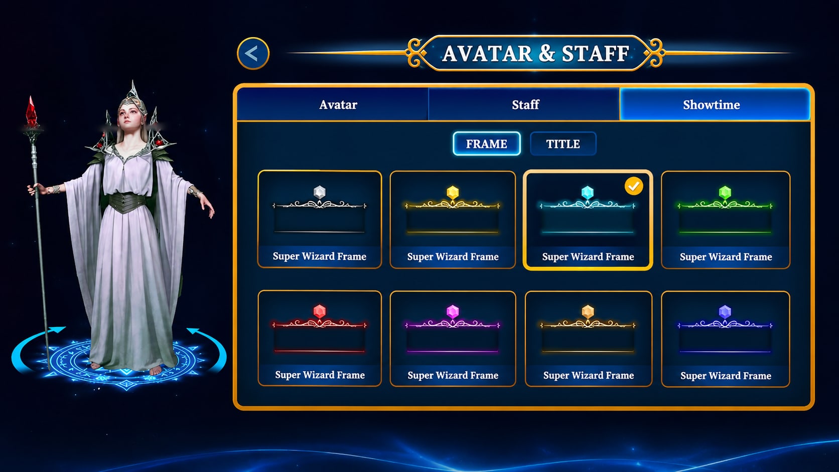
Avatar & Staff — preview on the left, a consistent grid on the right, and one unmistakable selected state. 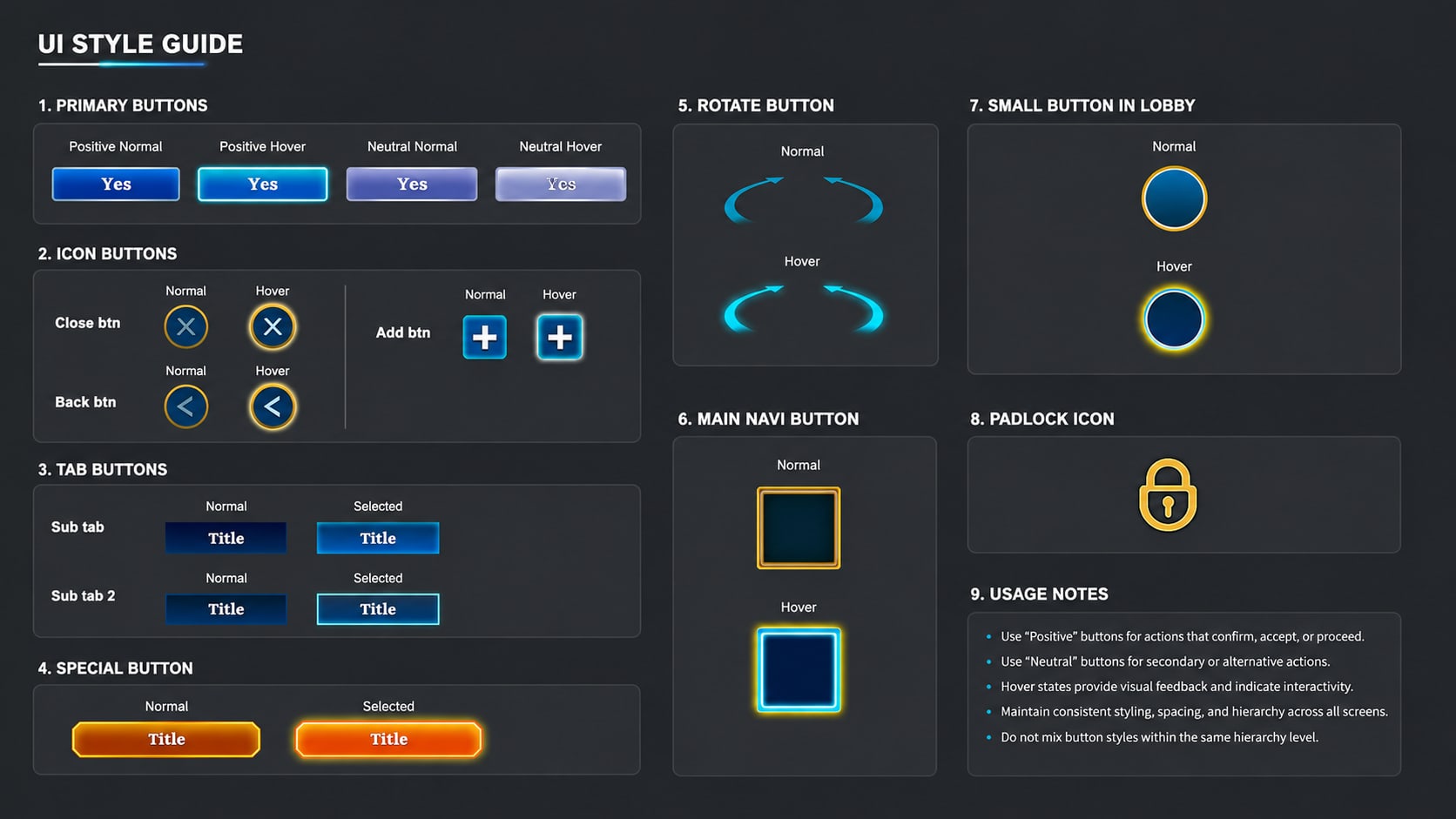
The style guide — primary, neutral, icon, tab, and special controls in every state, with usage rules written next to them. 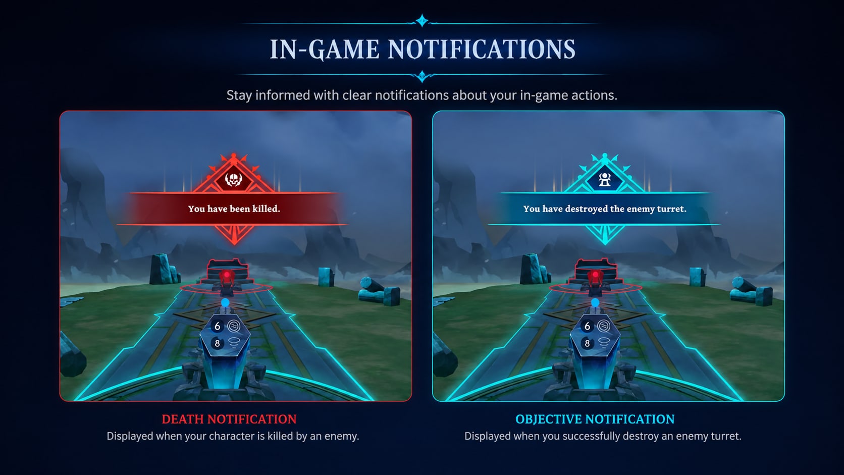
In-game notifications — negative and positive events share one crest, one banner, and one position. Only color and icon carry the meaning.
06 · Outcome
One Interface Instead of Many
The final direction pulls gameplay, progression, customization, commerce, and combat feedback into one consistent UI.
Instead of redesigning every feature on its own, I built shared visual and interaction rules the game can keep growing into — so it still looks like War of Wizards, just easier to read and get around.
Clearer hierarchy · Room to grow · Consistent interaction states