Roblox Game — Roblox Baseball
Building a baseball game UI system
- My role
- UI/UX Design · UI Art · Visual Design · Game Interface
- Collaboration
- PM · Engineering · Art
- Discipline
- Game UI · UI Art · Design System · Gameplay States
The challenge
This needed one UI system for a competitive Roblox baseball game — covering the lobby, batting, equipment, collections, progression, and match rewards. Instead of designing each screen on its own, I built a reusable visual language the game could grow into.
What I did
- I set four goals up front: look like baseball, make gameplay actions obvious, keep interactions consistent across features, and build components that work for content we haven't made yet.
- I based the visual direction on three things — bold geometry, color coding, and readable hierarchy — so it feels like competitive sports while staying Roblox-friendly.
- I built the lobby in three layers: what you have, where you can go, and what to do next.
- I designed batting as a fixed sequence — Select Pitch → Ready → Pitch → Feedback — always in the same place, so players think about timing instead of the UI.
- I kept the match HUD down to what you actually need mid-play, using blue and red for you versus your opponent and putting the score where you'd expect it.
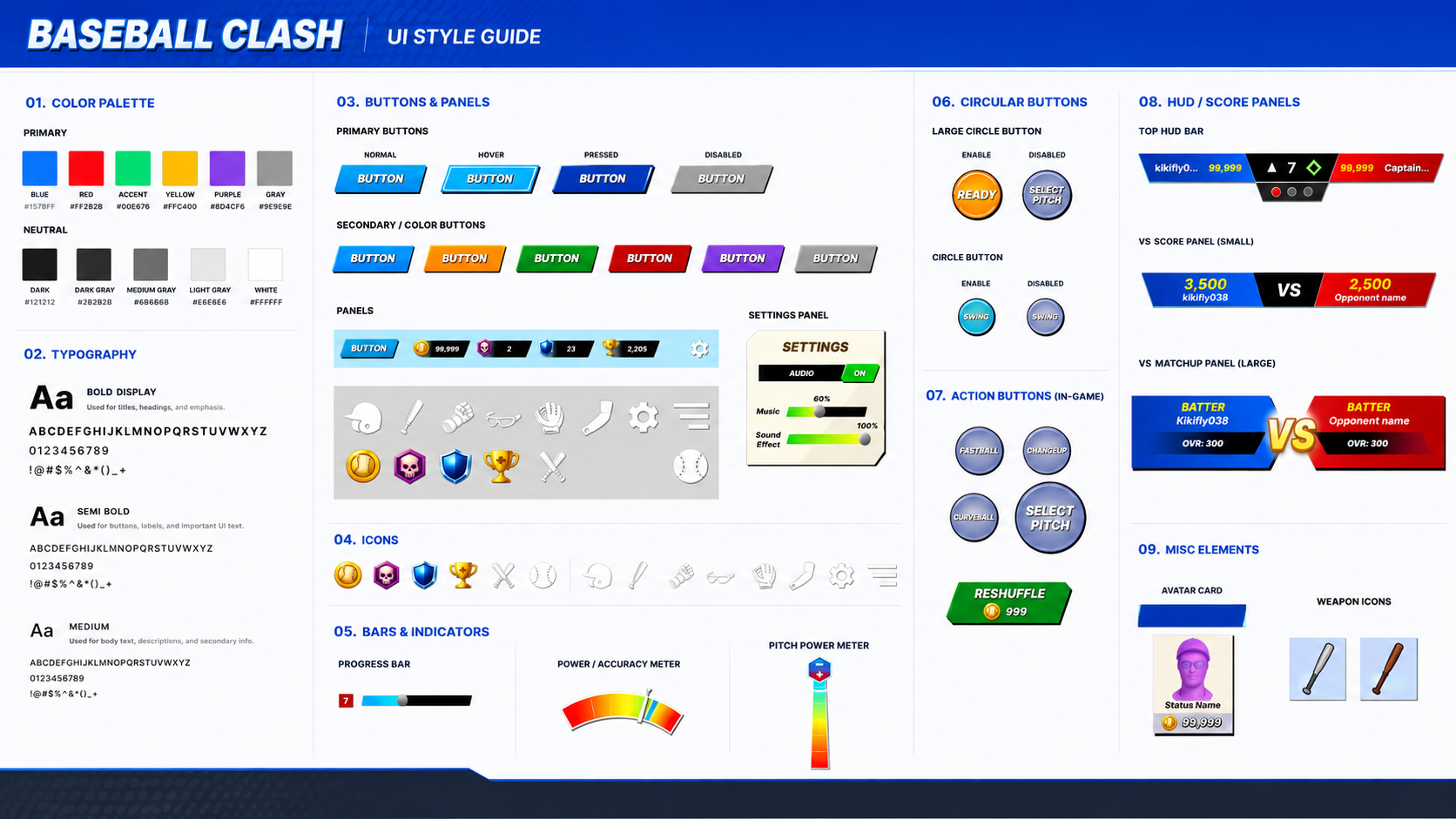
UI style guide
01 · Challenge
Creating a Visual Identity for the Game
The game needed one UI system covering everything — the lobby, batting, equipment, collections, progression, and match rewards.
Designing each screen on its own would have fallen apart fast, so I built a reusable visual language the game could keep growing into.
- Identity
- make it look and feel like baseball
- Clarity
- make core gameplay actions immediately understandable
- Consistency
- repeat interaction patterns across different features
- Scale
- build reusable components that support future content
02 · Visual System
A Bold Sports-Game Language
I wanted it to feel as approachable as Roblox but as charged as a competitive sports game. Three things got it there.
Bold geometry — angled panels, strong silhouettes, structured containers — gives it the competitive edge. Color always means the same thing, whether it's a team, an action, a state, or feedback. And big type with strong contrast keeps the important stuff readable when play gets fast. It's energetic without getting noisy.
Bold geometry → Color coding → Readable hierarchy
03 · Navigation
A Lobby Players Can Read at a Glance
The lobby is the hub, so I kept resources, navigation, and the way into gameplay clearly separated.
That split means a player can see what they have, where they can go, and what to do next without hunting for it.
- 01 Player resources
- currencies and progression stay visible without dominating the screen
- 02 Primary navigation
- large, color-coded buttons give quick access to key features
- 03 Gameplay entry
- the most important actions remain visually prominent
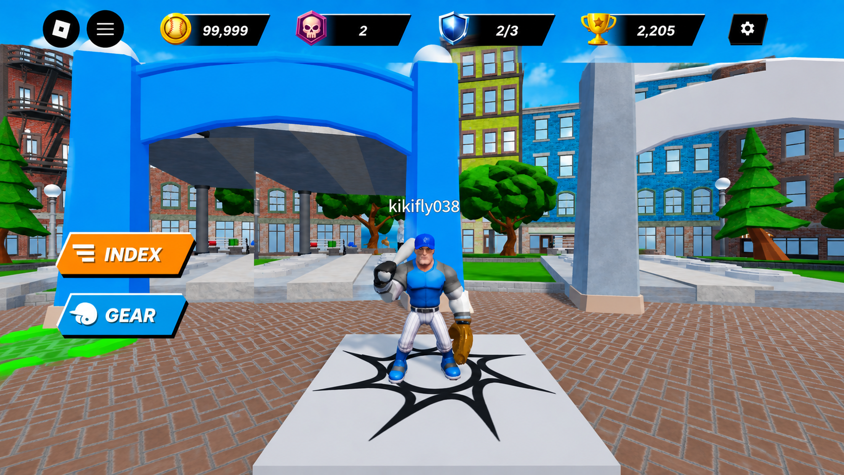
Lobby — resources across the top, navigation on the left, the player centered. 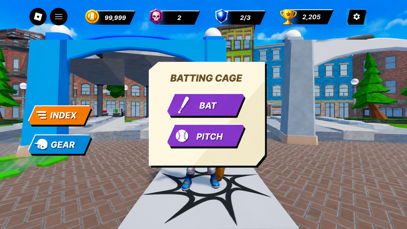
Gameplay entry — a focused dialog with two clear ways into the batting cage. 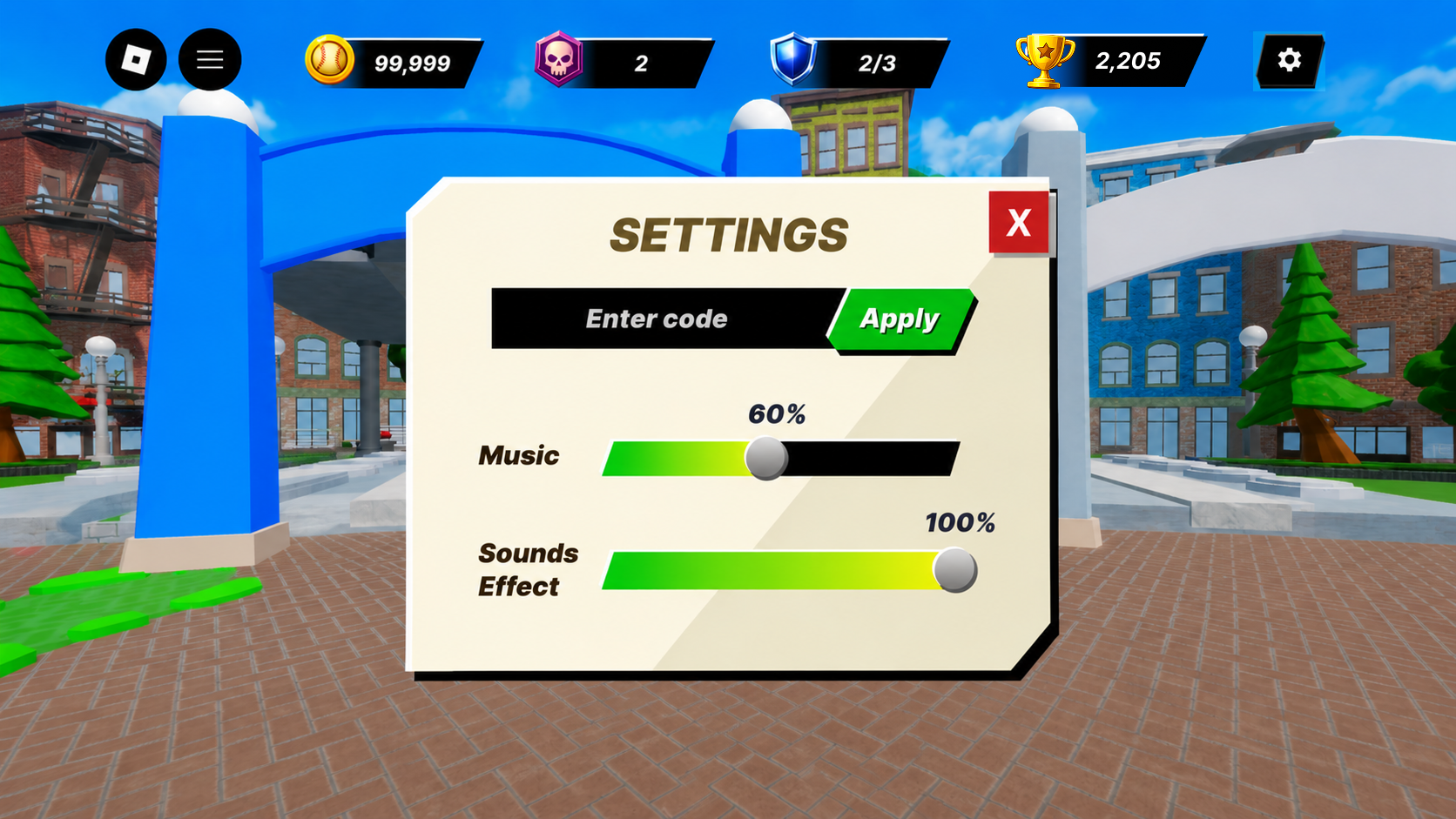
Settings — the same panel and slider language reused for utility screens.
04 · Batting Cage
One Learnable Sequence of Gameplay States
The batting cage is where players learn the controls, so I built it as a fixed sequence. Pitch options orbit one primary action, the button changes label and color as you commit, and the timing meter wraps the button it belongs to.
Nothing moves between states, so players learn the layout once — and the same controls carry straight into real matches.
- Fixed placement
- the primary action stays in the same corner across every state
- Attached meters
- timing feedback wraps the button it belongs to
- One-word outcomes
- results read instantly mid-swing
Select Pitch → Ready → Pitch → Feedback
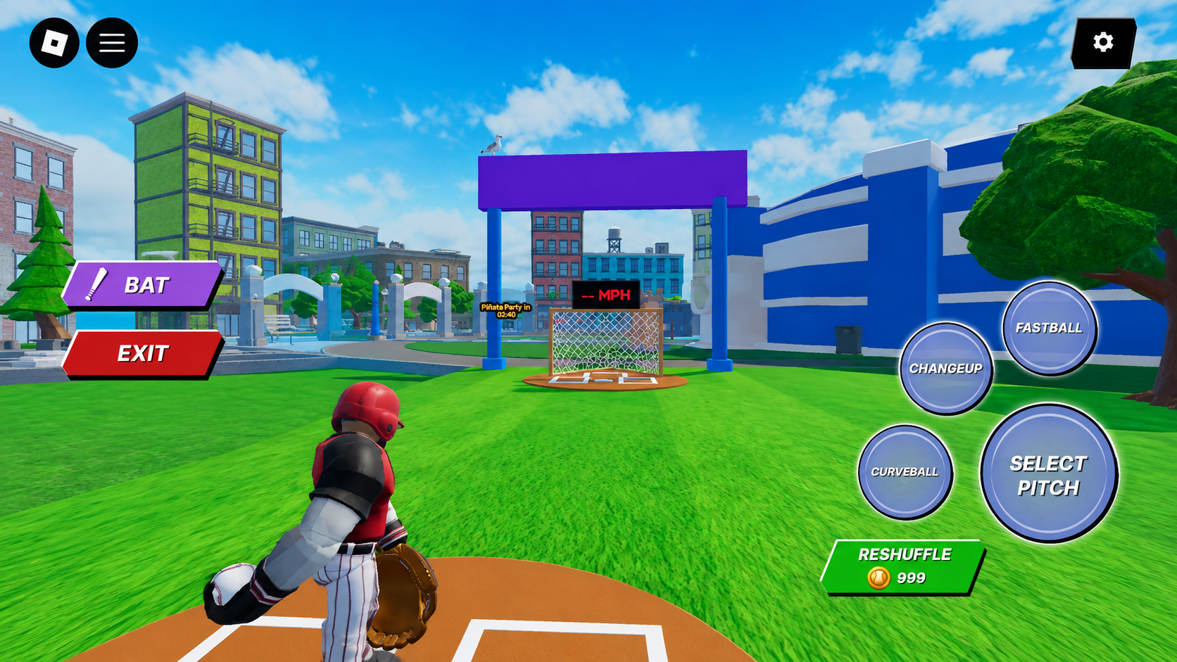
Select Pitch — options orbit the primary action. 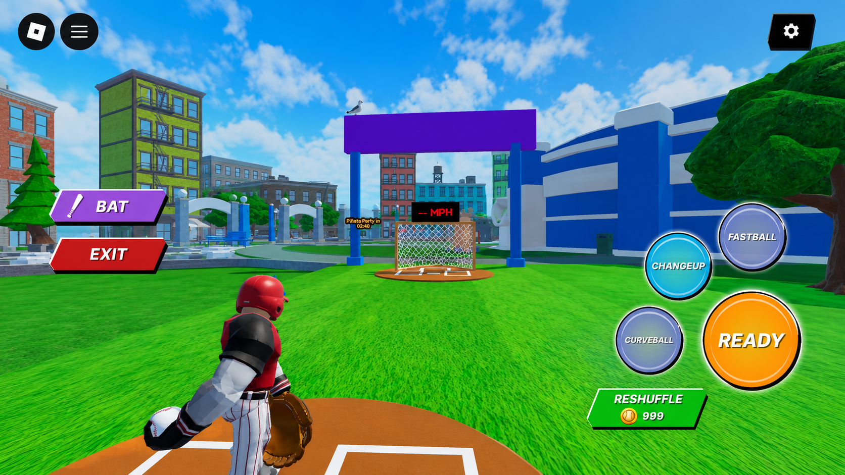
Ready — the orange action button signals commitment. 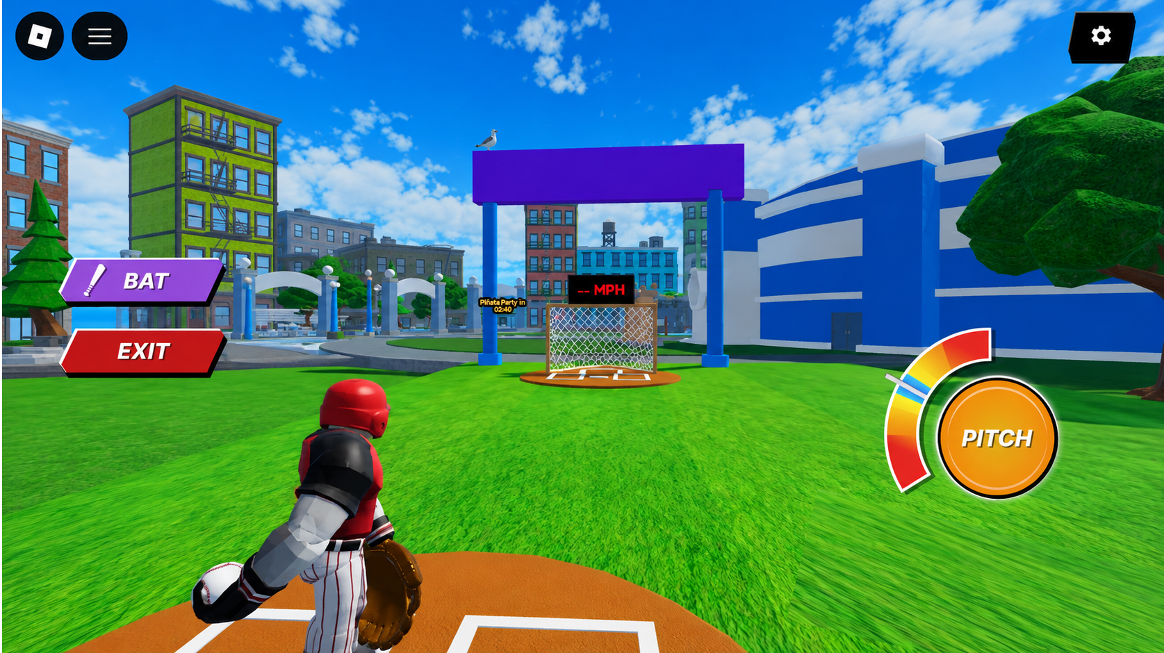
Pitch — the timing meter attaches to the button itself. 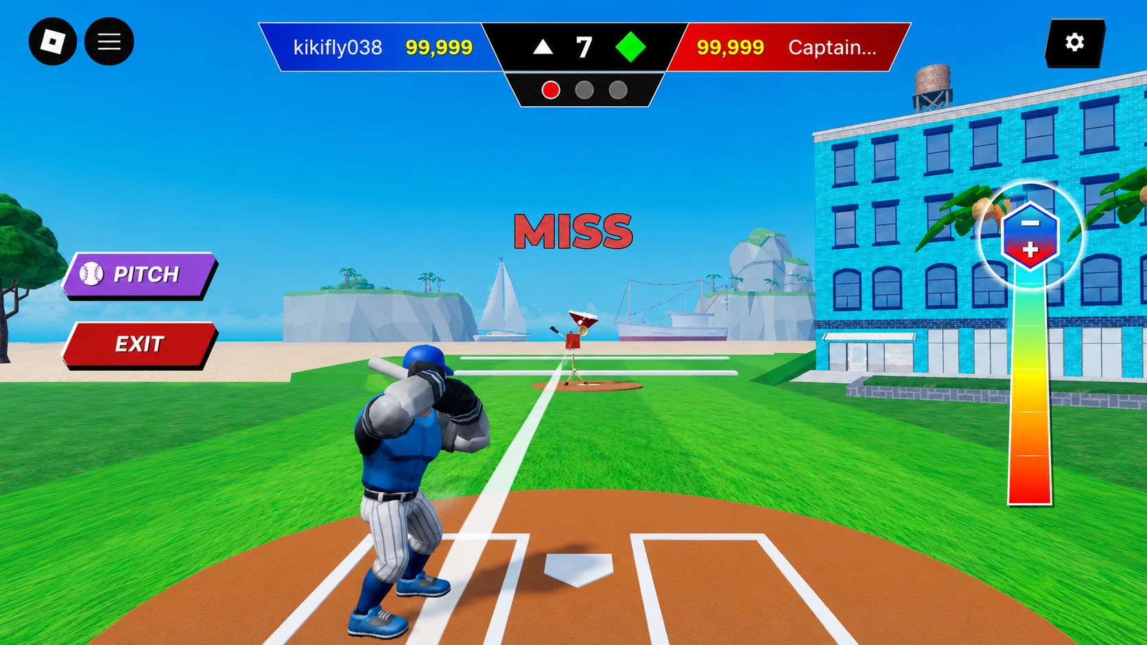
Feedback — outcomes announce themselves in one word.
05 · Match HUD
Competitive Play With Only What Players Need
In matches the HUD only shows what you need right now. Blue is you, red is your opponent, and the score, inning, and outs never move from the first pitch to the last.
A turn goes match, aim, bat, pitch — and the batting and pitching controls are the same ones players already learned in the cage. The stakes go up without anything new to figure out.
- Blue vs. red
- instant ownership between player and opponent
- Anchored scoreboard
- score, inning and outs never move
- Large controls
- gameplay actions stay reachable mid-play
Match → Aim → Bat → Pitch
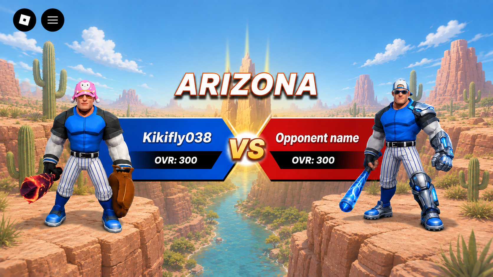
Match — blue and red set ownership before the first pitch. 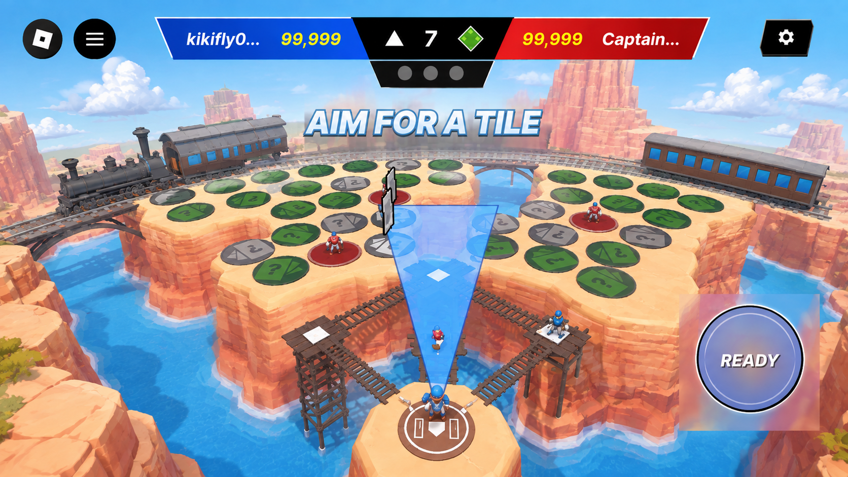
Aim — one prompt, one cone, one button. 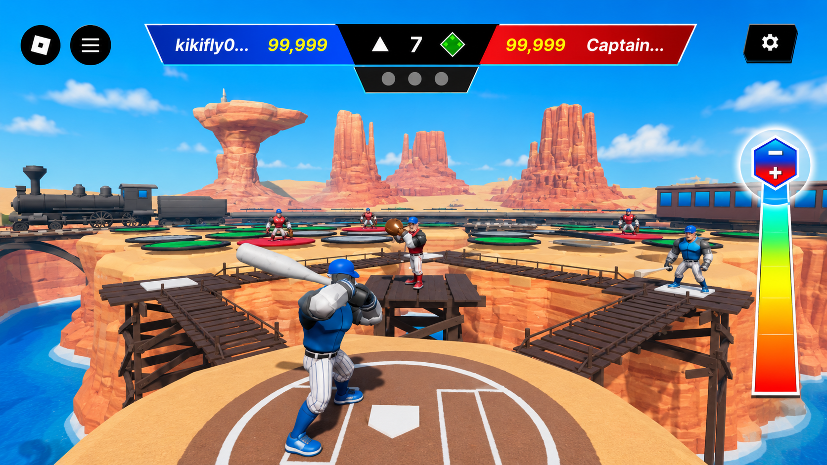
Bat — the scoreboard stays put while the swing meter takes focus. 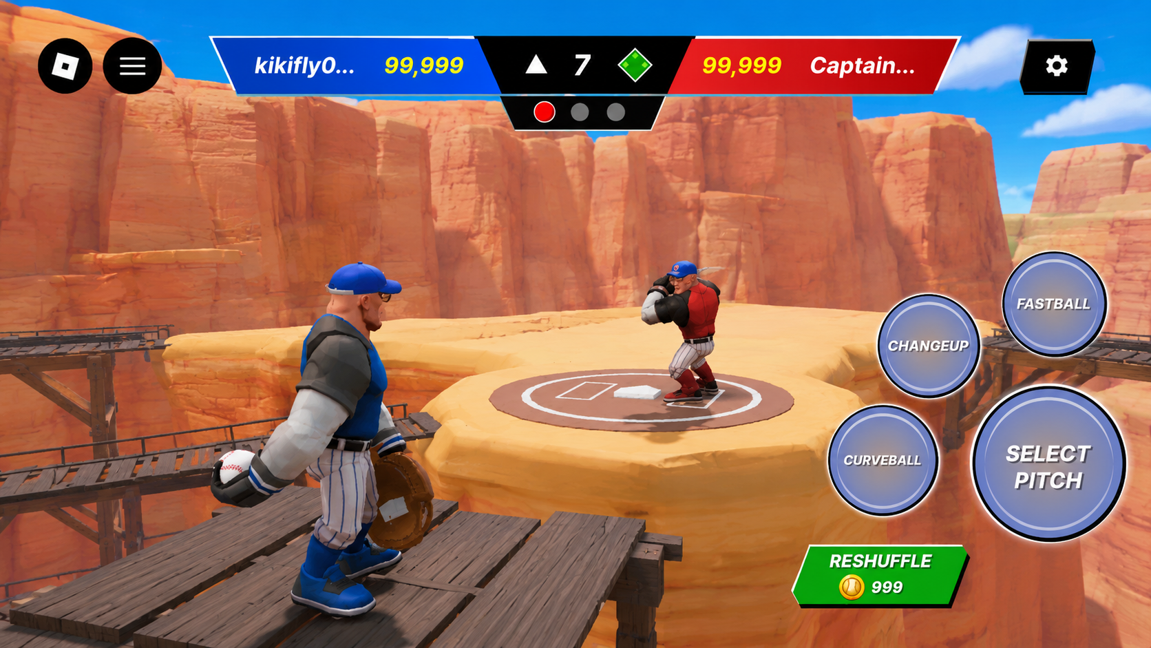
Pitch — the cage controls carried into competitive play. 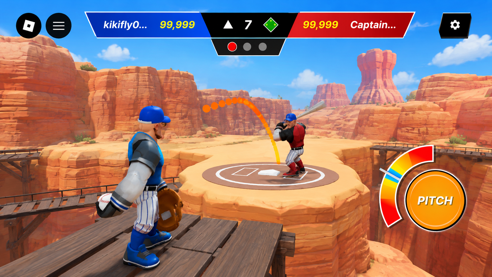
Delivery — the ball arc and timing meter read together.
06 · Progression & Commerce
Customization, Collection, and Reward as One Pattern
The Locker Room handles equipment and buying in the same UI language, with obvious states for equipped, available, and purchasable.
The Collection Index turns collectibles into real progression. You can browse by rarity, tell owned from locked, and see how far you've gotten.
The end-of-match screen gives players a payoff worth looking at while being clear about exactly what they earned.
Equipped → Available → Purchase
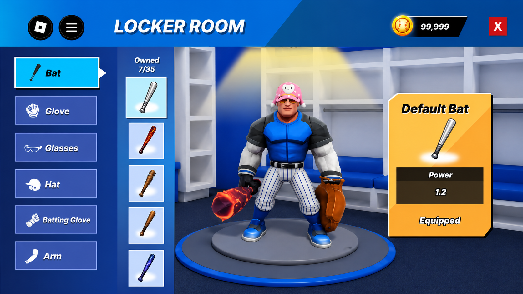
Equipped — a flat stat readout and no call to action. 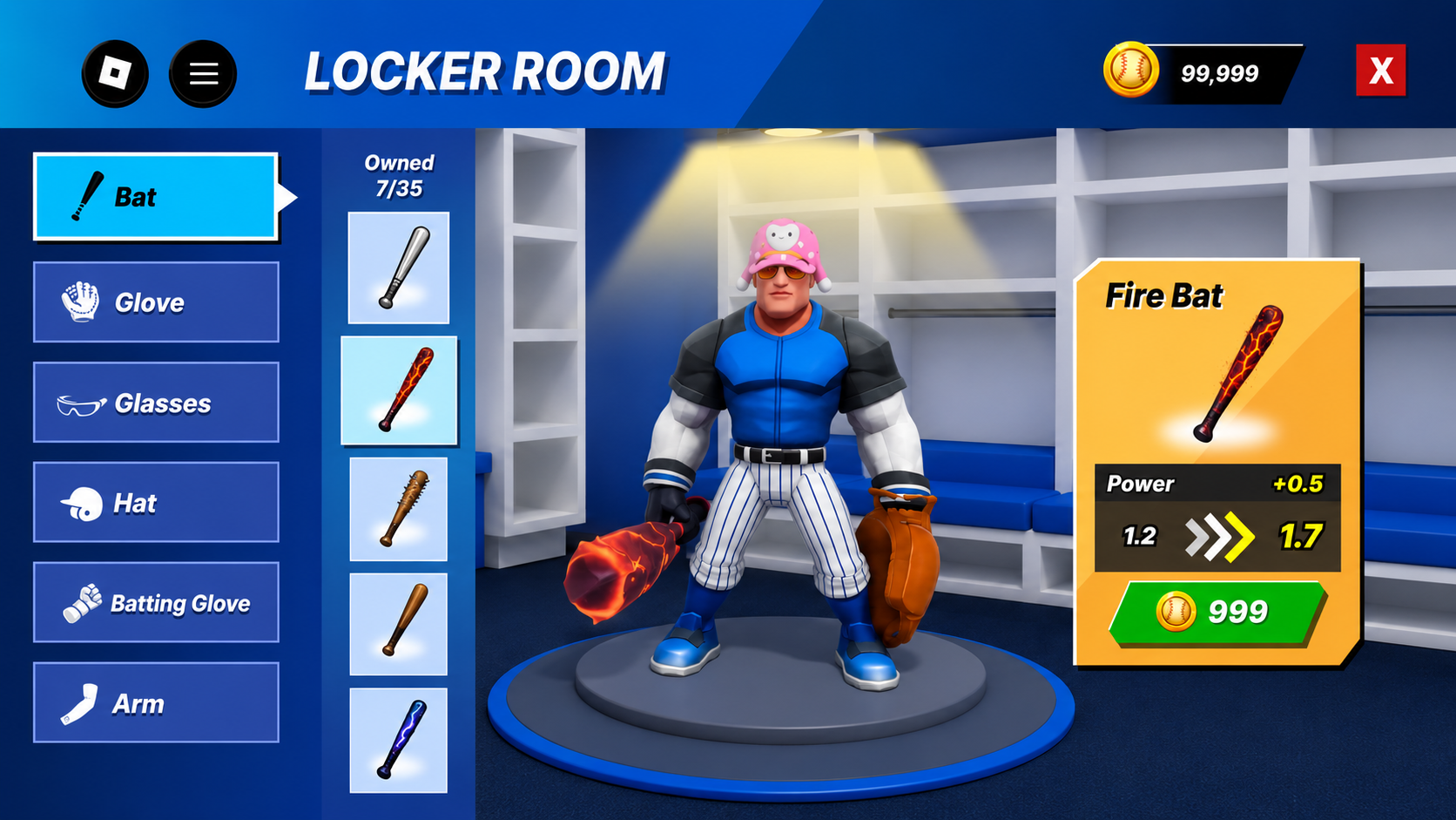
Purchase — the stat delta and price do the persuading. 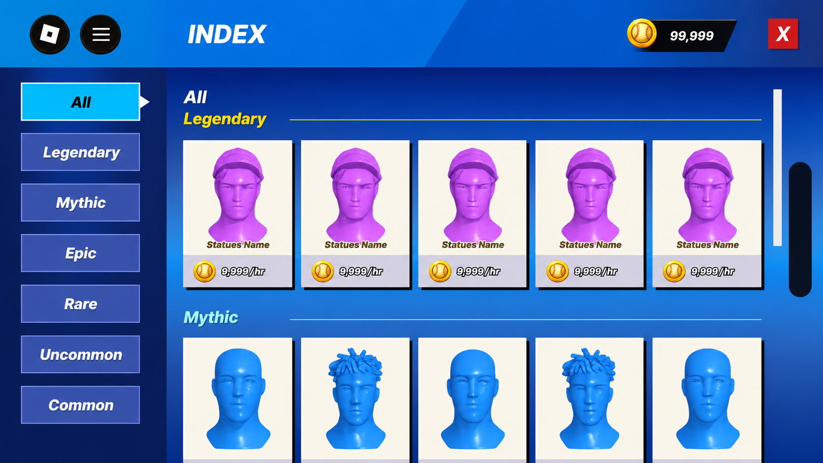
Index — rarity filters on the left, one repeating card across every tier. 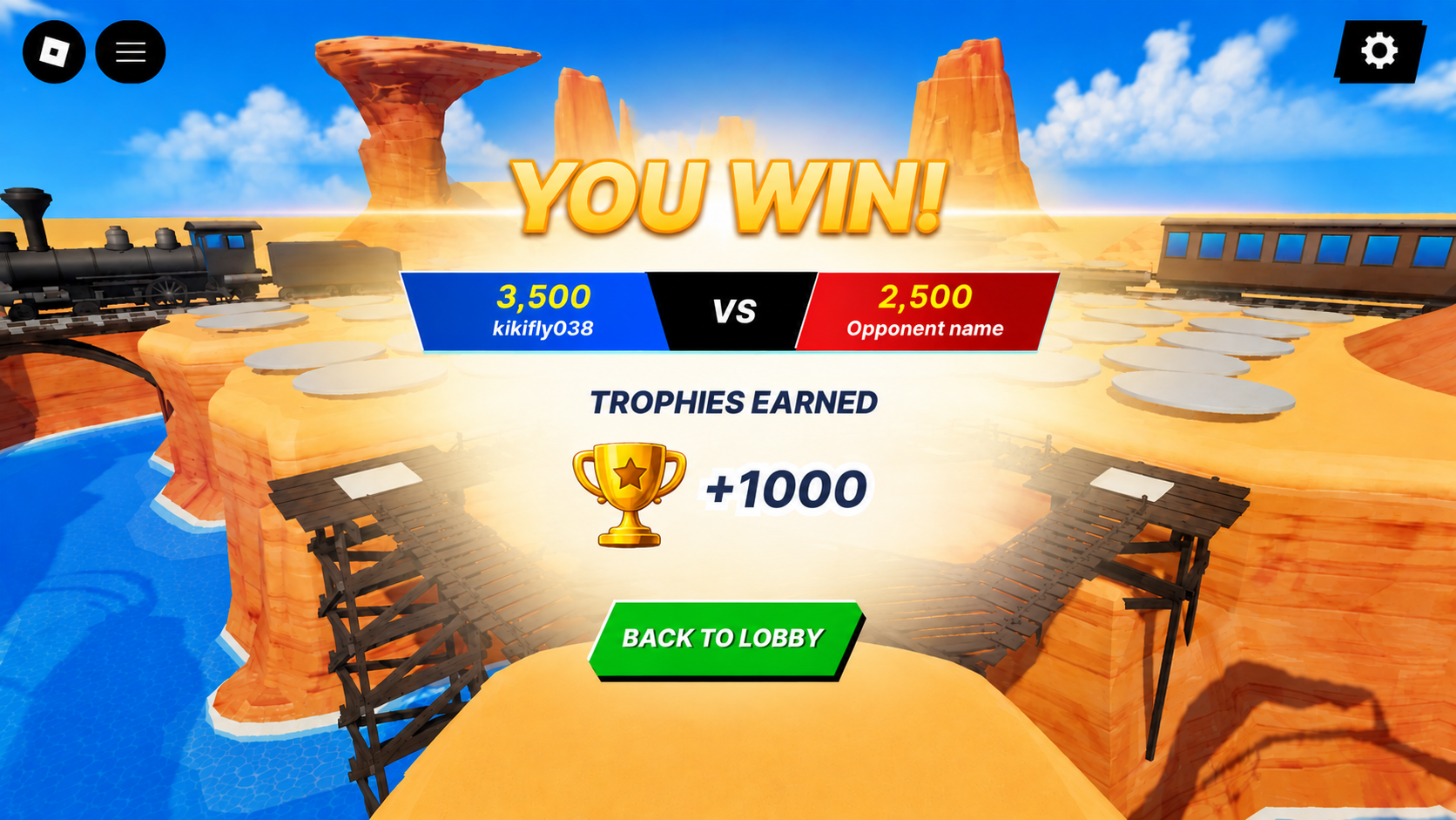
Rewards — four beats, top to bottom, ending in one action.
07 · Outcome
One Baseball UI That Can Grow
I built reusable patterns for buttons, containers, interaction states, and color so nothing drifts as the game grows.
The lobby, gameplay, customization, progression, and rewards all speak the same visual language — and new content can ship without redesigning anything.
- Buttons
- Primary · Secondary · Purchase · Exit
- Containers
- Panels · Cards · Dialogs · HUD elements
- States
- Normal · Selected · Ready · Equipped
- Color identity
- Player Blue · Opponent Red · Action Orange · Gameplay Purple · Purchase Green
Consistent visual language · Clear gameplay states · Reusable UI art system